FabCon is coming to Atlanta
Join us at FabCon Atlanta from March 16 - 20, 2026, for the ultimate Fabric, Power BI, AI and SQL community-led event. Save $200 with code FABCOMM.
Register now!- Power BI forums
- Get Help with Power BI
- Desktop
- Service
- Report Server
- Power Query
- Mobile Apps
- Developer
- DAX Commands and Tips
- Custom Visuals Development Discussion
- Health and Life Sciences
- Power BI Spanish forums
- Translated Spanish Desktop
- Training and Consulting
- Instructor Led Training
- Dashboard in a Day for Women, by Women
- Galleries
- Data Stories Gallery
- Themes Gallery
- Contests Gallery
- QuickViz Gallery
- Quick Measures Gallery
- Visual Calculations Gallery
- Notebook Gallery
- Translytical Task Flow Gallery
- TMDL Gallery
- R Script Showcase
- Webinars and Video Gallery
- Ideas
- Custom Visuals Ideas (read-only)
- Issues
- Issues
- Events
- Upcoming Events
The Power BI Data Visualization World Championships is back! Get ahead of the game and start preparing now! Learn more
- Power BI forums
- Forums
- Get Help with Power BI
- DAX Commands and Tips
- SHow Values a %
- Subscribe to RSS Feed
- Mark Topic as New
- Mark Topic as Read
- Float this Topic for Current User
- Bookmark
- Subscribe
- Printer Friendly Page
- Mark as New
- Bookmark
- Subscribe
- Mute
- Subscribe to RSS Feed
- Permalink
- Report Inappropriate Content
SHow Values a %
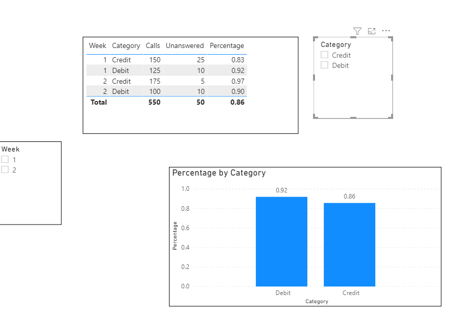
Hello all. Relatively easy one for you all. The below chart being the example of my data, I am looking to create the % values in the right most column via a Dax formula. I want to be able to rollup the combine % by week for visualizations and also break down by category as needed. I created a simple 1-(25/150) in the query, but it does not allow for a true representation of the % in the graph with using the average.
Thanks all
| Week | Category | Calls | Unanswered | |
| 1 | Credit | 150 | 25 | 83% |
| 1 | Debit | 125 | 10 | 92% |
| 2 | Credit | 175 | 5 | |
| 2 | Debit | 100 | 10 |
- Mark as New
- Bookmark
- Subscribe
- Mute
- Subscribe to RSS Feed
- Permalink
- Report Inappropriate Content
Thanks for reply. I am not looking for the MAX. I should have explained better. The solutions I would be looking to visualize in a chart would be showing the Debit % as a rollup over the two weeks or being able look at the Credit and Debit Service % for that week combined in a single %.
- Mark as New
- Bookmark
- Subscribe
- Mute
- Subscribe to RSS Feed
- Permalink
- Report Inappropriate Content
Hi @Anonymous ,
If I understood correctly :
Percentage = 1- DIVIDE(MAX('Table'[Unanswered]),MAX('Table'[Calls]))
Let me know if you have any questions.
If this solves your issues, please mark it as the solution, so that others can find it easily. Kudos 👍are nice too.
Nathaniel
Did I answer your question? Mark my post as a solution!
Proud to be a Super User!
Helpful resources

Power BI Dataviz World Championships
The Power BI Data Visualization World Championships is back! Get ahead of the game and start preparing now!

| User | Count |
|---|---|
| 19 | |
| 13 | |
| 8 | |
| 4 | |
| 4 |
| User | Count |
|---|---|
| 29 | |
| 19 | |
| 17 | |
| 11 | |
| 10 |


