Party with Power BI’s own Guy in a Cube
Power BI is turning 10! Tune in for a special live episode on July 24 with behind-the-scenes stories, product evolution highlights, and a sneak peek at what’s in store for the future.
Save the date- Power BI forums
- Get Help with Power BI
- Desktop
- Service
- Report Server
- Power Query
- Mobile Apps
- Developer
- DAX Commands and Tips
- Custom Visuals Development Discussion
- Health and Life Sciences
- Power BI Spanish forums
- Translated Spanish Desktop
- Training and Consulting
- Instructor Led Training
- Dashboard in a Day for Women, by Women
- Galleries
- Data Stories Gallery
- Themes Gallery
- Contests Gallery
- Quick Measures Gallery
- Notebook Gallery
- Translytical Task Flow Gallery
- TMDL Gallery
- R Script Showcase
- Webinars and Video Gallery
- Ideas
- Custom Visuals Ideas (read-only)
- Issues
- Issues
- Events
- Upcoming Events
Enhance your career with this limited time 50% discount on Fabric and Power BI exams. Ends August 31st. Request your voucher.
- Power BI forums
- Forums
- Get Help with Power BI
- DAX Commands and Tips
- Reo-ordering my x-axis points
- Subscribe to RSS Feed
- Mark Topic as New
- Mark Topic as Read
- Float this Topic for Current User
- Bookmark
- Subscribe
- Printer Friendly Page
- Mark as New
- Bookmark
- Subscribe
- Mute
- Subscribe to RSS Feed
- Permalink
- Report Inappropriate Content
Reo-ordering my x-axis points
Hi,
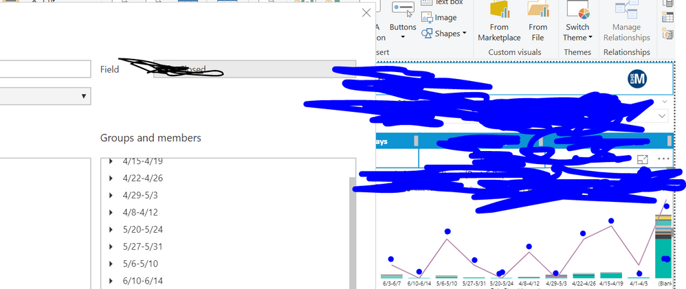
I jsut added in the June weeks to this graph but I can't figure out to switch how they are appearing on the x-axis. It is out of date order! Many thanks for your advice!!
Solved! Go to Solution.
- Mark as New
- Bookmark
- Subscribe
- Mute
- Subscribe to RSS Feed
- Permalink
- Report Inappropriate Content
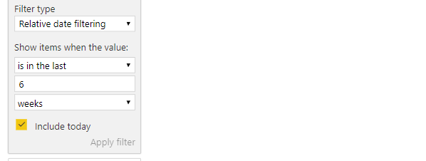
Great, add a visual level filter. Drag the actual date field to the visual level filters, apply relative date filtering set to last 6 weeks.
- Mark as New
- Bookmark
- Subscribe
- Mute
- Subscribe to RSS Feed
- Permalink
- Report Inappropriate Content
Your x-axis field is not of Date type; hence the points are not sorted as desire. Those are sorted alphabetically.
You may either name your weeks in such a way that those would align with calendar dates (e.g. prefix with 0 where needed, etc). Or use another more powerful feature Power BI has called Sort By Column.
- Mark as New
- Bookmark
- Subscribe
- Mute
- Subscribe to RSS Feed
- Permalink
- Report Inappropriate Content
Thank you for the date tip!! Adding in 0's fixed it immediately!
Another question - How can I limit the number of weeks appearing on m y x-axis. I would like it to show 6 weeks at a time.
many thanks for all your help!
- Mark as New
- Bookmark
- Subscribe
- Mute
- Subscribe to RSS Feed
- Permalink
- Report Inappropriate Content
Great, add a visual level filter. Drag the actual date field to the visual level filters, apply relative date filtering set to last 6 weeks.
- Mark as New
- Bookmark
- Subscribe
- Mute
- Subscribe to RSS Feed
- Permalink
- Report Inappropriate Content
Thank you!!
Helpful resources
| User | Count |
|---|---|
| 25 | |
| 12 | |
| 8 | |
| 6 | |
| 6 |
| User | Count |
|---|---|
| 26 | |
| 12 | |
| 11 | |
| 8 | |
| 7 |


