FabCon is coming to Atlanta
Join us at FabCon Atlanta from March 16 - 20, 2026, for the ultimate Fabric, Power BI, AI and SQL community-led event. Save $200 with code FABCOMM.
Register now!- Power BI forums
- Get Help with Power BI
- Desktop
- Service
- Report Server
- Power Query
- Mobile Apps
- Developer
- DAX Commands and Tips
- Custom Visuals Development Discussion
- Health and Life Sciences
- Power BI Spanish forums
- Translated Spanish Desktop
- Training and Consulting
- Instructor Led Training
- Dashboard in a Day for Women, by Women
- Galleries
- Data Stories Gallery
- Themes Gallery
- Contests Gallery
- QuickViz Gallery
- Quick Measures Gallery
- Visual Calculations Gallery
- Notebook Gallery
- Translytical Task Flow Gallery
- TMDL Gallery
- R Script Showcase
- Webinars and Video Gallery
- Ideas
- Custom Visuals Ideas (read-only)
- Issues
- Issues
- Events
- Upcoming Events
The Power BI Data Visualization World Championships is back! Get ahead of the game and start preparing now! Learn more
- Power BI forums
- Forums
- Get Help with Power BI
- DAX Commands and Tips
- Problem with date & data linking
- Subscribe to RSS Feed
- Mark Topic as New
- Mark Topic as Read
- Float this Topic for Current User
- Bookmark
- Subscribe
- Printer Friendly Page
- Mark as New
- Bookmark
- Subscribe
- Mute
- Subscribe to RSS Feed
- Permalink
- Report Inappropriate Content
Problem with date & data linking
Hello everyone!
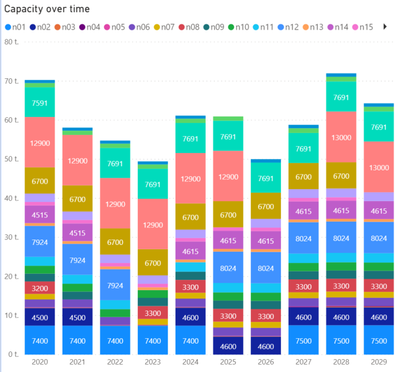
I'm trying to build a model where I present different kinds of data over time, and I would like to be able to put all kinds of data on the same timeline. First of all, I want to create a stacked column + line graph like below.
Now, I have multiple rows for capacity, which all have different initial capacities. In addition, I have dates when improvements are made (then the capacity is 0 for a while) and then greater than initial capacities.
The need for capacity (line in the graph) comes from a different table.
I tried creating a "master date table", and with a following measure i got it to work - given that i set the source of the capacity (n001, n002,..) as a legend.
if(FIRSTDATE(Capacities[Improvement start date])>FIRSTDATE('Date'[date]),sum(Capacities[Initial capacity]),if(FIRSTDATE(Capacities[Improvement end date])>FIRSTDATE('Date'[date]),0,sum(Capacities[New capacity])))
Of cource, it doesn't work without the legend, because it always checks the first date. However, in the future, I would like to present the type of capacity, not the source of it, so I'll need it fixed. Any ideas how to do it?
Thanks!
- Mark as New
- Bookmark
- Subscribe
- Mute
- Subscribe to RSS Feed
- Permalink
- Report Inappropriate Content
Helpful resources

Power BI Dataviz World Championships
The Power BI Data Visualization World Championships is back! Get ahead of the game and start preparing now!

| User | Count |
|---|---|
| 5 | |
| 5 | |
| 4 | |
| 4 | |
| 2 |
| User | Count |
|---|---|
| 13 | |
| 12 | |
| 9 | |
| 8 | |
| 7 |


