Huge last-minute discounts for FabCon Vienna from September 15-18, 2025
Supplies are limited. Contact info@espc.tech right away to save your spot before the conference sells out.
Get your discount- Power BI forums
- Get Help with Power BI
- Desktop
- Service
- Report Server
- Power Query
- Mobile Apps
- Developer
- DAX Commands and Tips
- Custom Visuals Development Discussion
- Health and Life Sciences
- Power BI Spanish forums
- Translated Spanish Desktop
- Training and Consulting
- Instructor Led Training
- Dashboard in a Day for Women, by Women
- Galleries
- Data Stories Gallery
- Themes Gallery
- Contests Gallery
- Quick Measures Gallery
- Notebook Gallery
- Translytical Task Flow Gallery
- TMDL Gallery
- R Script Showcase
- Webinars and Video Gallery
- Ideas
- Custom Visuals Ideas (read-only)
- Issues
- Issues
- Events
- Upcoming Events
Score big with last-minute savings on the final tickets to FabCon Vienna. Secure your discount
- Power BI forums
- Forums
- Get Help with Power BI
- DAX Commands and Tips
- Number of opened and closed issues per week + cumu...
- Subscribe to RSS Feed
- Mark Topic as New
- Mark Topic as Read
- Float this Topic for Current User
- Bookmark
- Subscribe
- Printer Friendly Page
- Mark as New
- Bookmark
- Subscribe
- Mute
- Subscribe to RSS Feed
- Permalink
- Report Inappropriate Content
Number of opened and closed issues per week + cumulative count of the opened issues in a chart
Hello folks,
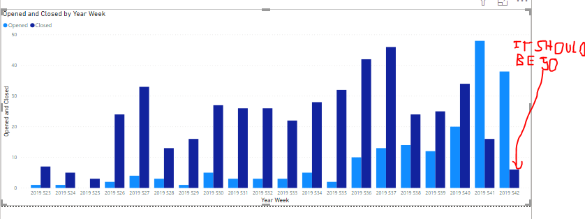
I would like to display on a "line and clustered chart" the number of tickets opened and closed per year week.
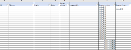
First I have my data table that looks like this :
To do that, I followed the answer given in this topic LINK
I created a calendar table and I linked it to the "creation date" :
To finish, I created two columns in the table to put a 0 or 1 if closed or opened :

- Mark as New
- Bookmark
- Subscribe
- Mute
- Subscribe to RSS Feed
- Permalink
- Report Inappropriate Content
Hi @Anonymous ,
this happens because you connect to [Created date]. You need to add a new relationship between your two tables, between Calendar[Date] and Data[Closed date]. This second relationship will be inactive. In order to make use of it, you have to use the USERELATIONSHIP-function inside a measure, something like this
measureClosed =
CALCULATE (
    SUM ( Data[Closed] );
    USERELATIONSHIP ( Data[Date Closure]; Calendar[Date] )
)
As for your cumulative count, it will depend a little on you Calendar-table, but in general it should look something like this
cumulative open =
CALCULATE (
    SUM ( data[open] );
    FILTER (
        ALL ( Calendar );
        Calendar[Week] <= MIN ( Calendar[Week] )
            && Calendar[Year] = MIN ( Calendar[Year] )
    )
)
Cheers,
Sturla
Helpful resources
| User | Count |
|---|---|
| 12 | |
| 11 | |
| 8 | |
| 6 | |
| 6 |
| User | Count |
|---|---|
| 24 | |
| 19 | |
| 14 | |
| 10 | |
| 7 |


