FabCon is coming to Atlanta
Join us at FabCon Atlanta from March 16 - 20, 2026, for the ultimate Fabric, Power BI, AI and SQL community-led event. Save $200 with code FABCOMM.
Register now!- Power BI forums
- Get Help with Power BI
- Desktop
- Service
- Report Server
- Power Query
- Mobile Apps
- Developer
- DAX Commands and Tips
- Custom Visuals Development Discussion
- Health and Life Sciences
- Power BI Spanish forums
- Translated Spanish Desktop
- Training and Consulting
- Instructor Led Training
- Dashboard in a Day for Women, by Women
- Galleries
- Data Stories Gallery
- Themes Gallery
- Contests Gallery
- QuickViz Gallery
- Quick Measures Gallery
- Visual Calculations Gallery
- Notebook Gallery
- Translytical Task Flow Gallery
- TMDL Gallery
- R Script Showcase
- Webinars and Video Gallery
- Ideas
- Custom Visuals Ideas (read-only)
- Issues
- Issues
- Events
- Upcoming Events
The Power BI Data Visualization World Championships is back! Get ahead of the game and start preparing now! Learn more
- Power BI forums
- Forums
- Get Help with Power BI
- DAX Commands and Tips
- Measure filtering within Graphs not functioning as...
- Subscribe to RSS Feed
- Mark Topic as New
- Mark Topic as Read
- Float this Topic for Current User
- Bookmark
- Subscribe
- Printer Friendly Page
- Mark as New
- Bookmark
- Subscribe
- Mute
- Subscribe to RSS Feed
- Permalink
- Report Inappropriate Content
Measure filtering within Graphs not functioning as expected
Hi,
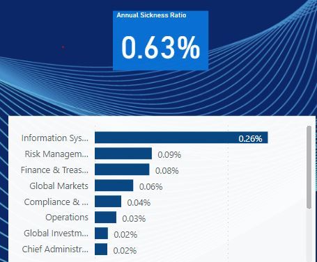
I have an issue where a measure is being used in a horizontal bar graph; along the Y axis is split out by Department and along the X axis is the measure value for the different departments. The measure when split on the graph seems to be not filtering by each department throughout the whole graph.
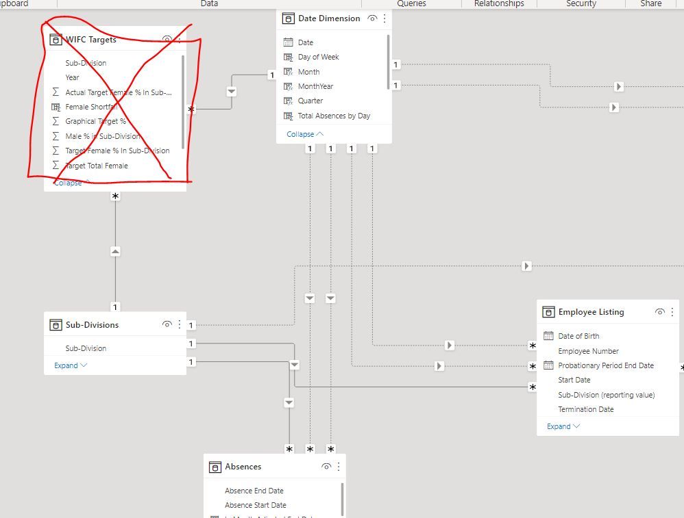
The Issue seems to be the graph. For each bar, its not calculating the measure correctly. The bars of the bar graph (see picture below) total the annualised sick ratio (same measure that is used in the graph, see picture at the bottom). Why is this happening? Shouldn't the bars being calculating their own sickness ratio based on the annual sickness ratio measurement below?
From how it's interacting, it looks like the filtering occurring to split up the measure into the bars looks like it's filtering the measure [Past 12 Month Sick Days] but not the [Active Employees] and [Headcount (12 Months Prior)] measures. However, when I use a filter on the page for those departments, it does in fact filter the whole measure, and not produce the issue described above.
In Summary I would like my bars in my bar graph to be calculating their own annual sickness ratio, and I'm unsure if it's because of the relationships put together, or if graphs can't do something that complicated.
The measure(s) is calculated as below:


Solved! Go to Solution.
- Mark as New
- Bookmark
- Subscribe
- Mute
- Subscribe to RSS Feed
- Permalink
- Report Inappropriate Content
Hi @JamesLindsay101 ,
//From how it's interacting, it looks like the filtering occurring to split up the measure into the bars looks like it's filtering the measure [Past 12 Month Sick Days] but not the [Active Employees] and [Headcount (12 Months Prior)] measures. However, when I use a filter on the page for those departments, it does in fact filter the whole measure, and not produce the issue described above.
Do you use the same column for the axis and filter in your scenario?
In addition, try to put "Annualised Sickness Ratio" measure into the bar chart and check if there are any difference compared with the result in the card.
Best Regards,
Icey
Helpful resources

Power BI Dataviz World Championships
The Power BI Data Visualization World Championships is back! Get ahead of the game and start preparing now!

| User | Count |
|---|---|
| 15 | |
| 8 | |
| 4 | |
| 4 | |
| 3 |
| User | Count |
|---|---|
| 24 | |
| 11 | |
| 10 | |
| 8 | |
| 5 |

