- Power BI forums
- Updates
- News & Announcements
- Get Help with Power BI
- Desktop
- Service
- Report Server
- Power Query
- Mobile Apps
- Developer
- DAX Commands and Tips
- Custom Visuals Development Discussion
- Health and Life Sciences
- Power BI Spanish forums
- Translated Spanish Desktop
- Power Platform Integration - Better Together!
- Power Platform Integrations (Read-only)
- Power Platform and Dynamics 365 Integrations (Read-only)
- Training and Consulting
- Instructor Led Training
- Dashboard in a Day for Women, by Women
- Galleries
- Community Connections & How-To Videos
- COVID-19 Data Stories Gallery
- Themes Gallery
- Data Stories Gallery
- R Script Showcase
- Webinars and Video Gallery
- Quick Measures Gallery
- 2021 MSBizAppsSummit Gallery
- 2020 MSBizAppsSummit Gallery
- 2019 MSBizAppsSummit Gallery
- Events
- Ideas
- Custom Visuals Ideas
- Issues
- Issues
- Events
- Upcoming Events
- Community Blog
- Power BI Community Blog
- Custom Visuals Community Blog
- Community Support
- Community Accounts & Registration
- Using the Community
- Community Feedback
Register now to learn Fabric in free live sessions led by the best Microsoft experts. From Apr 16 to May 9, in English and Spanish.
- Power BI forums
- Forums
- Get Help with Power BI
- DAX Commands and Tips
- Re: Last N months from selected month
- Subscribe to RSS Feed
- Mark Topic as New
- Mark Topic as Read
- Float this Topic for Current User
- Bookmark
- Subscribe
- Printer Friendly Page
- Mark as New
- Bookmark
- Subscribe
- Mute
- Subscribe to RSS Feed
- Permalink
- Report Inappropriate Content
Last N months from selected month
Hi Team,
Please do needful for the following criteria.
I have the below kind of data, the requirement i need is , if we select May, we need to show last four months data(Feb, Mar, apr, May) . and it should be based on year also(Ex:- if we select 2022 feb, then result is 2021 Nov, 2021 dec, 2022 jan, 2022 feb)
Thanks in Advance.
Solved! Go to Solution.
- Mark as New
- Bookmark
- Subscribe
- Mute
- Subscribe to RSS Feed
- Permalink
- Report Inappropriate Content
Hi @siva54 ,
You may try this solution.
1 Create a date column with the following Calculated column in your sample table
date =
VAR mon_ =
    SWITCH (
        'Table'[Month],
        "January", 1,
        "February", 2,
        "March", 3,
        "April", 4,
        "May", 5,
        "June", 6,
        "July", 7,
        "August", 8,
        "September", 9,
        "October", 10,
        "November", 11,
        "December", 12
    )
RETURN
    DATE ( 'Table'[Year], mon_, 1 )
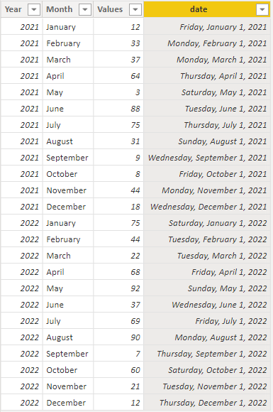
Then, the sample table will look like this.
2 Using the date column from calendar table to create Slicers
3 Create a measure as follows and take it to create your visual
LastFourMonth =
VAR selectedYear =
    SELECTEDVALUE ( 'calendar'[Date].[Year] )
VAR selectedMon =
    SELECTEDVALUE ( 'calendar'[Date].[MonthNo] )
VAR start_ =
    DATE ( selectedYear, selectedMon - 4, 1 )
VAR end_ =
    DATE ( selectedYear, selectedMon + 1, 1 ) - 1
RETURN
    CALCULATE (
        SUM ( 'Table'[Values] ),
        FILTER ( 'Table', 'Table'[date] > start_ && 'Table'[date] <= end_ )
    )
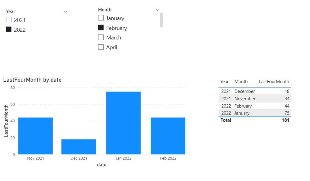
The visuals will look like this.
Also, attach the pbix for reference.
If this post helps, then please consider Accept it as the solution to help the other members find it more quickly. If I misunderstand your needs or you still have problems on it, please feel free to let me know. Thanks a lot!
Best Regards,
Community Support Team _ Caiyun
- Mark as New
- Bookmark
- Subscribe
- Mute
- Subscribe to RSS Feed
- Permalink
- Report Inappropriate Content
Hi:
Here are a couple of ways to do this. I think page two is your initial request. The first page is doing a running total on the number of months selected. Page two is Relative so if you set it to 6, it will always show last six months.
Please see file link:
https://drive.google.com/file/d/1WmogqeJsHJDXC663WJJ0rkBTjnmNC-P2/view?usp=sharing
- Mark as New
- Bookmark
- Subscribe
- Mute
- Subscribe to RSS Feed
- Permalink
- Report Inappropriate Content
the view will be like this.
Here we selected 2022 feb, so need to show last 5 months data.
Thanks in advance
- Mark as New
- Bookmark
- Subscribe
- Mute
- Subscribe to RSS Feed
- Permalink
- Report Inappropriate Content
Hello:
Please find attached file for one potential solution.https://drive.google.com/file/d/1WmogqeJsHJDXC663WJJ0rkBTjnmNC-P2/view?usp=sharing
I added a date table for future time intel calculations to be easier. I have used made up figures. I hope this helps!
Helpful resources

Microsoft Fabric Learn Together
Covering the world! 9:00-10:30 AM Sydney, 4:00-5:30 PM CET (Paris/Berlin), 7:00-8:30 PM Mexico City

Power BI Monthly Update - April 2024
Check out the April 2024 Power BI update to learn about new features.

| User | Count |
|---|---|
| 52 | |
| 27 | |
| 24 | |
| 13 | |
| 9 |
| User | Count |
|---|---|
| 74 | |
| 58 | |
| 47 | |
| 16 | |
| 12 |


