FabCon is coming to Atlanta
Join us at FabCon Atlanta from March 16 - 20, 2026, for the ultimate Fabric, Power BI, AI and SQL community-led event. Save $200 with code FABCOMM.
Register now!- Power BI forums
- Get Help with Power BI
- Desktop
- Service
- Report Server
- Power Query
- Mobile Apps
- Developer
- DAX Commands and Tips
- Custom Visuals Development Discussion
- Health and Life Sciences
- Power BI Spanish forums
- Translated Spanish Desktop
- Training and Consulting
- Instructor Led Training
- Dashboard in a Day for Women, by Women
- Galleries
- Data Stories Gallery
- Themes Gallery
- Contests Gallery
- Quick Measures Gallery
- Notebook Gallery
- Translytical Task Flow Gallery
- TMDL Gallery
- R Script Showcase
- Webinars and Video Gallery
- Ideas
- Custom Visuals Ideas (read-only)
- Issues
- Issues
- Events
- Upcoming Events
Calling all Data Engineers! Fabric Data Engineer (Exam DP-700) live sessions are back! Starting October 16th. Sign up.
- Power BI forums
- Forums
- Get Help with Power BI
- DAX Commands and Tips
- Imporssible to sort my values in order
- Subscribe to RSS Feed
- Mark Topic as New
- Mark Topic as Read
- Float this Topic for Current User
- Bookmark
- Subscribe
- Printer Friendly Page
- Mark as New
- Bookmark
- Subscribe
- Mute
- Subscribe to RSS Feed
- Permalink
- Report Inappropriate Content
Imporssible to sort my values in order
Hi Everyone,
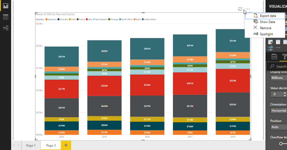
I have little problem : i cant sort my values in order. Don't understand why i didnt get the option ?
I would like to order small value country at first and bigger on the top..
Anyone know ?
Thanks in advance for help !
Solved! Go to Solution.
- Mark as New
- Bookmark
- Subscribe
- Mute
- Subscribe to RSS Feed
- Permalink
- Report Inappropriate Content
Yeah, I am not aware of that option in the stacked column chart. What it is doing is sorting the stacks alphabetically according to the legend. If you have multiple values, it sorts the stacks by the order of the values in the Values area. I can't see how your stacked column chart is configured but I am guessing that you are using Legend.
So, you can get around this by creating a Sort By column for what it looks like is a Country column that you are using in your Legend. This can be numeric and be whatever order you choose it to be so you can kind of work around this. But, not dynamic in that if for some reason in one of your stacks some country overtakes another as biggest, that won't be reflected dynamically.
There are other visuals that do a better job of this like the Ribbon chart visual so that you can see how things ebb and flow over time.
Follow on LinkedIn
@ me in replies or I'll lose your thread!!!
Instead of a Kudo, please vote for this idea
Become an expert!: Enterprise DNA
External Tools: MSHGQM
YouTube Channel!: Microsoft Hates Greg
Latest book!: DAX For Humans
DAX is easy, CALCULATE makes DAX hard...
- Mark as New
- Bookmark
- Subscribe
- Mute
- Subscribe to RSS Feed
- Permalink
- Report Inappropriate Content
It was a better idea, it's really better with a ribbon !
Thanks for the advice and have taking time for me,
Wish you the best !
- Mark as New
- Bookmark
- Subscribe
- Mute
- Subscribe to RSS Feed
- Permalink
- Report Inappropriate Content
Yeah, I am not aware of that option in the stacked column chart. What it is doing is sorting the stacks alphabetically according to the legend. If you have multiple values, it sorts the stacks by the order of the values in the Values area. I can't see how your stacked column chart is configured but I am guessing that you are using Legend.
So, you can get around this by creating a Sort By column for what it looks like is a Country column that you are using in your Legend. This can be numeric and be whatever order you choose it to be so you can kind of work around this. But, not dynamic in that if for some reason in one of your stacks some country overtakes another as biggest, that won't be reflected dynamically.
There are other visuals that do a better job of this like the Ribbon chart visual so that you can see how things ebb and flow over time.
Follow on LinkedIn
@ me in replies or I'll lose your thread!!!
Instead of a Kudo, please vote for this idea
Become an expert!: Enterprise DNA
External Tools: MSHGQM
YouTube Channel!: Microsoft Hates Greg
Latest book!: DAX For Humans
DAX is easy, CALCULATE makes DAX hard...
- Mark as New
- Bookmark
- Subscribe
- Mute
- Subscribe to RSS Feed
- Permalink
- Report Inappropriate Content
It was a better idea, it's really better with a ribbon !
Thanks for the advice and have taking time for me,
Wish you the best !
Helpful resources
| User | Count |
|---|---|
| 10 | |
| 9 | |
| 7 | |
| 4 | |
| 4 |


