FabCon is coming to Atlanta
Join us at FabCon Atlanta from March 16 - 20, 2026, for the ultimate Fabric, Power BI, AI and SQL community-led event. Save $200 with code FABCOMM.
Register now!- Power BI forums
- Get Help with Power BI
- Desktop
- Service
- Report Server
- Power Query
- Mobile Apps
- Developer
- DAX Commands and Tips
- Custom Visuals Development Discussion
- Health and Life Sciences
- Power BI Spanish forums
- Translated Spanish Desktop
- Training and Consulting
- Instructor Led Training
- Dashboard in a Day for Women, by Women
- Galleries
- Data Stories Gallery
- Themes Gallery
- Contests Gallery
- QuickViz Gallery
- Quick Measures Gallery
- Visual Calculations Gallery
- Notebook Gallery
- Translytical Task Flow Gallery
- TMDL Gallery
- R Script Showcase
- Webinars and Video Gallery
- Ideas
- Custom Visuals Ideas (read-only)
- Issues
- Issues
- Events
- Upcoming Events
The Power BI Data Visualization World Championships is back! Get ahead of the game and start preparing now! Learn more
- Power BI forums
- Forums
- Get Help with Power BI
- DAX Commands and Tips
- I want to take the average of the last 3 years of ...
- Subscribe to RSS Feed
- Mark Topic as New
- Mark Topic as Read
- Float this Topic for Current User
- Bookmark
- Subscribe
- Printer Friendly Page
- Mark as New
- Bookmark
- Subscribe
- Mute
- Subscribe to RSS Feed
- Permalink
- Report Inappropriate Content
I want to take the average of the last 3 years of the total number on a monthly and yearly basis
Hi, I have a table like this. And I want to get the second table from this table. I try to use the rollup and sum functions with the filter but I can't find any solution for getting the right amount written in the table to show in a graphic.
I wrote something like this but I should get also the next 3 years and the next three years till last year.
| JAAR | MAAND | Country | amount |
| 2015 | 1 | Netherlands | 1082 |
| 2015 | 1 | Belgium | 174 |
| 2015 | 1 | Belgium | 8 |
| 2015 | 1 | Luxembourg | 1 |
| 2015 | 1 | Suriname | 15 |
| 2015 | 2 | Netherlands | 1181 |
| 2015 | 2 | Belgium | 212 |
| 2015 | 2 | Belgium | 5 |
| 2015 | 2 | Luxembourg | 2 |
| 2015 | 2 | Suriname | 5 |
| 2016 | 1 | Netherlands | 1244 |
| 2016 | 1 | Belgium | 259 |
| 2016 | 1 | Belgium | 23 |
| 2016 | 1 | Luxembourg | 1 |
| 2016 | 1 | Suriname | 2 |
| 2016 | 2 | Netherlands | 1252 |
| 2016 | 2 | Belgium | 264 |
| 2016 | 2 | Belgium | 19 |
| 2016 | 2 | Luxembourg | 2 |
| 2016 | 2 | Suriname | 4 |
| 2017 | 1 | Netherlands | 1088 |
| 2017 | 1 | Belgium | 243 |
| 2017 | 1 | Belgium | 17 |
| 2017 | 1 | Luxembourg | 4 |
| 2017 | 2 | Netherlands | 1054 |
| 2017 | 2 | Belgium | 288 |
| 2017 | 2 | Belgium | 15 |
| 2017 | 2 | Luxembourg | 2 |
| 2017 | 2 | Suriname | 5 |
| AVG JAAR | Maand | Country | AVG |
| 15/16/17 | 1 | Netherlands | 1138 |
| 15/16/17 | 1 | Luxembourg | 2 |
| 15/16/17 | 1 | Belgique | 120 |
| 15/16/17 | 2 | Netherlands | 1162 |
| 16/17/18 | 1 | Netherlands | etc |
| 16/17/18 | 1 | Luxembourg | etc |
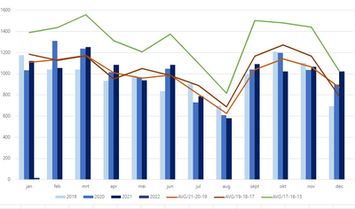
And at the end I will get a graphic like this :
Thank you for your help
Solved! Go to Solution.
- Mark as New
- Bookmark
- Subscribe
- Mute
- Subscribe to RSS Feed
- Permalink
- Report Inappropriate Content
Hi @Anonymous ,
I created a sample pbix file(see attachment) for you, please check whether that is what you want.
1. Create a month dimension table
| Month No. | Month Name |
| 1 | January |
| 2 | February |
| 3 | March |
| 4 | April |
| 5 | May |
| 6 | June |
| 7 | July |
| 8 | August |
| 9 | September |
| 10 | October |
| 11 | November |
| 12 | December |
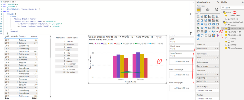
2. Create the measures as below to the average values(AVG/17-16-15,AVG/19-18-17 and )
AVG/17-16-15 =
var _baseyear=2021
VAR _selmonth =
    SELECTEDVALUE ( 'Months'[Month No.] )
RETURN
    AVERAGEX (
        FILTER (
            'Summary Incident Yearly',
            'Summary Incident Yearly'[JAAR] >= _baseyear-6
                && 'Summary Incident Yearly'[JAAR] <= _baseyear-4
                && 'Summary Incident Yearly'[MAAND] = _selmonth
        ),
        [amount]
    )AVG/17-16-15 =
var _baseyear=2021
VAR _selmonth =
    SELECTEDVALUE ( 'Months'[Month No.] )
RETURN
    AVERAGEX (
        FILTER (
            'Summary Incident Yearly',
            'Summary Incident Yearly'[JAAR] >= _baseyear-6
                && 'Summary Incident Yearly'[JAAR] <= _baseyear-4
                && 'Summary Incident Yearly'[MAAND] = _selmonth
        ),
        [amount]
    )
AVG/19-18-17 =
var _baseyear=2021
VAR _selmonth =
SELECTEDVALUE ( 'Months'[Month No.] )
RETURN
AVERAGEX (
FILTER (
'Summary Incident Yearly',
'Summary Incident Yearly'[JAAR] >= _baseyear-4
&& 'Summary Incident Yearly'[JAAR] <= _baseyear-2
&& 'Summary Incident Yearly'[MAAND] = _selmonth
),
[amount]
)AVG/21-20-19 =
var _baseyear=2021
VAR _selmonth =
SELECTEDVALUE ( 'Months'[Month No.] )
RETURN
AVERAGEX (
FILTER (
'Summary Incident Yearly',
'Summary Incident Yearly'[JAAR] >= _baseyear-2
&& 'Summary Incident Yearly'[JAAR] <= _baseyear
&& 'Summary Incident Yearly'[MAAND] = _selmonth
),
[amount]
)3. Create Line and clustered column chart as below
Best Regards
Helpful resources

Power BI Dataviz World Championships
The Power BI Data Visualization World Championships is back! Get ahead of the game and start preparing now!

| User | Count |
|---|---|
| 13 | |
| 5 | |
| 5 | |
| 3 | |
| 3 |
| User | Count |
|---|---|
| 25 | |
| 10 | |
| 10 | |
| 6 | |
| 6 |


