FabCon is coming to Atlanta
Join us at FabCon Atlanta from March 16 - 20, 2026, for the ultimate Fabric, Power BI, AI and SQL community-led event. Save $200 with code FABCOMM.
Register now!Go To
- Power BI forums
- Get Help with Power BI
- Desktop
- Service
- Report Server
- Power Query
- Mobile Apps
- Developer
- DAX Commands and Tips
- Custom Visuals Development Discussion
- Health and Life Sciences
- Power BI Spanish forums
- Translated Spanish Desktop
- Training and Consulting
- Instructor Led Training
- Dashboard in a Day for Women, by Women
- Galleries
- Data Stories Gallery
- Themes Gallery
- Contests Gallery
- Quick Measures Gallery
- Notebook Gallery
- Translytical Task Flow Gallery
- TMDL Gallery
- R Script Showcase
- Webinars and Video Gallery
- Ideas
- Custom Visuals Ideas (read-only)
- Issues
- Issues
- Events
- Upcoming Events
Turn on suggestions
Auto-suggest helps you quickly narrow down your search results by suggesting possible matches as you type.
Showing results for
Calling all Data Engineers! Fabric Data Engineer (Exam DP-700) live sessions are back! Starting October 16th. Sign up.
- Power BI forums
- Forums
- Get Help with Power BI
- DAX Commands and Tips
- How to obtain the average of the region depending ...
Reply
Topic Options
- Subscribe to RSS Feed
- Mark Topic as New
- Mark Topic as Read
- Float this Topic for Current User
- Bookmark
- Subscribe
- Printer Friendly Page
- Mark as New
- Bookmark
- Subscribe
- Mute
- Subscribe to RSS Feed
- Permalink
- Report Inappropriate Content
How to obtain the average of the region depending on the producer that is selected
02-10-2023
12:18 PM
Hello, good afternoon!
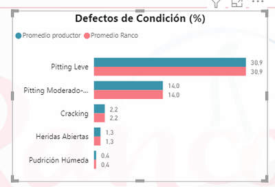
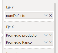
I am creating a comparative graph where the average of the defects obtained by producer is compared vs. the average of the defects obtained by our company "Ranco". The Graphic is built as follows:

Y-axis ->
nameDefect = DynamicCountersampleView[nameDefect]
X-axis ->
Average Producer :
AVERAGEX(VistaContramuestrasDinamica,
VistaContramuestrasDinamica[TotalMuestra] * VistaContramuestrasDinamica[porcDefectoTotal] + VistaContramuestrasDinamica[UnaMuestra] * VistaContramuestrasDinamica[porcDefectoUnaMuestra])
Average Ranco:
Ranco condition defects = CALCULATE(AVERAGE(VistaContramuestrasDinamica[porcDefectoTotal]),ALL(Producer[Short Name Producer]),ALL(ViewCountersamplesDynamics[codCuartel]))
So far I find the creation of the graphic good. But I would like to add a third measure or value that represents the average of the region to which the producer belongs, for these purposes in the same table VistaContramuestrasDinamica we have the fields ViewCountersamplesDynamics [ Region] and ViewCountersamplesDynamics [Short Name Producer].
So far I find the creation of the graphic good. But I would like to add a third measure or value that represents the average of the region to which the producer belongs, for these purposes in the same table VistaContramuestrasDinamica we have the fields ViewCountersamplesDynamics [ Region] and ViewCountersamplesDynamics [Short Name Producer].
How could I create this measure and thus show the average Region associated with the producer?
Thank you very much for your help! 😄
Thank you very much for your help! 😄
0 REPLIES 0
Helpful resources
Announcements


