Join us at FabCon Vienna from September 15-18, 2025
The ultimate Fabric, Power BI, SQL, and AI community-led learning event. Save €200 with code FABCOMM.
Get registered- Power BI forums
- Get Help with Power BI
- Desktop
- Service
- Report Server
- Power Query
- Mobile Apps
- Developer
- DAX Commands and Tips
- Custom Visuals Development Discussion
- Health and Life Sciences
- Power BI Spanish forums
- Translated Spanish Desktop
- Training and Consulting
- Instructor Led Training
- Dashboard in a Day for Women, by Women
- Galleries
- Data Stories Gallery
- Themes Gallery
- Contests Gallery
- Quick Measures Gallery
- Notebook Gallery
- Translytical Task Flow Gallery
- TMDL Gallery
- R Script Showcase
- Webinars and Video Gallery
- Ideas
- Custom Visuals Ideas (read-only)
- Issues
- Issues
- Events
- Upcoming Events
Enhance your career with this limited time 50% discount on Fabric and Power BI exams. Ends August 31st. Request your voucher.
- Power BI forums
- Forums
- Get Help with Power BI
- DAX Commands and Tips
- How to make line chart title and measure change dy...
- Subscribe to RSS Feed
- Mark Topic as New
- Mark Topic as Read
- Float this Topic for Current User
- Bookmark
- Subscribe
- Printer Friendly Page
- Mark as New
- Bookmark
- Subscribe
- Mute
- Subscribe to RSS Feed
- Permalink
- Report Inappropriate Content
How to make line chart title and measure change dynamically based on table values filter
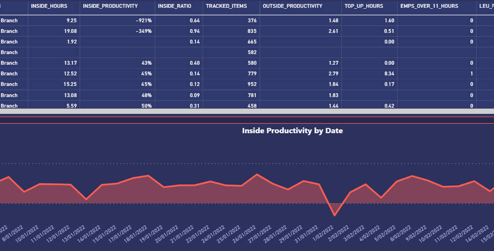
I have a table and line chart. I need the line chart title to dynamically change based on the values clicked in the table e.g. #1 looking at the first row, (under the measure 'Inside_Hours') if I clicked on "9.25", I would like the line chart to display the 'Inside Hours' measure and the chart title to display "X Branch Inside Hours by Date"
The same will apply to other columns e.g. #2 if I clicked on "-921%", then the line chart should display the 'Inside Productivity' measure and the chart title should display "X Branch Inside Productivity by Date".
Hope that made sense. Appreciate any help thanks.
Here's sample pbix file >> https://drive.google.com/file/d/1rSy29PmC-GlqORl26PzBghtNsMxWKvCe/view?usp=sharing
Solved! Go to Solution.
- Mark as New
- Bookmark
- Subscribe
- Mute
- Subscribe to RSS Feed
- Permalink
- Report Inappropriate Content
I think might be possible if you make a single measure that switches between all the metrics and create a dimension table with all the metrics to use as filter context and title.
- Mark as New
- Bookmark
- Subscribe
- Mute
- Subscribe to RSS Feed
- Permalink
- Report Inappropriate Content
- Mark as New
- Bookmark
- Subscribe
- Mute
- Subscribe to RSS Feed
- Permalink
- Report Inappropriate Content
That's interesting coz the same visuals work in Excel report but with custom VBA. I understand it's not a fair comparison but I presumed something similar could be archieved in PowerBi.
@tamerj1 @AlexisOlson any advice/tips?
- Mark as New
- Bookmark
- Subscribe
- Mute
- Subscribe to RSS Feed
- Permalink
- Report Inappropriate Content
I think might be possible if you make a single measure that switches between all the metrics and create a dimension table with all the metrics to use as filter context and title.
- Mark as New
- Bookmark
- Subscribe
- Mute
- Subscribe to RSS Feed
- Permalink
- Report Inappropriate Content
Thanks. I'll do further research on how to accomplish this.
Helpful resources
| User | Count |
|---|---|
| 11 | |
| 8 | |
| 6 | |
| 6 | |
| 6 |
| User | Count |
|---|---|
| 24 | |
| 14 | |
| 13 | |
| 9 | |
| 8 |


