FabCon is coming to Atlanta
Join us at FabCon Atlanta from March 16 - 20, 2026, for the ultimate Fabric, Power BI, AI and SQL community-led event. Save $200 with code FABCOMM.
Register now!- Power BI forums
- Get Help with Power BI
- Desktop
- Service
- Report Server
- Power Query
- Mobile Apps
- Developer
- DAX Commands and Tips
- Custom Visuals Development Discussion
- Health and Life Sciences
- Power BI Spanish forums
- Translated Spanish Desktop
- Training and Consulting
- Instructor Led Training
- Dashboard in a Day for Women, by Women
- Galleries
- Data Stories Gallery
- Themes Gallery
- Contests Gallery
- Quick Measures Gallery
- Notebook Gallery
- Translytical Task Flow Gallery
- TMDL Gallery
- R Script Showcase
- Webinars and Video Gallery
- Ideas
- Custom Visuals Ideas (read-only)
- Issues
- Issues
- Events
- Upcoming Events
To celebrate FabCon Vienna, we are offering 50% off select exams. Ends October 3rd. Request your discount now.
- Power BI forums
- Forums
- Get Help with Power BI
- DAX Commands and Tips
- How to fill value for empty date to keep continuou...
- Subscribe to RSS Feed
- Mark Topic as New
- Mark Topic as Read
- Float this Topic for Current User
- Bookmark
- Subscribe
- Printer Friendly Page
- Mark as New
- Bookmark
- Subscribe
- Mute
- Subscribe to RSS Feed
- Permalink
- Report Inappropriate Content
How to fill value for empty date to keep continuous same period
I have a line chart and a matrix table, and want to keep the X axis align with table column header to compare data. So I have to fill values for empty date. But there is a problem. Hope someone can help. Thanks.
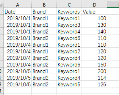
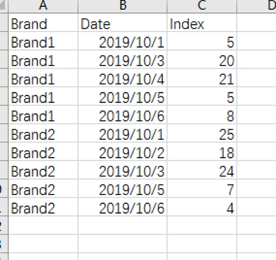
I have two sample data to compose two visuals:
the first table to compose line chart: sheet1:
the second table to compose the matrix table: sheet2:
here is the final visuals:
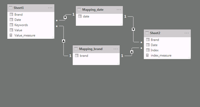
Here is table relationship(I also created two mapping table for date and brand in order to interact two charts together):
Based on table 1, because not every day has full data for each brand/keyword. To keep two visuals align at X axis, I created measure for line value as below:
Value_measure = CALCULATE(IF(ISBLANK(CALCULATE(SUM(Sheet1[Value]),FILTER(ALLSELECTED(Sheet1[Brand]),1=1))),0,CALCULATE(SUM(Sheet1[Value]))))
But the problem is:
Brand1 should only have keyword1,2,3; Brand2 should only have keyword 4,5,6.
But in the line chart, the "legand" shows 6 keywords if I selected Brand1 on left slicer. How should I only show filtered keywords in line chart?
The main purpose is only show last 6 days data, and compare two chart values.
Here is the sample data and PBI file:
https://pan.baidu.com/s/1fJY65WvpTVr23h9trR0ntA
Download code is "wy9h"


