Join us at FabCon Vienna from September 15-18, 2025
The ultimate Fabric, Power BI, SQL, and AI community-led learning event. Save €200 with code FABCOMM.
Get registered- Power BI forums
- Get Help with Power BI
- Desktop
- Service
- Report Server
- Power Query
- Mobile Apps
- Developer
- DAX Commands and Tips
- Custom Visuals Development Discussion
- Health and Life Sciences
- Power BI Spanish forums
- Translated Spanish Desktop
- Training and Consulting
- Instructor Led Training
- Dashboard in a Day for Women, by Women
- Galleries
- Data Stories Gallery
- Themes Gallery
- Contests Gallery
- Quick Measures Gallery
- Notebook Gallery
- Translytical Task Flow Gallery
- TMDL Gallery
- R Script Showcase
- Webinars and Video Gallery
- Ideas
- Custom Visuals Ideas (read-only)
- Issues
- Issues
- Events
- Upcoming Events
Compete to become Power BI Data Viz World Champion! First round ends August 18th. Get started.
- Power BI forums
- Forums
- Get Help with Power BI
- DAX Commands and Tips
- How to create clustered column chart containing th...
- Subscribe to RSS Feed
- Mark Topic as New
- Mark Topic as Read
- Float this Topic for Current User
- Bookmark
- Subscribe
- Printer Friendly Page
- Mark as New
- Bookmark
- Subscribe
- Mute
- Subscribe to RSS Feed
- Permalink
- Report Inappropriate Content
How to create clustered column chart containing think cells
Hello,
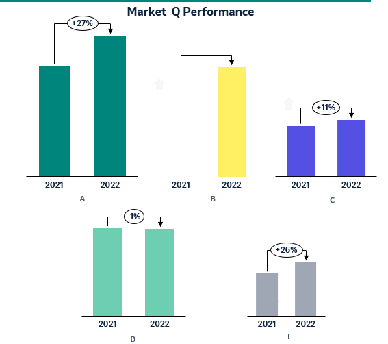
I am trying to create a visual that should look like the below print screen, however I am not able to find a visual that shows similar outcome.
The visual should show the sales of the 5 products (A-E) for 2021 & 2022 and the thinkcell should include the % vs. PY.
I have created the DAX measures to calculate seperately the 3 values (2021 sales, 2022 sales & %, however I cannot find any visual with the above outcome.
Do you have any idea if it`s possible in PowerBI to have a similar visual?
Any help would be highly appreciated.
Solved! Go to Solution.
- Mark as New
- Bookmark
- Subscribe
- Mute
- Subscribe to RSS Feed
- Permalink
- Report Inappropriate Content
There are visuals that do this and much, much more... but you've got to pay for them. They're being created by the Zebra company. Have a look at this.
- Mark as New
- Bookmark
- Subscribe
- Mute
- Subscribe to RSS Feed
- Permalink
- Report Inappropriate Content
There are visuals that do this and much, much more... but you've got to pay for them. They're being created by the Zebra company. Have a look at this.
- Mark as New
- Bookmark
- Subscribe
- Mute
- Subscribe to RSS Feed
- Permalink
- Report Inappropriate Content
Helpful resources
| User | Count |
|---|---|
| 24 | |
| 10 | |
| 8 | |
| 7 | |
| 6 |
| User | Count |
|---|---|
| 32 | |
| 12 | |
| 10 | |
| 10 | |
| 9 |


