FabCon is coming to Atlanta
Join us at FabCon Atlanta from March 16 - 20, 2026, for the ultimate Fabric, Power BI, AI and SQL community-led event. Save $200 with code FABCOMM.
Register now!- Power BI forums
- Get Help with Power BI
- Desktop
- Service
- Report Server
- Power Query
- Mobile Apps
- Developer
- DAX Commands and Tips
- Custom Visuals Development Discussion
- Health and Life Sciences
- Power BI Spanish forums
- Translated Spanish Desktop
- Training and Consulting
- Instructor Led Training
- Dashboard in a Day for Women, by Women
- Galleries
- Data Stories Gallery
- Themes Gallery
- Contests Gallery
- QuickViz Gallery
- Quick Measures Gallery
- Visual Calculations Gallery
- Notebook Gallery
- Translytical Task Flow Gallery
- TMDL Gallery
- R Script Showcase
- Webinars and Video Gallery
- Ideas
- Custom Visuals Ideas (read-only)
- Issues
- Issues
- Events
- Upcoming Events
The Power BI Data Visualization World Championships is back! Get ahead of the game and start preparing now! Learn more
- Power BI forums
- Forums
- Get Help with Power BI
- DAX Commands and Tips
- How to calculate and display averages in a bar gra...
- Subscribe to RSS Feed
- Mark Topic as New
- Mark Topic as Read
- Float this Topic for Current User
- Bookmark
- Subscribe
- Printer Friendly Page
- Mark as New
- Bookmark
- Subscribe
- Mute
- Subscribe to RSS Feed
- Permalink
- Report Inappropriate Content
How to calculate and display averages in a bar graph in power bi
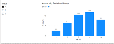
Hi there, I'm extremely new to Power BI and certainly new here...I was just wondering if you could help me out with something. I want to display the Average of a data set over 13 Periods on a bar graph in Power BI. I created a very simple New Measure using AVERAGE, calling the data set whose Average I want to display. However, I'm unable to drag this to the X Axis to display as a 14th Period showing the Average (like a grand total, but instead it's the grand average). How do I do it?
Solved! Go to Solution.
- Mark as New
- Bookmark
- Subscribe
- Mute
- Subscribe to RSS Feed
- Permalink
- Report Inappropriate Content
Hi @AM103 ,
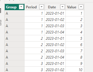
I created some data:
Here are the steps you can follow:
1. Create calculated table.
Table 2 =
var _column1=
DISTINCT('True'[Period])
var _column2=
{14}
return
UNION(
    _column1,_column2)
2. Create measure.
Measure =
IF(
    MAX('Table 2'[Period])=14,
 AVERAGEX(ALLSELECTED('True'),[Value])
   ,
    AVERAGEX(
        FILTER(ALLSELECTED('True'),'True'[Period]=MAX('Table 2'[Period])),[Value]))
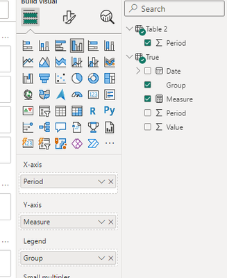
3. Place the field in Visual.
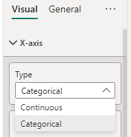
X-axis – Type – X-axis -- Categorical
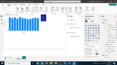
4. Result:
Best Regards,
Liu Yang
If this post helps, then please consider Accept it as the solution to help the other members find it more quickly
- Mark as New
- Bookmark
- Subscribe
- Mute
- Subscribe to RSS Feed
- Permalink
- Report Inappropriate Content
Certainly! Displaying an average line on a bar graph in Power BI involves a combination of measures and visual adjustments. Here's a step-by-step guide to help you achieve this:
Create Your Data Model: Ensure that your data model is correctly set up in Power BI with the necessary tables and relationships.
Create a New Measure for Average: You mentioned you've created a new measure using the AVERAGE function. Let's call this measure AverageValue. Ensure that this measure is correctly calculating the average for your dataset.
Create a New Table or Measure for Period: To represent the 14th period as an average line, you might need to introduce a new table or measure that represents this period.
Use a Combo Chart: Instead of just using a bar chart, you might want to consider using a combo chart (column + line chart) to show the bars for each of the 13 periods and the average line for the 14th period.
Add Average Line to the Combo Chart:
- Drag your AverageValue measure onto the Values field of your combo chart.
- In the Visualizations pane, under the Combo chart options, ensure you have both the clustered column chart and line chart types selected.
- For the AverageValue measure in the Values field, set its chart type to a line.
Adjust Axes and Scales:
- Make sure the axes are consistent so that the average line is easily visible against the bar chart.
- Adjust the scales and formats as needed to ensure clarity.
Add Titles and Labels:
- Add appropriate titles to your visualizations.
- Consider adding a data label to the average line to clearly display the average value for the 14th period.
Filtering and Interactivity:
- If necessary, set up filters or slicers to allow users to interactively explore the data across different periods while still displaying the average line.
By following these steps, you should be able to create a bar graph in Power BI that displays the average of your dataset over 13 periods as a 14th period average line. Remember, Power BI offers a lot of flexibility in terms of visualizations and calculations, so you might need to adjust based on your specific dataset and requirements.
If this post helps, then please consider Accepting it as the solution to help the other members find it more quickly.
In case there is still a problem, please feel free and explain your issue in detail, It will be my pleasure to assist you in any way I can.
Helpful resources

Power BI Dataviz World Championships
The Power BI Data Visualization World Championships is back! Get ahead of the game and start preparing now!

| User | Count |
|---|---|
| 19 | |
| 13 | |
| 9 | |
| 4 | |
| 4 |
| User | Count |
|---|---|
| 30 | |
| 27 | |
| 17 | |
| 11 | |
| 10 |
