FabCon is coming to Atlanta
Join us at FabCon Atlanta from March 16 - 20, 2026, for the ultimate Fabric, Power BI, AI and SQL community-led event. Save $200 with code FABCOMM.
Register now!- Power BI forums
- Get Help with Power BI
- Desktop
- Service
- Report Server
- Power Query
- Mobile Apps
- Developer
- DAX Commands and Tips
- Custom Visuals Development Discussion
- Health and Life Sciences
- Power BI Spanish forums
- Translated Spanish Desktop
- Training and Consulting
- Instructor Led Training
- Dashboard in a Day for Women, by Women
- Galleries
- Data Stories Gallery
- Themes Gallery
- Contests Gallery
- QuickViz Gallery
- Quick Measures Gallery
- Visual Calculations Gallery
- Notebook Gallery
- Translytical Task Flow Gallery
- TMDL Gallery
- R Script Showcase
- Webinars and Video Gallery
- Ideas
- Custom Visuals Ideas (read-only)
- Issues
- Issues
- Events
- Upcoming Events
The Power BI Data Visualization World Championships is back! Get ahead of the game and start preparing now! Learn more
- Power BI forums
- Forums
- Get Help with Power BI
- DAX Commands and Tips
- Hide dates on axis where ratio is not calculated
- Subscribe to RSS Feed
- Mark Topic as New
- Mark Topic as Read
- Float this Topic for Current User
- Bookmark
- Subscribe
- Printer Friendly Page
- Mark as New
- Bookmark
- Subscribe
- Mute
- Subscribe to RSS Feed
- Permalink
- Report Inappropriate Content
Hide dates on axis where ratio is not calculated
Hi Folks and @Stachu
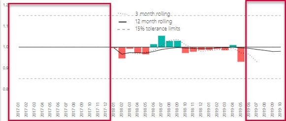
I have a visual which plots the ratio of two measures as updown graphs, which use a combination measures to achieve what my boss wanted to see. I need to try and not show the areas in red, so that the user doesn't have to adjust the timeline continously using the Time Line Slicer. I'm thinking a filtered date table but I didn't have succes with that.
Background information :You will notice that the bars are showing the difference of the ratio from 1 ( the closer the ratio is to one or partity - the better) green bars show a ratio greater than one, and red less than one.
Questions:
Can I make the date on the axis only show the period where the ratio ( F1) is calculated, and can I restrict the rolling averages from not projecting "into the future"
I was wondering if there is an easier method to "clip" or filter the time line to only show months where there is information to display?
Hope someone has an elegant solution to only show the bars and lines for months where the ratio is informed and not the blank periods. I was trying to use the filter pane but that doesn't seem to work either.
Cheers and thanks in advance
Manfred
Solved! Go to Solution.
- Mark as New
- Bookmark
- Subscribe
- Mute
- Subscribe to RSS Feed
- Permalink
- Report Inappropriate Content
Hi.
Mate, to automatically hide the areas where there's no ratio or where the ratio makes no sense, you should return BLANKS. Just adjust your measures. Visuals work the same way that a simple table does: if there's only BLANKS in a row, the row does not get displayed.
Best
Darek
- Mark as New
- Bookmark
- Subscribe
- Mute
- Subscribe to RSS Feed
- Permalink
- Report Inappropriate Content
Hi @Anonymous
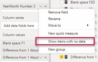
Thanks mate - I used the Blank() tweak the formulas (especially the constant lines - I couldn't add the analytics feature to add constant lines. But ....I was still getting all the dates presented in the graphics. And then I remembered to check the "Show items with no data" on the axis box. Boom - solved! Feel quite relieved and sheepish 😌at the same time. Thanks again for the help!
- Mark as New
- Bookmark
- Subscribe
- Mute
- Subscribe to RSS Feed
- Permalink
- Report Inappropriate Content
In truth... I didn't even know there was the option you mention 🙂
All good that ends well...
Best
Darek
Helpful resources

Power BI Dataviz World Championships
The Power BI Data Visualization World Championships is back! Get ahead of the game and start preparing now!

| User | Count |
|---|---|
| 19 | |
| 13 | |
| 9 | |
| 4 | |
| 4 |
| User | Count |
|---|---|
| 30 | |
| 26 | |
| 17 | |
| 11 | |
| 10 |


