Join us at FabCon Vienna from September 15-18, 2025
The ultimate Fabric, Power BI, SQL, and AI community-led learning event. Save €200 with code FABCOMM.
Get registered- Power BI forums
- Get Help with Power BI
- Desktop
- Service
- Report Server
- Power Query
- Mobile Apps
- Developer
- DAX Commands and Tips
- Custom Visuals Development Discussion
- Health and Life Sciences
- Power BI Spanish forums
- Translated Spanish Desktop
- Training and Consulting
- Instructor Led Training
- Dashboard in a Day for Women, by Women
- Galleries
- Data Stories Gallery
- Themes Gallery
- Contests Gallery
- Quick Measures Gallery
- Notebook Gallery
- Translytical Task Flow Gallery
- TMDL Gallery
- R Script Showcase
- Webinars and Video Gallery
- Ideas
- Custom Visuals Ideas (read-only)
- Issues
- Issues
- Events
- Upcoming Events
Compete to become Power BI Data Viz World Champion! First round ends August 18th. Get started.
- Power BI forums
- Forums
- Get Help with Power BI
- DAX Commands and Tips
- Find the delay in course development milestone whe...
- Subscribe to RSS Feed
- Mark Topic as New
- Mark Topic as Read
- Float this Topic for Current User
- Bookmark
- Subscribe
- Printer Friendly Page
- Mark as New
- Bookmark
- Subscribe
- Mute
- Subscribe to RSS Feed
- Permalink
- Report Inappropriate Content
Find the delay in course development milestone when only Planned delivery date is available
Hi All,
Sample data to track the delays
| Course Number | Milestone | Estimated delivery date | Actual delivery date |
| Course1 | 1a | 1/1/2018 | 1/10/2018 |
| 1b | 1/5/2018 | 1/15/2018 | |
| 2a | 2/8/2018 | 2/10/2018 | |
| 2b | 2/15/2018 | ||
| 3a | 3/22/2018 | ||
| 3b | 4/1/2018 | ||
| 4a | 5/22/2018 | ||
This is sample data for only one course. Similarly I have multiple courses.
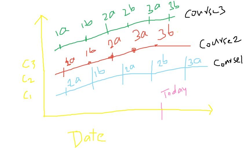
1. All courses should be tracked at one glance.
In the above example 2b milestone delay also should be calculated.
Requirement:
Would like to track all the courses and each milestones delay.

Though the Actual date for Current milestone(2b) is not present, we should calculate the delay with todays date and project that delay in the visual.
We tried with line chart but it's expecting a value and only course is being tracked at a time.
1.Please suggest the best visual that suits the requirement.
2. Dax to calcuate the current milestone delay with today.
3. Other milestones delay is not required which are empty for actual delivery date.
- Mark as New
- Bookmark
- Subscribe
- Mute
- Subscribe to RSS Feed
- Permalink
- Report Inappropriate Content
Please check out the As Timeline visual in AppSource. Here is what it would look like with your sample data (for the one course, with the Stacked format option turned off). You can also add a calculated column with the delay in days to your table with the expression below, and put it in the Overlay field well of the visual to show the delay.
If this works for you, please mark it as the solution. Kudos are appreciated too. Please let me know if not.
Regards,
Pat
Did I answer your question? Mark my post as a solution! Kudos are also appreciated!
To learn more about Power BI, follow me on Twitter or subscribe on YouTube.
@mahoneypa HoosierBI on YouTube
Helpful resources
| User | Count |
|---|---|
| 16 | |
| 8 | |
| 6 | |
| 6 | |
| 5 |
| User | Count |
|---|---|
| 24 | |
| 13 | |
| 13 | |
| 8 | |
| 8 |


