Fabric Data Days starts November 4th!
Advance your Data & AI career with 50 days of live learning, dataviz contests, hands-on challenges, study groups & certifications and more!
Get registered- Power BI forums
- Get Help with Power BI
- Desktop
- Service
- Report Server
- Power Query
- Mobile Apps
- Developer
- DAX Commands and Tips
- Custom Visuals Development Discussion
- Health and Life Sciences
- Power BI Spanish forums
- Translated Spanish Desktop
- Training and Consulting
- Instructor Led Training
- Dashboard in a Day for Women, by Women
- Galleries
- Data Stories Gallery
- Themes Gallery
- Contests Gallery
- QuickViz Gallery
- Quick Measures Gallery
- Visual Calculations Gallery
- Notebook Gallery
- Translytical Task Flow Gallery
- TMDL Gallery
- R Script Showcase
- Webinars and Video Gallery
- Ideas
- Custom Visuals Ideas (read-only)
- Issues
- Issues
- Events
- Upcoming Events
Get Fabric Certified for FREE during Fabric Data Days. Don't miss your chance! Request now
- Power BI forums
- Forums
- Get Help with Power BI
- DAX Commands and Tips
- Dynamic Group that can be pulled into summary meas...
- Subscribe to RSS Feed
- Mark Topic as New
- Mark Topic as Read
- Float this Topic for Current User
- Bookmark
- Subscribe
- Printer Friendly Page
- Mark as New
- Bookmark
- Subscribe
- Mute
- Subscribe to RSS Feed
- Permalink
- Report Inappropriate Content
Dynamic Group that can be pulled into summary measures Power BI
I have a reference table that is the primary slicer for my entire Power BI file. This table has a repeated index for all UK local authorities (LA's) and their associated comparators. It looks like like:
| Barking and Dagenham | Southwark |
| Barking and Dagenham | Tower Hamlets |
| Barking and Dagenham | Lambeth |
| Barking and Dagenham | Barking and Dagenham |
| Barnet | Harrow |
| Barnet | Redbridge |
| Barnet | Enfield |
So a slicer will allow a user to select an LA from the `LA Index` but what we want is for the `LA Comparator` list for use in visuals. Then we want to select those `LA Comparators` when they appear in other data tables for the purposes of summary for a group. Acting a filter. So if the user selected Barking and Dagenham a sperate table of population might then like this:
| Southwark | 10000 |
| Tower Hamlets | 15000 |
| Lambeth | 4000 |
| Barking and Dagenham | 5000 |
But then summarise that into an average of 8500 that can be used in a Card or KPI visual.
Even better if I could use that grouping in something like a sunburst visual with the outer rings being the comparators and inner ring being the selected LA.
Bascially, how can I make `LA Comparators` a dynmic variable I can use across anything. I hope that is clear. Happy to answer any questions anyone might have.
- Mark as New
- Bookmark
- Subscribe
- Mute
- Subscribe to RSS Feed
- Permalink
- Report Inappropriate Content
- Mark as New
- Bookmark
- Subscribe
- Mute
- Subscribe to RSS Feed
- Permalink
- Report Inappropriate Content
- Mark as New
- Bookmark
- Subscribe
- Mute
- Subscribe to RSS Feed
- Permalink
- Report Inappropriate Content
- Mark as New
- Bookmark
- Subscribe
- Mute
- Subscribe to RSS Feed
- Permalink
- Report Inappropriate Content
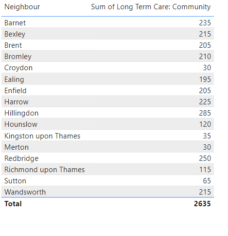
Hello @tamerj1 I don't think I have explained the issue clearly. I don't want a table. I want to create a measure that will filter the necessary values to the LA Comparators of my selected value and summarise just those ones into a single measure. Jsut trying you soultion give me this.
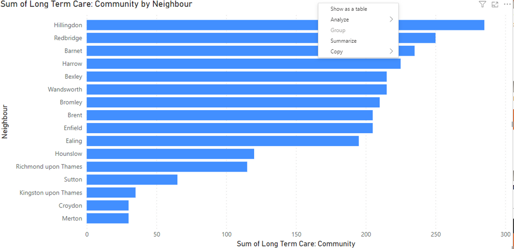
And yes, that works for a Card visual, but not for a KPI or anyhting else that requires a group as I need it to be a singlar value. For exmaple. If I also droped that into a bar chart it looks like this:
I don't want individual bar for each comparator. I want a singualr bar that would be a average or some other transofrmation of those groups so that I can show it along side other metircs.
- Mark as New
- Bookmark
- Subscribe
- Mute
- Subscribe to RSS Feed
- Permalink
- Report Inappropriate Content
Not 100% sure I understand your requirement. I mean If you want to see a single value in the column chart then remove the column fron the chart (keep only the measure)
- Mark as New
- Bookmark
- Subscribe
- Mute
- Subscribe to RSS Feed
- Permalink
- Report Inappropriate Content
Let stry it this way. If I wanted to take the original table:
| LA Index | LA Comparator |
| Barking and Dagenham | Southwark |
| Barking and Dagenham | Tower Hamlets |
| Barking and Dagenham | Lambeth |
| Barking and Dagenham | Barking and Dagenham |
| Barnet | Harrow |
| Barnet | Redbridge |
| Barnet | Enfield |
Filter it to Barking and Dagenham:
| LA Index | LA Comparator |
| Barking and Dagenham | Southwark |
| Barking and Dagenham | Tower Hamlets |
| Barking and Dagenham | Lambeth |
| Barking and Dagenham | Barking and Dagenham |
Now I need to produce a cross table summary for a starburst visual form another table:
| LA Index | Percentage of Popualtion |
| Southwark | 20% |
| Barking and Dagenham | 50% |
| Tower Hamlets | 10% |
| Lambeth | 10% |
The cross table needs to be the selected value 'Barking and Dagenham', and the other group needs to the others grouped togehter as an average:
| LA Index | Percentage of Popualtion |
| Comparators | 15% |
| Barking and Dagenham | 50% |
How do I get to the Other comparator group as a measure or value in a table I can use elsewhere.
Helpful resources

Power BI Monthly Update - November 2025
Check out the November 2025 Power BI update to learn about new features.

Fabric Data Days
Advance your Data & AI career with 50 days of live learning, contests, hands-on challenges, study groups & certifications and more!

| User | Count |
|---|---|
| 5 | |
| 5 | |
| 5 | |
| 4 | |
| 4 |
| User | Count |
|---|---|
| 24 | |
| 21 | |
| 15 | |
| 12 | |
| 10 |


