Join us at FabCon Vienna from September 15-18, 2025
The ultimate Fabric, Power BI, SQL, and AI community-led learning event. Save €200 with code FABCOMM.
Get registered- Power BI forums
- Get Help with Power BI
- Desktop
- Service
- Report Server
- Power Query
- Mobile Apps
- Developer
- DAX Commands and Tips
- Custom Visuals Development Discussion
- Health and Life Sciences
- Power BI Spanish forums
- Translated Spanish Desktop
- Training and Consulting
- Instructor Led Training
- Dashboard in a Day for Women, by Women
- Galleries
- Data Stories Gallery
- Themes Gallery
- Contests Gallery
- Quick Measures Gallery
- Notebook Gallery
- Translytical Task Flow Gallery
- TMDL Gallery
- R Script Showcase
- Webinars and Video Gallery
- Ideas
- Custom Visuals Ideas (read-only)
- Issues
- Issues
- Events
- Upcoming Events
Compete to become Power BI Data Viz World Champion! First round ends August 18th. Get started.
- Power BI forums
- Forums
- Get Help with Power BI
- DAX Commands and Tips
- DAX Measure to return the name of the largest cate...
- Subscribe to RSS Feed
- Mark Topic as New
- Mark Topic as Read
- Float this Topic for Current User
- Bookmark
- Subscribe
- Printer Friendly Page
- Mark as New
- Bookmark
- Subscribe
- Mute
- Subscribe to RSS Feed
- Permalink
- Report Inappropriate Content
DAX Measure to return the name of the largest category
Hi All()
Considering I have the following column chart:
Where the category in the axis is Age Range, and the values on each column are actually a measure the counts the number of a certain group of people falling in those categories (it is actually a very simple measure).
I want a card that returns the category with the largest amount of people on it. Considering the chart above, the card would return "De 20 a 30". As simple as that.
Any thoughts?
Solved! Go to Solution.
- Mark as New
- Bookmark
- Subscribe
- Mute
- Subscribe to RSS Feed
- Permalink
- Report Inappropriate Content
Hi,
Try utilizing MAXX:
e.g.
You can replace sum with count.
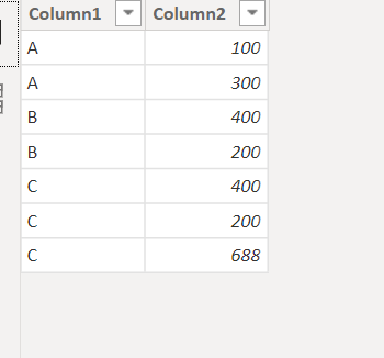
Example data:

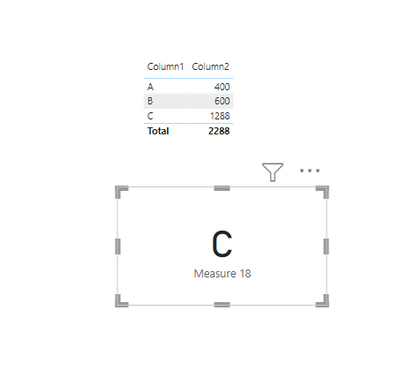
End result:

I hope this post helps to solve your issue and if it does consider accepting it as a solution and giving the post a thumbs up!
My LinkedIn: https://www.linkedin.com/in/n%C3%A4ttiahov-00001/
Did I answer your question? Mark my post as a solution!
Proud to be a Super User!
- Mark as New
- Bookmark
- Subscribe
- Mute
- Subscribe to RSS Feed
- Permalink
- Report Inappropriate Content
Hi,
Try utilizing MAXX:
e.g.
You can replace sum with count.
Example data:

End result:

I hope this post helps to solve your issue and if it does consider accepting it as a solution and giving the post a thumbs up!
My LinkedIn: https://www.linkedin.com/in/n%C3%A4ttiahov-00001/
Did I answer your question? Mark my post as a solution!
Proud to be a Super User!
- Mark as New
- Bookmark
- Subscribe
- Mute
- Subscribe to RSS Feed
- Permalink
- Report Inappropriate Content
Dear @ValtteriN
The solution you provided works well, Thank you SO MUCH for your prompt response 😃
I chose to author the measure a bit different, with an ADDCOLUMNS statement surrounding the measure. (Marco Russo and Alberto Ferrari say this is a best practice in some cases. Please refer to this video https://www.sqlbi.com/articles/best-practices-using-summarize-and-addcolumns/).
Thank you so much once again! Going accept this as a solution and connect with you on Linkedin.
Regards!
Helpful resources
| User | Count |
|---|---|
| 16 | |
| 8 | |
| 7 | |
| 6 | |
| 6 |
| User | Count |
|---|---|
| 26 | |
| 13 | |
| 12 | |
| 8 | |
| 8 |


