Become a Certified Power BI Data Analyst!
Join us for an expert-led overview of the tools and concepts you'll need to pass exam PL-300. The first session starts on June 11th. See you there!
Get registered- Power BI forums
- Get Help with Power BI
- Desktop
- Service
- Report Server
- Power Query
- Mobile Apps
- Developer
- DAX Commands and Tips
- Custom Visuals Development Discussion
- Health and Life Sciences
- Power BI Spanish forums
- Translated Spanish Desktop
- Training and Consulting
- Instructor Led Training
- Dashboard in a Day for Women, by Women
- Galleries
- Webinars and Video Gallery
- Data Stories Gallery
- Themes Gallery
- Contests Gallery
- Quick Measures Gallery
- Notebook Gallery
- Translytical Task Flow Gallery
- R Script Showcase
- Ideas
- Custom Visuals Ideas (read-only)
- Issues
- Issues
- Events
- Upcoming Events
Power BI is turning 10! Let’s celebrate together with dataviz contests, interactive sessions, and giveaways. Register now.
- Subscribe to RSS Feed
- Mark Topic as New
- Mark Topic as Read
- Float this Topic for Current User
- Bookmark
- Subscribe
- Printer Friendly Page
- Mark as New
- Bookmark
- Subscribe
- Mute
- Subscribe to RSS Feed
- Permalink
- Report Inappropriate Content
DAX COMMAND
I have data in excel as shown below.
C1_1 C1_2 C1_3 C1_4 C1_5
| Affordable | Affordable | Do not know | Do not know | Affordable |
| Affordable | Affordable | Do not know | Do not know | Do not know |
| Affordable | Affordable | Do not know | Affordable | Affordable |
| Affordable | Affordable | Do not know | Do not know | Affordable |
| Not affordable | Not affordable | Do not know | Do not know | Not affordable |
| Affordable | Do not know | Affordable | Affordable | Affordable |
| Affordable | Do not know | Do not know | Do not know | Affordable |
| Affordable | Do not know | Not affordable | Do not know | Do not know |
| Affordable | Affordable | Do not know | Do not know | Do not know |
| Affordable | Do not know | Do not know | Do not know | Do not know |
| Affordable | Affordable | Do not know | Do not know | Do not know |
| Affordable | Affordable | Do not know | Do not know | Do not know |
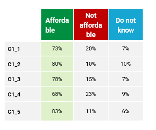
And I want to get visualization in Power BI as shown below. I do not know which measures I have to use to get this kind of table in Power BI. If anyone knows please help. Thanks in advance!
Solved! Go to Solution.
- Mark as New
- Bookmark
- Subscribe
- Mute
- Subscribe to RSS Feed
- Permalink
- Report Inappropriate Content
Once you load your data, click "transform data" to bring up your power query window.
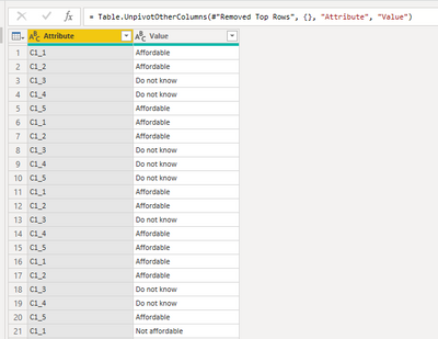
Once that window opens, select all of your columns and then under the transform tab, click unpivot columns
This should give you a table with 2 columns - Attribute and Value (see screenshot using your example data)
Close and apply these changes.
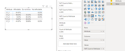
Add a matrix visualization to your canvas, add the Attribute field to Rows and Value to columns
Then add your Attribute field to the values. (It should change to "First Attribute" because it is a text field) click the arrow next to it and select "Count" instead of "First".
Then select the same arrow and under "Show value as" select "Percent of row total" for your use case. Then remove the totals from the matrix and you should have what you need!
- Mark as New
- Bookmark
- Subscribe
- Mute
- Subscribe to RSS Feed
- Permalink
- Report Inappropriate Content
Thank you Syk, you explained everything in detail and your advice helped me too much!
- Mark as New
- Bookmark
- Subscribe
- Mute
- Subscribe to RSS Feed
- Permalink
- Report Inappropriate Content
Great to hear! Consider marking that reply as the solution so others can easily find it if they have a similar issue!
Helpful resources

Join our Fabric User Panel
This is your chance to engage directly with the engineering team behind Fabric and Power BI. Share your experiences and shape the future.

Power BI Monthly Update - June 2025
Check out the June 2025 Power BI update to learn about new features.

| User | Count |
|---|---|
| 16 | |
| 13 | |
| 12 | |
| 11 | |
| 11 |
| User | Count |
|---|---|
| 19 | |
| 14 | |
| 14 | |
| 11 | |
| 9 |


