FabCon is coming to Atlanta
Join us at FabCon Atlanta from March 16 - 20, 2026, for the ultimate Fabric, Power BI, AI and SQL community-led event. Save $200 with code FABCOMM.
Register now!- Power BI forums
- Get Help with Power BI
- Desktop
- Service
- Report Server
- Power Query
- Mobile Apps
- Developer
- DAX Commands and Tips
- Custom Visuals Development Discussion
- Health and Life Sciences
- Power BI Spanish forums
- Translated Spanish Desktop
- Training and Consulting
- Instructor Led Training
- Dashboard in a Day for Women, by Women
- Galleries
- Data Stories Gallery
- Themes Gallery
- Contests Gallery
- QuickViz Gallery
- Quick Measures Gallery
- Visual Calculations Gallery
- Notebook Gallery
- Translytical Task Flow Gallery
- TMDL Gallery
- R Script Showcase
- Webinars and Video Gallery
- Ideas
- Custom Visuals Ideas (read-only)
- Issues
- Issues
- Events
- Upcoming Events
The Power BI Data Visualization World Championships is back! Get ahead of the game and start preparing now! Learn more
- Power BI forums
- Forums
- Get Help with Power BI
- DAX Commands and Tips
- Count Rows with Multiple Conditions
- Subscribe to RSS Feed
- Mark Topic as New
- Mark Topic as Read
- Float this Topic for Current User
- Bookmark
- Subscribe
- Printer Friendly Page
- Mark as New
- Bookmark
- Subscribe
- Mute
- Subscribe to RSS Feed
- Permalink
- Report Inappropriate Content
Count Rows with Multiple Conditions
Hello,
I have created a matrix that shows territory. sales person , opps stage, and countrow opps. On the sales person, I have checked off show items with no data, so I can see sales persons with no opps. I tried to copy the matrix and change to a pie chart, but the Blanks (no data) drops off the visual.
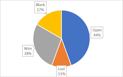
How can I create a pie chart showing the same data? Below is a example set of data and the outcome I am looking to achieve in the pie chart.
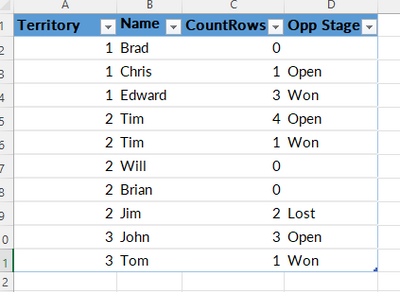
Territory Name CountRows Opp Stage
| 01 | Brad | 0 | |
| 01 | Chris | 1 | Open |
| 01 | Edward | 3 | Won |
| 02 | Tim | 4 | Open |
| 02 | Tim | 1 | Won |
| 02 | Will | 0 | |
| 02 | Brian | 0 | |
| 02 | Jim | 2 | Lost |
| 03 | John | 3 | Open |
| 03 | Tom | 1 | Won |
| Opp Stage | Count |
| Open | 8 |
| Lost | 2 |
| Won | 5 |
| Blank | 3 |
Thank you in advance for looking at my post.
Solved! Go to Solution.
- Mark as New
- Bookmark
- Subscribe
- Mute
- Subscribe to RSS Feed
- Permalink
- Report Inappropriate Content
Hi , @Alicia83B
Here are the steps you can follow:
(1)This is my test data which is the same as yours:
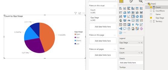
(2)We can create a measure :
Count = IF( SELECTEDVALUE(Sheet2[Opp Stage])=BLANK() , COUNTROWS('Sheet2') , SUM('Sheet2'[CountRows]))(3)Then we put the measure in the visual and the field we need and we can meet your need:
If this method does not meet your needs, you can provide us with your special sample data and the desired output sample data in the form of tables, so that we can better help you solve the problem.
Best Regards,
Aniya Zhang
If this post helps, then please consider Accept it as the solution to help the other members find it more quickly
- Mark as New
- Bookmark
- Subscribe
- Mute
- Subscribe to RSS Feed
- Permalink
- Report Inappropriate Content
@Alicia83B , You should use Opp Stage ad legend and count of Territory as value.
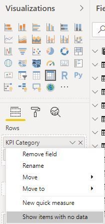
If needed use this option on the right click of Opp Stage in the visualization pane
- Mark as New
- Bookmark
- Subscribe
- Mute
- Subscribe to RSS Feed
- Permalink
- Report Inappropriate Content
@amitchandak This does work when I have the data in a matrix visual. However, if I switch to a pie chart visual, it does not work. That is what I am looking to do. Thx.
Helpful resources

Power BI Dataviz World Championships
The Power BI Data Visualization World Championships is back! Get ahead of the game and start preparing now!

| User | Count |
|---|---|
| 17 | |
| 8 | |
| 4 | |
| 4 | |
| 3 |
| User | Count |
|---|---|
| 26 | |
| 17 | |
| 14 | |
| 11 | |
| 10 |


