- Power BI forums
- Updates
- News & Announcements
- Get Help with Power BI
- Desktop
- Service
- Report Server
- Power Query
- Mobile Apps
- Developer
- DAX Commands and Tips
- Custom Visuals Development Discussion
- Health and Life Sciences
- Power BI Spanish forums
- Translated Spanish Desktop
- Power Platform Integration - Better Together!
- Power Platform Integrations (Read-only)
- Power Platform and Dynamics 365 Integrations (Read-only)
- Training and Consulting
- Instructor Led Training
- Dashboard in a Day for Women, by Women
- Galleries
- Community Connections & How-To Videos
- COVID-19 Data Stories Gallery
- Themes Gallery
- Data Stories Gallery
- R Script Showcase
- Webinars and Video Gallery
- Quick Measures Gallery
- 2021 MSBizAppsSummit Gallery
- 2020 MSBizAppsSummit Gallery
- 2019 MSBizAppsSummit Gallery
- Events
- Ideas
- Custom Visuals Ideas
- Issues
- Issues
- Events
- Upcoming Events
- Community Blog
- Power BI Community Blog
- Custom Visuals Community Blog
- Community Support
- Community Accounts & Registration
- Using the Community
- Community Feedback
Earn a 50% discount on the DP-600 certification exam by completing the Fabric 30 Days to Learn It challenge.
- Power BI forums
- Forums
- Get Help with Power BI
- DAX Commands and Tips
- Re: Conditional formatting on the X-axis
- Subscribe to RSS Feed
- Mark Topic as New
- Mark Topic as Read
- Float this Topic for Current User
- Bookmark
- Subscribe
- Printer Friendly Page
- Mark as New
- Bookmark
- Subscribe
- Mute
- Subscribe to RSS Feed
- Permalink
- Report Inappropriate Content
Conditional formatting on the X-axis
Hi everyone,
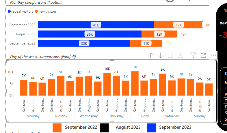
I am trying to do a report that will automatically update at the start of each month. Within this report there are some charts, like the one attached.
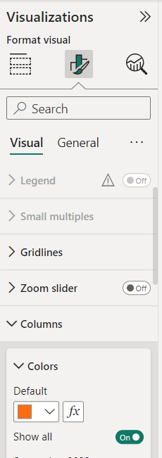
For the graph selected i want it to match the legend below using conditional formatting. This is because every month i want the colour to remain the same, whereby the earliest month in the data set is orange, the latest month in the data set is blue and the other month is black. I have been finding it difficult to write the correct DAX that will do this. Is it possible or is there perhaps a way to work around it. I am also attaching two more screenshots if they help?
Any help would be appreciated
Thank you,
Luke
Solved! Go to Solution.
- Mark as New
- Bookmark
- Subscribe
- Mute
- Subscribe to RSS Feed
- Permalink
- Report Inappropriate Content
hi @Lukep ,
Not sure if i fully get you. Supposing you have a data table like:
| date | amt |
| 12/1/2022 | 1 |
| 12/2/2022 | 1 |
| 1/1/2023 | 2 |
| 1/2/2023 | 2 |
| 2/1/2023 | 3 |
| 2/2/2023 | 3 |
| 3/1/2023 | 4 |
| 3/2/2023 | 4 |
| 4/1/2023 | 5 |
| 4/2/2023 | 5 |
| 5/1/2023 | 6 |
| 5/2/2023 | 6 |
Try to
1) create a calculated dates table like below and connect with data[date].
dates =
ADDCOLUMNS(
    CALENDAR(MIN(data[date]), MAX(data[date])),
    "YYMM", FORMAT([Date], "yy/mm")
)
2) create another calculated slicer table like below and keep it unrelated:
slicer = dates
3) plot a slicer with slicer[date] column;
4) plot a column chart with dates[yymm] and data[amt] column, and apply conditional formatting for the column color with a measure like:
Color =
VAR _minsliceddate = MIN(slicer[date])
VAR _maxsliceddate = MAX(slicer[date])
VAR _minslicedmonth = YEAR(_minsliceddate)*12+MONTH(_minsliceddate)
VAR _maxslicedmonth = YEAR(_maxsliceddate)*12+MONTH(_maxsliceddate)
VAR _currentdate = MAX(dates[date])
VAR _currentmonth = YEAR(_currentdate)*12+MONTH(_currentdate)
VAR _result =
SWITCH(
    TRUE(),
    _currentmonth =_minslicedmonth, "Orange",
    _currentmonth=_maxslicedmonth, "Blue",
   _currentmonth=_maxslicedmonth-1, "Black",
    "Gray"
)
RETURN _result
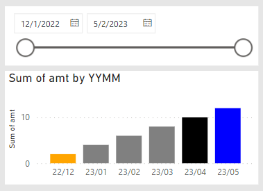
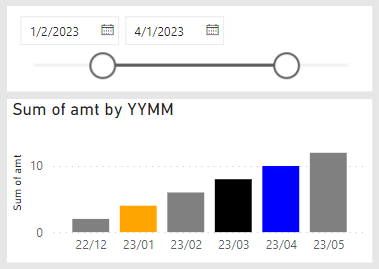
it worked like:
- Mark as New
- Bookmark
- Subscribe
- Mute
- Subscribe to RSS Feed
- Permalink
- Report Inappropriate Content
- Mark as New
- Bookmark
- Subscribe
- Mute
- Subscribe to RSS Feed
- Permalink
- Report Inappropriate Content
hello @Lukep ,
you could try to create a measure that forms the conditional formatting for you
measure = if( AND([month] = 9, [year] = 2022), "orange", if(AND([month] = 9, [year] = 2023),"blue","black"))
then add this measure in the fx color setting in your bar as a field value option and you will get the colors for each legend
- Mark as New
- Bookmark
- Subscribe
- Mute
- Subscribe to RSS Feed
- Permalink
- Report Inappropriate Content
Hi @eliasayyy ,
I need a measure that will still work without me having to go in and change anything when the data automatically updates at the start of each month. for example the most recent months report is October (10)


