Join us at FabCon Vienna from September 15-18, 2025
The ultimate Fabric, Power BI, SQL, and AI community-led learning event. Save €200 with code FABCOMM.
Get registered- Power BI forums
- Get Help with Power BI
- Desktop
- Service
- Report Server
- Power Query
- Mobile Apps
- Developer
- DAX Commands and Tips
- Custom Visuals Development Discussion
- Health and Life Sciences
- Power BI Spanish forums
- Translated Spanish Desktop
- Training and Consulting
- Instructor Led Training
- Dashboard in a Day for Women, by Women
- Galleries
- Data Stories Gallery
- Themes Gallery
- Contests Gallery
- Quick Measures Gallery
- Notebook Gallery
- Translytical Task Flow Gallery
- TMDL Gallery
- R Script Showcase
- Webinars and Video Gallery
- Ideas
- Custom Visuals Ideas (read-only)
- Issues
- Issues
- Events
- Upcoming Events
Compete to become Power BI Data Viz World Champion! First round ends August 18th. Get started.
- Power BI forums
- Forums
- Get Help with Power BI
- DAX Commands and Tips
- Conditional Format: Majority of the Average
- Subscribe to RSS Feed
- Mark Topic as New
- Mark Topic as Read
- Float this Topic for Current User
- Bookmark
- Subscribe
- Printer Friendly Page
- Mark as New
- Bookmark
- Subscribe
- Mute
- Subscribe to RSS Feed
- Permalink
- Report Inappropriate Content
Conditional Format: Majority of the Average
I have a matrix table, showing a variety of projects. Across the top is months. You can filter down through the projects to sub projects. Each project has a impact rating, red, amber, green (3,2,1). I want to show by month how heavy the impact is but I don't want to roll up the total/sum of the numbers. I want to see the colour by the majority average of the impact ratings. Is this possible?
The idea is to use a DAX formula and apply it to the impact ratings, so that if I have a project with 6x 1 ratings and 35x 3 ratings, the cell in the matrix will show red.
- Mark as New
- Bookmark
- Subscribe
- Mute
- Subscribe to RSS Feed
- Permalink
- Report Inappropriate Content
- Mark as New
- Bookmark
- Subscribe
- Mute
- Subscribe to RSS Feed
- Permalink
- Report Inappropriate Content
Thanks for the response.
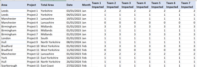
So the area (on the left) and their project impact the team on the right.
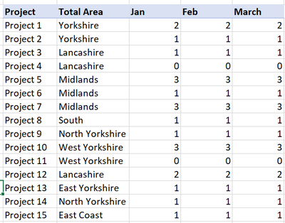
I want to summarise by month and total area but the number needs to be MODE. I want the most frequent team impact number as the number across.
Dummy data included.
So the summary would look something like this;
And then I can apply conditional formatting to form a heat map of impacted teams.
Letting PBi summarise the total data, leaves you with a SUM or Count of the impact numbers and I don't want that.
Hope this makes sense.
Helpful resources
| User | Count |
|---|---|
| 28 | |
| 12 | |
| 8 | |
| 7 | |
| 5 |
| User | Count |
|---|---|
| 35 | |
| 14 | |
| 12 | |
| 9 | |
| 7 |


