New Offer! Become a Certified Fabric Data Engineer
Check your eligibility for this 50% exam voucher offer and join us for free live learning sessions to get prepared for Exam DP-700.
Get Started- Power BI forums
- Get Help with Power BI
- Desktop
- Service
- Report Server
- Power Query
- Mobile Apps
- Developer
- DAX Commands and Tips
- Custom Visuals Development Discussion
- Health and Life Sciences
- Power BI Spanish forums
- Translated Spanish Desktop
- Training and Consulting
- Instructor Led Training
- Dashboard in a Day for Women, by Women
- Galleries
- Community Connections & How-To Videos
- COVID-19 Data Stories Gallery
- Themes Gallery
- Data Stories Gallery
- R Script Showcase
- Webinars and Video Gallery
- Quick Measures Gallery
- 2021 MSBizAppsSummit Gallery
- 2020 MSBizAppsSummit Gallery
- 2019 MSBizAppsSummit Gallery
- Events
- Ideas
- Custom Visuals Ideas
- Issues
- Issues
- Events
- Upcoming Events
Don't miss out! 2025 Microsoft Fabric Community Conference, March 31 - April 2, Las Vegas, Nevada. Use code MSCUST for a $150 discount. Prices go up February 11th. Register now.
- Power BI forums
- Forums
- Get Help with Power BI
- DAX Commands and Tips
- Compare same measure in a chart with two sets of s...
- Subscribe to RSS Feed
- Mark Topic as New
- Mark Topic as Read
- Float this Topic for Current User
- Bookmark
- Subscribe
- Printer Friendly Page
- Mark as New
- Bookmark
- Subscribe
- Mute
- Subscribe to RSS Feed
- Permalink
- Report Inappropriate Content
Compare same measure in a chart with two sets of slicers (same slicers)
Hi all!
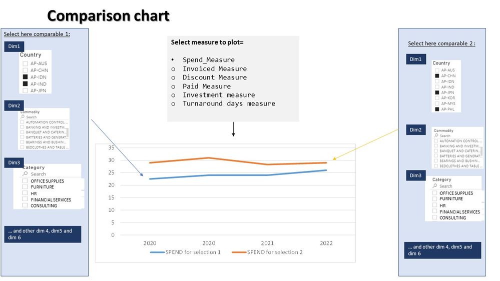
I'm struggling with the following. I attached an image for better understanding
I need to create a chart that plots a different measure based on selection. I know how to do that. The problem comes into play when I want to chart this measure comparing two same sets of slicers (I have 6 dimensions i need to use per each comparable).
I have come to two possible solutions but they are not as clean as desired. One is overlapping two charts showng the same measure but adapting interactions between slicers and charts. The sencond one would be duplicating all dimensions tables/columns and duplicating all measures to use the ALLSELECTED function to adapt each measure to each set dimensions, but that would be messy.
Any idea on how to make it?
Thanks!
- Mark as New
- Bookmark
- Subscribe
- Mute
- Subscribe to RSS Feed
- Permalink
- Report Inappropriate Content
Thanks for the reply @amitchandak .
Nevertheless My data is huge and duplicating tables or dimensions is not possible from a data model and data size point of view.
Thanks anyway!
- Mark as New
- Bookmark
- Subscribe
- Mute
- Subscribe to RSS Feed
- Permalink
- Report Inappropriate Content
@XTF , My two video can help
Compare two Brands: https://youtu.be/exN4nTewgbc
How to use two Date/Period slicers
Helpful resources

Join us at the Microsoft Fabric Community Conference
March 31 - April 2, 2025, in Las Vegas, Nevada. Use code MSCUST for a $150 discount! Prices go up Feb. 11th.

Join our Community Sticker Challenge 2025
If you love stickers, then you will definitely want to check out our Community Sticker Challenge!

Power BI Monthly Update - January 2025
Check out the January 2025 Power BI update to learn about new features in Reporting, Modeling, and Data Connectivity.

| User | Count |
|---|---|
| 21 | |
| 15 | |
| 15 | |
| 11 | |
| 7 |
| User | Count |
|---|---|
| 25 | |
| 24 | |
| 12 | |
| 12 | |
| 11 |

