FabCon is coming to Atlanta
Join us at FabCon Atlanta from March 16 - 20, 2026, for the ultimate Fabric, Power BI, AI and SQL community-led event. Save $200 with code FABCOMM.
Register now!- Power BI forums
- Get Help with Power BI
- Desktop
- Service
- Report Server
- Power Query
- Mobile Apps
- Developer
- DAX Commands and Tips
- Custom Visuals Development Discussion
- Health and Life Sciences
- Power BI Spanish forums
- Translated Spanish Desktop
- Training and Consulting
- Instructor Led Training
- Dashboard in a Day for Women, by Women
- Galleries
- Data Stories Gallery
- Themes Gallery
- Contests Gallery
- QuickViz Gallery
- Quick Measures Gallery
- Visual Calculations Gallery
- Notebook Gallery
- Translytical Task Flow Gallery
- TMDL Gallery
- R Script Showcase
- Webinars and Video Gallery
- Ideas
- Custom Visuals Ideas (read-only)
- Issues
- Issues
- Events
- Upcoming Events
The Power BI Data Visualization World Championships is back! Get ahead of the game and start preparing now! Learn more
- Power BI forums
- Forums
- Get Help with Power BI
- DAX Commands and Tips
- Classify values into 3 groups
- Subscribe to RSS Feed
- Mark Topic as New
- Mark Topic as Read
- Float this Topic for Current User
- Bookmark
- Subscribe
- Printer Friendly Page
- Mark as New
- Bookmark
- Subscribe
- Mute
- Subscribe to RSS Feed
- Permalink
- Report Inappropriate Content
Classify values into 3 groups
Hi experts!
I have a table that contains different values for each article for each week:
| Date | Amount | Price | Article | Value 1 | Value 2 | Value 3 |
| 01.01.2024 | 500 | 4 | A | 1 | 2 | 3 |
| 01.02.2024 | 600 | 5 | B | 2 | 1 | 2 |
Now I would like to transpose these values into a matrix on the rows and then make them visible for each individual classification. These classifications are like:
- Class 1: Value 1 below 2
- Class 2: Value 2 below 2
- Class 3: Value 3 and Value 1 above 0
In the end I would like to display this in the following way:
| Article | Date | Measure | Class 1 | Class 2 | Class 3 |
| A | 01.01.2024 | Amount | 500 | 500 | |
| A | 01.01.2024 | Price | 4 | 4 | |
| B | 01.02.2024 | Amount | 600 | 600 | |
| B | 01.02.2024 | Price | 5 | 5 |
As you can see, the values for each measure get's displayed when the classification is true or false.
How would you do this?
Solved! Go to Solution.
- Mark as New
- Bookmark
- Subscribe
- Mute
- Subscribe to RSS Feed
- Permalink
- Report Inappropriate Content
Hi @joshua1990 ,
Here are the steps you can follow:
1. In power query – select [Amount] and []Price] – Transform – Unpivot Columns.
2. In power query – select [Value1], [Value2], [Value3]– Transform – Unpivot Columns.
3. Create measure.
Measure =
SWITCH(
    TRUE(),
    OR(
    MAX('Table'[Article])="B"&&
    MAX('Table'[Attribute.1])="Value 1"&&MAX('Table'[Attribute])="Amount",
     MAX('Table'[Article])="B"&&
    MAX('Table'[Attribute.1])="Value 1"&&MAX('Table'[Attribute])="Price"),
    BLANK(),
    OR(
    MAX('Table'[Article])="A"&&
    MAX('Table'[Attribute.1])="Value 2"&&MAX('Table'[Attribute])="Amount",
     MAX('Table'[Article])="A"&&
    MAX('Table'[Attribute.1])="Value 2"&&MAX('Table'[Attribute])="Price"),
    BLANK(),
    MAX('Table'[Value]))
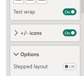
4. Matrix Visual – Fromat – Row headers – Options – stepped layout – set off.
5. Result:
Best Regards,
Liu Yang
If this post helps, then please consider Accept it as the solution to help the other members find it more quickly
Helpful resources

Power BI Monthly Update - November 2025
Check out the November 2025 Power BI update to learn about new features.

Fabric Data Days
Advance your Data & AI career with 50 days of live learning, contests, hands-on challenges, study groups & certifications and more!

| User | Count |
|---|---|
| 21 | |
| 10 | |
| 9 | |
| 4 | |
| 4 |
| User | Count |
|---|---|
| 34 | |
| 31 | |
| 20 | |
| 13 | |
| 11 |


