Join us at FabCon Vienna from September 15-18, 2025
The ultimate Fabric, Power BI, SQL, and AI community-led learning event. Save €200 with code FABCOMM.
Get registeredGo To
- Power BI forums
- Get Help with Power BI
- Desktop
- Service
- Report Server
- Power Query
- Mobile Apps
- Developer
- DAX Commands and Tips
- Custom Visuals Development Discussion
- Health and Life Sciences
- Power BI Spanish forums
- Translated Spanish Desktop
- Training and Consulting
- Instructor Led Training
- Dashboard in a Day for Women, by Women
- Galleries
- Data Stories Gallery
- Themes Gallery
- Contests Gallery
- Quick Measures Gallery
- Notebook Gallery
- Translytical Task Flow Gallery
- TMDL Gallery
- R Script Showcase
- Webinars and Video Gallery
- Ideas
- Custom Visuals Ideas (read-only)
- Issues
- Issues
- Events
- Upcoming Events
Turn on suggestions
Auto-suggest helps you quickly narrow down your search results by suggesting possible matches as you type.
Showing results for
Enhance your career with this limited time 50% discount on Fabric and Power BI exams. Ends September 15. Request your voucher.
- Power BI forums
- Forums
- Get Help with Power BI
- DAX Commands and Tips
- Calculate last nonblank values and show them on Ti...
Reply
Topic Options
- Subscribe to RSS Feed
- Mark Topic as New
- Mark Topic as Read
- Float this Topic for Current User
- Bookmark
- Subscribe
- Printer Friendly Page
- Mark as New
- Bookmark
- Subscribe
- Mute
- Subscribe to RSS Feed
- Permalink
- Report Inappropriate Content
Calculate last nonblank values and show them on Time chart like cumulative total
06-07-2023
02:23 PM
I hope I can explain as clearly as possible.I have a table with status changes of cars.
The machine can have 3 statuses: 0 (done), 1 (in work) or 2 (new)
Status change writes per datetime
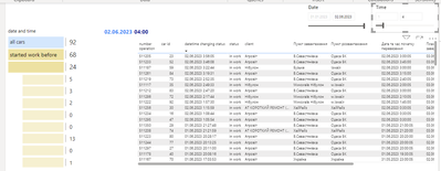
So, I create measure how much cars have status 1 (and required categories) on and before selected date and time
For example i choose 02.06.2023 and time 4.00 am
so from table i get 68 cars started work before and on this time
my measures
Start work before chart =
var count_d = calculate(DISTINCTCOUNTNOBLANK('Change Log Entry (status)'[lookup_car]), filter(ALL('Change Log Entry (status)'), 'Change Log Entry (status)'[date hour] <= max('Change Log Entry (status)'[date hour]) && 'Change Log Entry (status)'[Date and Time local]=[last date] && 'Change Log Entry (status)'[New Value] = "1"
&& [Розподіл авто]<>"тривалий ремонт (більше 2 діб)" &&
[Розподіл авто]<>"капітальний ремонт (більше місяца)" &&
[Розподіл авто]<>"заправка (до 1 доби)" &&
[Розподіл авто]<>"перезмінка (до 1 доби)" &&
[Розподіл авто]<>"паркінг (більше 1 доби)" &&
[Розподіл авто]<>"короткий ремонт (1-2 доби)"))
return
count_d
last date =
VAR _result =
CALCULATE (
max( 'Change Log Entry (status)'[Date and Time local]),
REMOVEFILTERS ( 'Change Log Entry (status)' ),
VALUES ( 'Change Log Entry (status)'[lookup_car] ),
filter(ALLSELECTED ( 'Change Log Entry (status)'), 'Change Log Entry (status)'[Date local]< MAX ( 'selected_date'[Date])
|| ('Change Log Entry (status)'[Date local]= MAX ('selected_date'[Date]) && [new Time]<= max('Hours'[new Time]))))
RETURN
_result
'selected_date'[Date] and 'Hours'[new Time] haven't relationships with my table (just simple date and time tables)
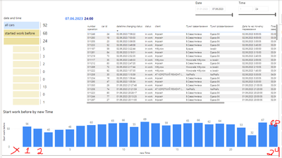
But now i need to show on chart how much cars started work on start day (from 1am because i show cars before to hour) and to end of day
it should be measure per selected date from slicer (not depend from time slicer) and chart should look like that
And today it should be values only to the active hour
but for another day from slicer, it should be all day on chart
I've been thinking about this for 2 weeks now and every time my measure is incorrectly displayed on the graph
1 REPLY 1
- Mark as New
- Bookmark
- Subscribe
- Mute
- Subscribe to RSS Feed
- Permalink
- Report Inappropriate Content
06-10-2023
12:37 PM
Does your calendar table have the required hour level granularity?
Please provide sample data that fully covers your issue.
Please show the expected outcome based on the sample data you provided.
Helpful resources
Top Solution Authors
| User | Count |
|---|---|
| 15 | |
| 12 | |
| 8 | |
| 7 | |
| 7 |
Top Kudoed Authors
| User | Count |
|---|---|
| 24 | |
| 20 | |
| 12 | |
| 10 | |
| 7 |


