FabCon is coming to Atlanta
Join us at FabCon Atlanta from March 16 - 20, 2026, for the ultimate Fabric, Power BI, AI and SQL community-led event. Save $200 with code FABCOMM.
Register now!- Power BI forums
- Get Help with Power BI
- Desktop
- Service
- Report Server
- Power Query
- Mobile Apps
- Developer
- DAX Commands and Tips
- Custom Visuals Development Discussion
- Health and Life Sciences
- Power BI Spanish forums
- Translated Spanish Desktop
- Training and Consulting
- Instructor Led Training
- Dashboard in a Day for Women, by Women
- Galleries
- Data Stories Gallery
- Themes Gallery
- Contests Gallery
- QuickViz Gallery
- Quick Measures Gallery
- Visual Calculations Gallery
- Notebook Gallery
- Translytical Task Flow Gallery
- TMDL Gallery
- R Script Showcase
- Webinars and Video Gallery
- Ideas
- Custom Visuals Ideas (read-only)
- Issues
- Issues
- Events
- Upcoming Events
The Power BI Data Visualization World Championships is back! Get ahead of the game and start preparing now! Learn more
- Power BI forums
- Forums
- Get Help with Power BI
- DAX Commands and Tips
- Calculate average at different hierarchy levels in...
- Subscribe to RSS Feed
- Mark Topic as New
- Mark Topic as Read
- Float this Topic for Current User
- Bookmark
- Subscribe
- Printer Friendly Page
- Mark as New
- Bookmark
- Subscribe
- Mute
- Subscribe to RSS Feed
- Permalink
- Report Inappropriate Content
Calculate average at different hierarchy levels in Matrix
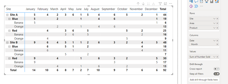
I am attempting to calculate the average itmes sold across different rows (hierarchy) of a matrix table to then compare to the actual number sold for each month and identify through conditional formating months where the number of items sold were above the average.
Example:
Calulate the average sold per month for 'Site A' (44/12 = 3.67) to then be able to identify the months where 'Site A' sales was above the average.
Then calculate the average sold per month for area 'Blue' (next level of the hierarchy) and identify the months where 'Blue' area items sold were above the average.
Thanks
Solved! Go to Solution.
- Mark as New
- Bookmark
- Subscribe
- Mute
- Subscribe to RSS Feed
- Permalink
- Report Inappropriate Content
@AJW2023 , Assuming you only want to change grand total
First, create a measure
M1= Sum(Table[Number sold])
Then create and use this measure
m2= Averagex(Values(Table[Month]), [M1])
- Mark as New
- Bookmark
- Subscribe
- Mute
- Subscribe to RSS Feed
- Permalink
- Report Inappropriate Content
@AJW2023 , Assuming you only want to change grand total
First, create a measure
M1= Sum(Table[Number sold])
Then create and use this measure
m2= Averagex(Values(Table[Month]), [M1])
- Mark as New
- Bookmark
- Subscribe
- Mute
- Subscribe to RSS Feed
- Permalink
- Report Inappropriate Content
Thats @amitchandak . That has calculated the averages for each of the rows as I was hoping.
Any ideas how to then compare each months total per cagegory and display if it is greater than the average using conditional formating?
For example for "Site A" the average is 3.67 therefore the months where the number sold were greater than the average = January, Feburary, May, July, August and September and highlight these values Red
Helpful resources

Power BI Monthly Update - November 2025
Check out the November 2025 Power BI update to learn about new features.

Fabric Data Days
Advance your Data & AI career with 50 days of live learning, contests, hands-on challenges, study groups & certifications and more!

| User | Count |
|---|---|
| 21 | |
| 10 | |
| 9 | |
| 4 | |
| 4 |
| User | Count |
|---|---|
| 34 | |
| 31 | |
| 20 | |
| 13 | |
| 12 |

