New Offer! Become a Certified Fabric Data Engineer
Check your eligibility for this 50% exam voucher offer and join us for free live learning sessions to get prepared for Exam DP-700.
Get Started- Power BI forums
- Get Help with Power BI
- Desktop
- Service
- Report Server
- Power Query
- Mobile Apps
- Developer
- DAX Commands and Tips
- Custom Visuals Development Discussion
- Health and Life Sciences
- Power BI Spanish forums
- Translated Spanish Desktop
- Training and Consulting
- Instructor Led Training
- Dashboard in a Day for Women, by Women
- Galleries
- Community Connections & How-To Videos
- COVID-19 Data Stories Gallery
- Themes Gallery
- Data Stories Gallery
- R Script Showcase
- Webinars and Video Gallery
- Quick Measures Gallery
- 2021 MSBizAppsSummit Gallery
- 2020 MSBizAppsSummit Gallery
- 2019 MSBizAppsSummit Gallery
- Events
- Ideas
- Custom Visuals Ideas
- Issues
- Issues
- Events
- Upcoming Events
Don't miss out! 2025 Microsoft Fabric Community Conference, March 31 - April 2, Las Vegas, Nevada. Use code MSCUST for a $150 discount. Prices go up February 11th. Register now.
- Power BI forums
- Forums
- Get Help with Power BI
- DAX Commands and Tips
- Re: Burndown Chart
- Subscribe to RSS Feed
- Mark Topic as New
- Mark Topic as Read
- Float this Topic for Current User
- Bookmark
- Subscribe
- Printer Friendly Page
- Mark as New
- Bookmark
- Subscribe
- Mute
- Subscribe to RSS Feed
- Permalink
- Report Inappropriate Content
Burndown Chart
Hi,
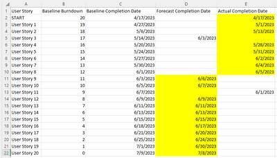
I am trying to create a burndown graph for a list of software activities (user stories), which have 3 date fields:
- Baseline Completion Date - Assigned to all activities when they are created and serves as initial baseline schedule.
- Forecast Completion Date - Live view on when an activity will complete.
- Actual Completion Date - Self explanatory.
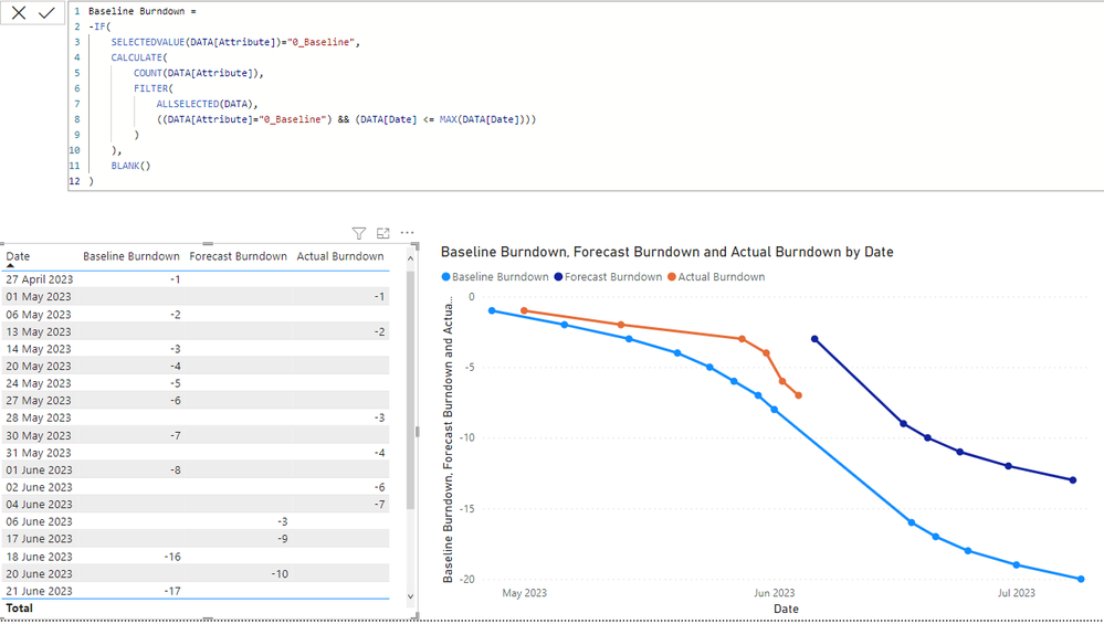
A simple example dataset is shown below along with required chart output.
In my dataset, I have the activity name then have ungrouped the 3 data fields differentiating through 'attribute' field.
I have attempted to create the burndown graph as follows but the counts are not as expected; some records are missing and the counts jump.- My burndown measures are same for baseline/forecast/actual except for referring to different attributes.
Please could someone advise how I can resolve this issue and best achieve the chart?
Solved! Go to Solution.
- Mark as New
- Bookmark
- Subscribe
- Mute
- Subscribe to RSS Feed
- Permalink
- Report Inappropriate Content
Hi, @Anonymous
If you do not want to show a spike , in my thought , we can compre this value before it and then we can create a measure based on the [Actual Value] measure:
Measure = var _cur_date = MAX('Calendar'[Date])
var _preDate = MAXX(FILTER( ALLSELECTED('Table')  , 'Table'[Date]< _cur_date && 'Table'[Attribute] = "Actual Completion Date") ,[Date])
var _prevalue = CALCULATE( SUM('Table'[Baseline Burndown]) , 'Table'[Attribute]="Actual Completion Date" , 'Calendar'[Date] = _preDate)
return
IF([Actual Value]=BLANK(), BLANK() ,IF(ABS( [Actual Value]-_prevalue)>2 ,BLANK() , [Actual Value]))
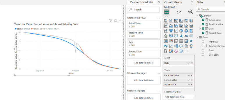
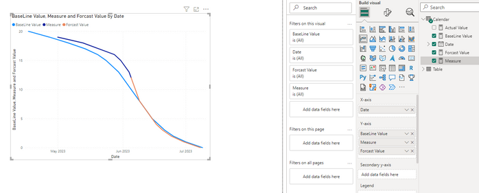
Then we can put this measure on the viusal and we can hide this spike in it :
Thank you for your time and sharing, and thank you for your support and understanding of PowerBI!
Best Regards,
Aniya Zhang
If this post helps, then please consider Accept it as the solution to help the other members find it more quickly
- Mark as New
- Bookmark
- Subscribe
- Mute
- Subscribe to RSS Feed
- Permalink
- Report Inappropriate Content
Hi , @Anonymous
According to your description, you want to create a burndown graph.
Thanks for your sample file , in my thought you want to show three measures in a line chart visual . And for your sample data , it seems you want to show the Forcast value after the max of the Actual Value .
This is my data apply to Desktop:
First we can create a calendar Date Table as dimension:

Then we can create three measures like this:

If this method does not meet your needs, you can provide us with your special sample data and the desired output sample data in the form of tables, so that we can better help you solve the problem. (You can also upload you sample .pbix [without sensitive data] to the OneDrive and share with the OneDrive link to me ! )
Thank you for your time and sharing, and thank you for your support and understanding of PowerBI!
Best Regards,
Aniya Zhang
If this post helps, then please consider Accept it as the solution to help the other members find it more quickly
- Mark as New
- Bookmark
- Subscribe
- Mute
- Subscribe to RSS Feed
- Permalink
- Report Inappropriate Content
Hi @v-yueyunzh-msft ,
Thank you, this is very close to what i require and inspiring me to look at different ways but there is an issue that I wish to overcome which is well illustrated in your example where there is a spike caused by early closure of a record (1st June). I would like the chart to burn down incrementally such that on this date only a burndown of -1 is achived. This drove me (unsuccessfully) to using COUNT and disregarding the 'Baseline Burndown' field. How can I achieve this?
Thanks
- Mark as New
- Bookmark
- Subscribe
- Mute
- Subscribe to RSS Feed
- Permalink
- Report Inappropriate Content
Hi, @Anonymous
If you do not want to show a spike , in my thought , we can compre this value before it and then we can create a measure based on the [Actual Value] measure:
Measure = var _cur_date = MAX('Calendar'[Date])
var _preDate = MAXX(FILTER( ALLSELECTED('Table')  , 'Table'[Date]< _cur_date && 'Table'[Attribute] = "Actual Completion Date") ,[Date])
var _prevalue = CALCULATE( SUM('Table'[Baseline Burndown]) , 'Table'[Attribute]="Actual Completion Date" , 'Calendar'[Date] = _preDate)
return
IF([Actual Value]=BLANK(), BLANK() ,IF(ABS( [Actual Value]-_prevalue)>2 ,BLANK() , [Actual Value]))
Then we can put this measure on the viusal and we can hide this spike in it :
Thank you for your time and sharing, and thank you for your support and understanding of PowerBI!
Best Regards,
Aniya Zhang
If this post helps, then please consider Accept it as the solution to help the other members find it more quickly
- Mark as New
- Bookmark
- Subscribe
- Mute
- Subscribe to RSS Feed
- Permalink
- Report Inappropriate Content
Hi , @Anonymous
Thanks for your quick response! Sure , in 2023/6/1 the value is "9" but in 2023/6/2 the value is "14" so it will be a spike due to the data will not deceit us.
For that , i do not fully understand the " I would like the chart to burn down incrementally such that on this date only a burndown of -1 is achived. This drove me (unsuccessfully) to using COUNT and disregarding the 'Baseline Burndown' field".
In my thought , you do not want to create a spike in your chart , you want to the line will decrease slowly , just like each date will minus -1?
That is, for this test data, we will ignore the number that caused the peak and give it a suitable value again?
And I don't quite understand your intention to use the COUNT function, the test data you provided shows that you are drawing visuals according to the 'Baseline Burndown' field.
Thank you for your time and sharing, and thank you for your support and understanding of PowerBI!
Best Regards,
Aniya Zhang
If this post helps, then please consider Accept it as the solution to help the other members find it more quickly
Helpful resources

Join us at the Microsoft Fabric Community Conference
March 31 - April 2, 2025, in Las Vegas, Nevada. Use code MSCUST for a $150 discount! Prices go up Feb. 11th.

Power BI Monthly Update - January 2025
Check out the January 2025 Power BI update to learn about new features in Reporting, Modeling, and Data Connectivity.

| User | Count |
|---|---|
| 21 | |
| 15 | |
| 15 | |
| 11 | |
| 7 |
| User | Count |
|---|---|
| 25 | |
| 24 | |
| 12 | |
| 12 | |
| 11 |


