FabCon is coming to Atlanta
Join us at FabCon Atlanta from March 16 - 20, 2026, for the ultimate Fabric, Power BI, AI and SQL community-led event. Save $200 with code FABCOMM.
Register now!- Power BI forums
- Get Help with Power BI
- Desktop
- Service
- Report Server
- Power Query
- Mobile Apps
- Developer
- DAX Commands and Tips
- Custom Visuals Development Discussion
- Health and Life Sciences
- Power BI Spanish forums
- Translated Spanish Desktop
- Training and Consulting
- Instructor Led Training
- Dashboard in a Day for Women, by Women
- Galleries
- Data Stories Gallery
- Themes Gallery
- Contests Gallery
- QuickViz Gallery
- Quick Measures Gallery
- Visual Calculations Gallery
- Notebook Gallery
- Translytical Task Flow Gallery
- TMDL Gallery
- R Script Showcase
- Webinars and Video Gallery
- Ideas
- Custom Visuals Ideas (read-only)
- Issues
- Issues
- Events
- Upcoming Events
Get Fabric Certified for FREE during Fabric Data Days. Don't miss your chance! Request now
- Power BI forums
- Forums
- Get Help with Power BI
- DAX Commands and Tips
- Bar Chart Measure Needed to Count Total Dates Beyo...
- Subscribe to RSS Feed
- Mark Topic as New
- Mark Topic as Read
- Float this Topic for Current User
- Bookmark
- Subscribe
- Printer Friendly Page
- Mark as New
- Bookmark
- Subscribe
- Mute
- Subscribe to RSS Feed
- Permalink
- Report Inappropriate Content
Bar Chart Measure Needed to Count Total Dates Beyond a Set Date
Hi,
I'm having some difficulty getting some DAX to work in favour of a bar chart I have in my report.
Here is a watered down version of the table in my data model that the bar chart references:
| asset lease unit reference | Notice Period | Option Effective Date ID | New Option Effective Date |
aaa | 6 | 4 | 01/01/2020 |
aaa | 6 | 0 | |
| aaa | 6 | 1 | 01/07/2023 |
| bbb | 6 | 2 | |
| bbb | 6 | 3 | 01/10/2021 |
| ccc | 6 | 4 | 06/04/2022 |
| ddd | 6 | 1 | 22/03/2023 |
| eee | 6 | 2 | |
| fff | 6 | 3 | 10/12/2022 |
In my report I have a date slicer (the "from" date is hidden but the "to" date is selectable). This enables the user to pick a date. The measure [as of date] is assigned to this.
That date is then used as the start date from which the bar chart begins displaying dates on its x-axis.
I want the y-axis to be a count of each date and the chart to have a drill down ability so that you can drill down from years to quarters, to months and then days and the count will be summed or split accordingly.
When qualifying a date should be counted, there are some rules that need to be applied. Sometimes there is no date in "New Option Effective Date". If this is the case, if the "Option Effective Date ID" is 0 then nothing should be counted. However, if the "Option Effective Date ID" is 2 then the [as of date] should be used advancing it in months using the number in the "Notice Period" column.
I have a fully functioning DateTable in my data model. I am not sure whether to link to it.
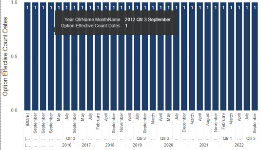
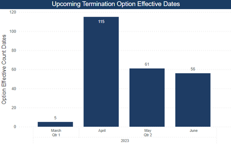
Unfortunately the chart that I am currently getting looks like the below - dates seem to be identified but the count is not accumulating for each month or whatever level is drilled down to. And dates showing FROM the as of date is not working as it goes back to 2016:
My DateTable is placed in the x-axis.
My DAX measure for the Y-axis is:
Option Effective Count Dates =
VAR asofdate = [As Of Date]
VAR BaseDate =
    IF(
        ISBLANK(MAX(Option_DST[New Option Effective Date])) && MAX(Option_DST[Option Effective Date ID]) = 2,
        EDATE(asofdate, MAX(Option_DST[Notice Period])),
        MAX(Option_DST[New Option Effective Date])
    )
RETURN

IF(
    NOT ISBLANK(BaseDate) && BaseDate >= asofdate,
    1,
    BLANK()
)
Where am I going wrong? Do I need a SUMX on the IF statement at the end?
- Mark as New
- Bookmark
- Subscribe
- Mute
- Subscribe to RSS Feed
- Permalink
- Report Inappropriate Content
I hope this message finds you well. I've noticed that this solution remain unresolved. If any of you have managed to find a resolution to the issue, I kindly request that you share your solution for the benefit of the entire community. Alternatively, if you're still facing challenges, please do let us know as well.
Your insights and updates will greatly assist others who might be encountering the same challenge.
____________
⭐️ Fabric Group Channel
⭐️ Microsoft Fabric Community
Please join the Power BI UX/UI User Group if you need help with dashboard design and usability
Join to Data Governance User Group
Join to DENEB and Power BI Enthusiasts User Group
Join to Data Fabric Best Practices User Group
Subscribe to my medium blog
- Mark as New
- Bookmark
- Subscribe
- Mute
- Subscribe to RSS Feed
- Permalink
- Report Inappropriate Content
@julesdude , you need to have a virtual table containing these 1s and 0s, and then count them (SUMX).
If this post helps, then please consider Accept it as the solution to help the other members find it more quickly. Appreciate your Kudos.
Check out my latest demo report in the data story gallery.
Stand with Ukraine!
Here are official ways you can support Ukraine financially (accounts with multiple currencies):
1) Support the Armed Forces of Ukraine: https://bank.gov.ua/ua/about/support-the-armed-forces
2) Come Back Alive foundation: https://www.comebackalive.in.ua/
Thank you!
- Mark as New
- Bookmark
- Subscribe
- Mute
- Subscribe to RSS Feed
- Permalink
- Report Inappropriate Content
Hi @ERD
Thanks. How would I be able to achieve this? Would I need to use SUMMARIZE?
Any example would help greatly.
- Mark as New
- Bookmark
- Subscribe
- Mute
- Subscribe to RSS Feed
- Permalink
- Report Inappropriate Content
@julesdude , I'm not sure how to achieve this without a second date table for the slicer here. But you can try this:
Measure =
VAR dt = MAX( 'Date_2'[Date] )
VAR t =
    ADDCOLUMNS (
        ADDCOLUMNS (
            'Table',
            "newdt",
                VAR noed = CALCULATE ( MAX ( 'Table'[New Option Effective Date   ] ) )
                VAR oedid = CALCULATE ( MAX ( 'Table'[Option Effective Date ID   ] ) )
                VAR np = CALCULATE ( MAX ( 'Table'[Notice Period   ] ) )
                VAR basedate = IF ( ISBLANK ( noed ) && oedid = 2, EDATE ( dt, np ), noed )
                RETURN
                    basedate
        ),
        "check", IF ( NOT ISBLANK ( [newdt] ) && [newdt] >= dt, 1, BLANK () ),
        "newdt_end", EOMONTH ( [newdt], 0 )
    )
VAR c_dt = MAX( 'Date'[Date] )
RETURN
    SUMX( FILTER ( t, IF ( ISINSCOPE('Date'[Date] ), [newdt] = c_dt, [newdt_end] = c_dt ) ), [check] )
If this post helps, then please consider Accept it as the solution to help the other members find it more quickly. Appreciate your Kudos.
Check out my latest demo report in the data story gallery.
Stand with Ukraine!
Here are official ways you can support Ukraine financially (accounts with multiple currencies):
1) Support the Armed Forces of Ukraine: https://bank.gov.ua/ua/about/support-the-armed-forces
2) Come Back Alive foundation: https://www.comebackalive.in.ua/
Thank you!
- Mark as New
- Bookmark
- Subscribe
- Mute
- Subscribe to RSS Feed
- Permalink
- Report Inappropriate Content
Hi @ERD
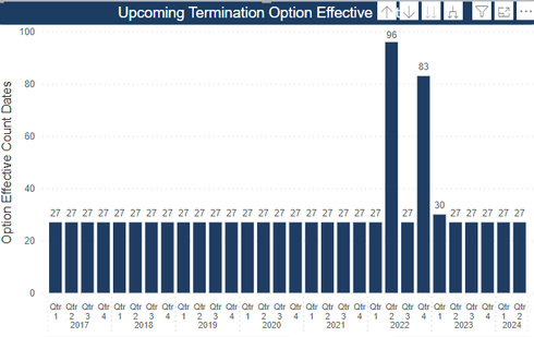
Thanks for the example. Think the approach will work, although I'm trying to apply it but getting odd results:
Looks like I'm getting too many counts at 27.
Just checking I'm getting this right. I duplicated my first date table in PQ to make a second one.
I dragged Date Table (2) hierarchy into the x-axis of the bar chart. Y-axis contains your measure above.
I have no relationship or cardinality between any of the date tables and the table with the data in it.
Also the x-axis is starting a lot earlier than the date I've selected in the date picker in the report. It begins in 2000.
- Mark as New
- Bookmark
- Subscribe
- Mute
- Subscribe to RSS Feed
- Permalink
- Report Inappropriate Content
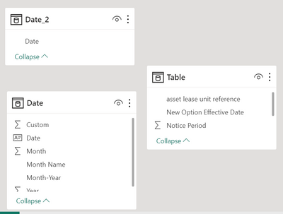
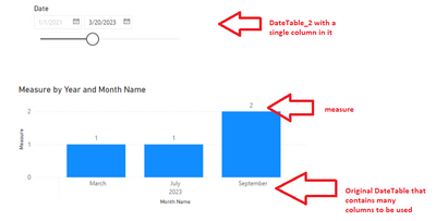
@julesdude , no, you only use Date_2 table for the slicer. It should only contain Date column. All other columns and hierarchies and whatever are staying in the original Date table. And they are not connected. So for the chart you use the original Date table.
If this post helps, then please consider Accept it as the solution to help the other members find it more quickly. Appreciate your Kudos.
Check out my latest demo report in the data story gallery.
Stand with Ukraine!
Here are official ways you can support Ukraine financially (accounts with multiple currencies):
1) Support the Armed Forces of Ukraine: https://bank.gov.ua/ua/about/support-the-armed-forces
2) Come Back Alive foundation: https://www.comebackalive.in.ua/
Thank you!
- Mark as New
- Bookmark
- Subscribe
- Mute
- Subscribe to RSS Feed
- Permalink
- Report Inappropriate Content
Thanks @ERD
Unfortunately, no joy. I am not getting this:
Chart is still showing the same
Steps I took to adapt:
My original date table "DateTable" is linked to another table in my data model. This other table supports another chart (table and chart unrelated to this visual).
I duplicated my existing date table by highlighting the Date column in PQ, right-clicking and selecting Add As New Query. Then this creates a new table with just that column as a list. I then selected it again and choose to Convert To Table - gave me a single column just with dates.
I placed DateTable_2 as the x-axis and assigned it to the date slicer (it was currently assigned to the original DateTable).
I placed your measure above in the Y-axis.
I ensured the column data type in the new date table was set to Date.
Maybe it's a relationship issue in the model. There is a relationship to another table, linked by Asset Lease Unit, and it is filtered by that table in a 1:* relationship. I don't think so though.
- Mark as New
- Bookmark
- Subscribe
- Mute
- Subscribe to RSS Feed
- Permalink
- Report Inappropriate Content
I placed DateTable_2 as the x-axis and assigned it to the date slicer (it was currently assigned to the original DateTable).
Again, DateTable_2 with a single date column is ONLY used in the slicer. You put the original DateTable to the x axis.
If this post helps, then please consider Accept it as the solution to help the other members find it more quickly. Appreciate your Kudos.
Check out my latest demo report in the data story gallery.
Stand with Ukraine!
Here are official ways you can support Ukraine financially (accounts with multiple currencies):
1) Support the Armed Forces of Ukraine: https://bank.gov.ua/ua/about/support-the-armed-forces
2) Come Back Alive foundation: https://www.comebackalive.in.ua/
Thank you!
- Mark as New
- Bookmark
- Subscribe
- Mute
- Subscribe to RSS Feed
- Permalink
- Report Inappropriate Content
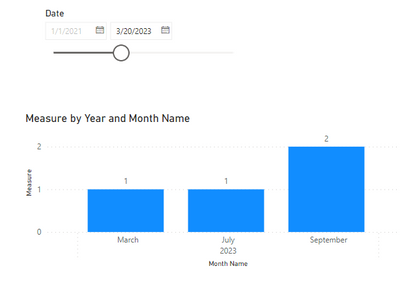
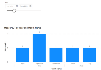
Thanks. It does appear better now. Only issue is that it's placing everything in one year - 2023:
- Mark as New
- Bookmark
- Subscribe
- Mute
- Subscribe to RSS Feed
- Permalink
- Report Inappropriate Content
But that depends on the date you choose...
If this post helps, then please consider Accept it as the solution to help the other members find it more quickly. Appreciate your Kudos.
Check out my latest demo report in the data story gallery.
Stand with Ukraine!
Here are official ways you can support Ukraine financially (accounts with multiple currencies):
1) Support the Armed Forces of Ukraine: https://bank.gov.ua/ua/about/support-the-armed-forces
2) Come Back Alive foundation: https://www.comebackalive.in.ua/
Thank you!
- Mark as New
- Bookmark
- Subscribe
- Mute
- Subscribe to RSS Feed
- Permalink
- Report Inappropriate Content
It does. But I've got dates in the "New Option Effective Date" column up to October 2031. They should be being counted and shown as their Option Effective Date ID is 4. Instead, if I select in the slicer a date, say, 13/07/2027, I just get a blank graph.
Helpful resources

Power BI Monthly Update - November 2025
Check out the November 2025 Power BI update to learn about new features.

Fabric Data Days
Advance your Data & AI career with 50 days of live learning, contests, hands-on challenges, study groups & certifications and more!

| User | Count |
|---|---|
| 11 | |
| 9 | |
| 9 | |
| 6 | |
| 5 |
| User | Count |
|---|---|
| 27 | |
| 22 | |
| 19 | |
| 17 | |
| 11 |
