FabCon is coming to Atlanta
Join us at FabCon Atlanta from March 16 - 20, 2026, for the ultimate Fabric, Power BI, AI and SQL community-led event. Save $200 with code FABCOMM.
Register now!- Power BI forums
- Get Help with Power BI
- Desktop
- Service
- Report Server
- Power Query
- Mobile Apps
- Developer
- DAX Commands and Tips
- Custom Visuals Development Discussion
- Health and Life Sciences
- Power BI Spanish forums
- Translated Spanish Desktop
- Training and Consulting
- Instructor Led Training
- Dashboard in a Day for Women, by Women
- Galleries
- Data Stories Gallery
- Themes Gallery
- Contests Gallery
- QuickViz Gallery
- Quick Measures Gallery
- Visual Calculations Gallery
- Notebook Gallery
- Translytical Task Flow Gallery
- TMDL Gallery
- R Script Showcase
- Webinars and Video Gallery
- Ideas
- Custom Visuals Ideas (read-only)
- Issues
- Issues
- Events
- Upcoming Events
The Power BI Data Visualization World Championships is back! Get ahead of the game and start preparing now! Learn more
- Power BI forums
- Forums
- Get Help with Power BI
- DAX Commands and Tips
- Average over entire column in DAX measure when fil...
- Subscribe to RSS Feed
- Mark Topic as New
- Mark Topic as Read
- Float this Topic for Current User
- Bookmark
- Subscribe
- Printer Friendly Page
- Mark as New
- Bookmark
- Subscribe
- Mute
- Subscribe to RSS Feed
- Permalink
- Report Inappropriate Content
Average over entire column in DAX measure when filtered
Hi,
I am using a "Line and clustered column chart" and would like to add an additional line to dsiplay the average value of one of the columns. I have written a DAX measure that pefectly calculates me the value that I want to see and I can use it on cards etc. However as soon as I put the measure on the chart, it is being calculated for each category on the x-axis again. Here is the structure of the measure that I use - it sums up values in a table (Table1) based on a filter in another table (Table2) and then divides by the number of selected entries in Table2.:
avg_activity =
VAR sumofactivity =
CALCULATE(
	SUM('Table1'[Activity]);
	'Table2'[Type] IN { "mytype" }
)
RETURN
VAR countofactivity =
CALCULATE(COUNTROWS(Table2);'Table2'[Type] IN { "mytype" })
RETURN
sumofactivity/countofactivity
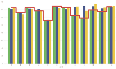
The month year hierachy on the x-axis is also from Table2, the values on the chart are from Table1. Now what I would like to get when putting this measure on a the chart wozuld be something like this:
but what I get looks like this:
I've also tried using caluclated columns but with no success. I know that the problem is me using the Calculate-Function wrong but would be very thankful for any hint on how to get the desired behaviour!
- Mark as New
- Bookmark
- Subscribe
- Mute
- Subscribe to RSS Feed
- Permalink
- Report Inappropriate Content
Perhaps:
avg_activity =
VAR sumofactivity =
CALCULATE(
	SUMX(ALL('Table1'),[Activity]);
	'Table2'[Type] IN { "mytype" }
)
RETURN
VAR countofactivity =
CALCULATE(COUNTROWS(ALL(Table2));'Table2'[Type] IN { "mytype" })
RETURN
sumofactivity/countofactivity
Follow on LinkedIn
@ me in replies or I'll lose your thread!!!
Instead of a Kudo, please vote for this idea
Become an expert!: Enterprise DNA
External Tools: MSHGQM
YouTube Channel!: Microsoft Hates Greg
Latest book!: DAX For Humans
DAX is easy, CALCULATE makes DAX hard...
- Mark as New
- Bookmark
- Subscribe
- Mute
- Subscribe to RSS Feed
- Permalink
- Report Inappropriate Content
Hi Greg, thanks for your quick response! Unfortunately that creates a value which is way too high, however at least it displays now a constant line, so I think you showed me the right track.
Helpful resources

Power BI Monthly Update - November 2025
Check out the November 2025 Power BI update to learn about new features.

Fabric Data Days
Advance your Data & AI career with 50 days of live learning, contests, hands-on challenges, study groups & certifications and more!

| User | Count |
|---|---|
| 21 | |
| 10 | |
| 9 | |
| 4 | |
| 4 |
| User | Count |
|---|---|
| 34 | |
| 31 | |
| 20 | |
| 13 | |
| 11 |


