FabCon is coming to Atlanta
Join us at FabCon Atlanta from March 16 - 20, 2026, for the ultimate Fabric, Power BI, AI and SQL community-led event. Save $200 with code FABCOMM.
Register now!- Power BI forums
- Get Help with Power BI
- Desktop
- Service
- Report Server
- Power Query
- Mobile Apps
- Developer
- DAX Commands and Tips
- Custom Visuals Development Discussion
- Health and Life Sciences
- Power BI Spanish forums
- Translated Spanish Desktop
- Training and Consulting
- Instructor Led Training
- Dashboard in a Day for Women, by Women
- Galleries
- Data Stories Gallery
- Themes Gallery
- Contests Gallery
- Quick Measures Gallery
- Notebook Gallery
- Translytical Task Flow Gallery
- TMDL Gallery
- R Script Showcase
- Webinars and Video Gallery
- Ideas
- Custom Visuals Ideas (read-only)
- Issues
- Issues
- Events
- Upcoming Events
Calling all Data Engineers! Fabric Data Engineer (Exam DP-700) live sessions are back! Starting October 16th. Sign up.
- Power BI forums
- Forums
- Get Help with Power BI
- DAX Commands and Tips
- Average of a group in a line chart
- Subscribe to RSS Feed
- Mark Topic as New
- Mark Topic as Read
- Float this Topic for Current User
- Bookmark
- Subscribe
- Printer Friendly Page
- Mark as New
- Bookmark
- Subscribe
- Mute
- Subscribe to RSS Feed
- Permalink
- Report Inappropriate Content
Average of a group in a line chart
Hello,
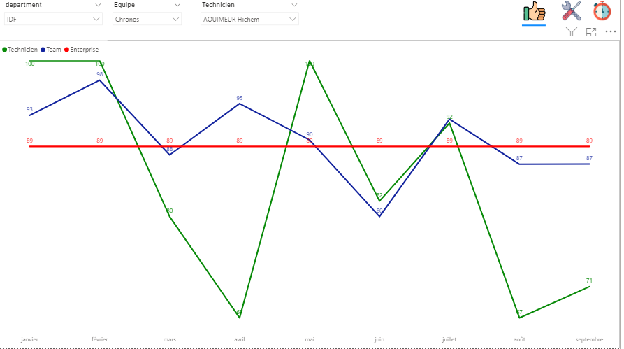
I'm trying to display 3 things on a line chart:
- average asked score ( a constant ) - Done
- average score of someone - Done
- average score of the someone 's team - issue
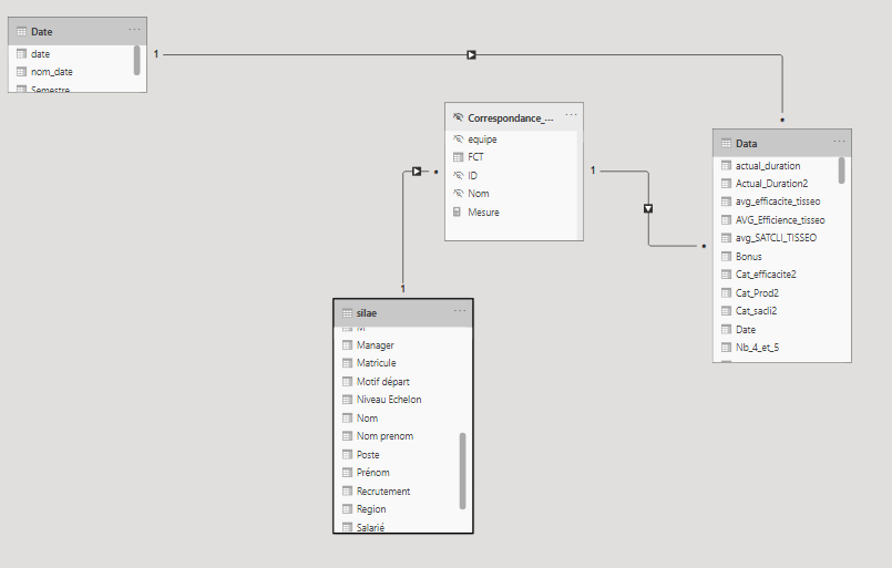
Here are my data
there are several Departments , with several teams , with several technicians.
I'd like to display my result in a line chart like this. A filter allow me to choose a Department , then a team , then a technician
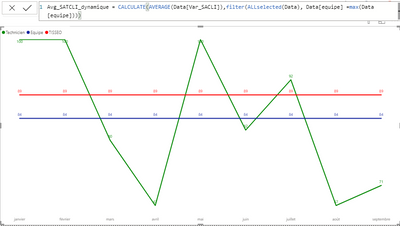
I tried the following Dax formula :
- Mark as New
- Bookmark
- Subscribe
- Mute
- Subscribe to RSS Feed
- Permalink
- Report Inappropriate Content
@Anonymous , Try with Team/Technicien
Avg_Score_department = CALCULATE(AVERAGE(Data[Score]),filter(ALLselected(Data), Data[Technicien] =max(Data[Technicien])))
- Mark as New
- Bookmark
- Subscribe
- Mute
- Subscribe to RSS Feed
- Permalink
- Report Inappropriate Content
@amitchandak Hello and thanks for your fast anwser 😊
unfortunately , it's not working since it shows a constant ( same result with Team/ Technician ) ...
I 'd like it to be calculated per month , may be I should use AVERAGEX ?
Helpful resources
| User | Count |
|---|---|
| 10 | |
| 9 | |
| 7 | |
| 4 | |
| 4 |


