Join us at the 2025 Microsoft Fabric Community Conference
Microsoft Fabric Community Conference 2025, March 31 - April 2, Las Vegas, Nevada. Use code MSCUST for a $150 discount.
Register now- Power BI forums
- Get Help with Power BI
- Desktop
- Service
- Report Server
- Power Query
- Mobile Apps
- Developer
- DAX Commands and Tips
- Custom Visuals Development Discussion
- Health and Life Sciences
- Power BI Spanish forums
- Translated Spanish Desktop
- Training and Consulting
- Instructor Led Training
- Dashboard in a Day for Women, by Women
- Galleries
- Webinars and Video Gallery
- Data Stories Gallery
- Themes Gallery
- Contests Gallery
- Quick Measures Gallery
- R Script Showcase
- COVID-19 Data Stories Gallery
- Community Connections & How-To Videos
- 2021 MSBizAppsSummit Gallery
- 2020 MSBizAppsSummit Gallery
- 2019 MSBizAppsSummit Gallery
- Events
- Ideas
- Custom Visuals Ideas
- Issues
- Issues
- Events
- Upcoming Events
The Power BI DataViz World Championships are on! With four chances to enter, you could win a spot in the LIVE Grand Finale in Las Vegas. Show off your skills.
- Power BI forums
- Forums
- Get Help with Power BI
- DAX Commands and Tips
- Re: Analytics Line for Average need to see in Card...
- Subscribe to RSS Feed
- Mark Topic as New
- Mark Topic as Read
- Float this Topic for Current User
- Bookmark
- Subscribe
- Printer Friendly Page
- Mark as New
- Bookmark
- Subscribe
- Mute
- Subscribe to RSS Feed
- Permalink
- Report Inappropriate Content
Analytics Line for Average need to see in Card visual
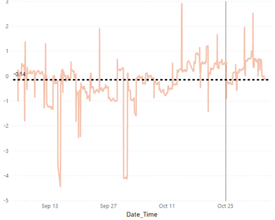
I have an average line using the Analytic pane for a measure that I created. I would like to see the average line's data label in a card visual to highlight it. Frankly any more than one line and average line on a visual and it gets too crowded to see the labels. What is the proper DAX to create this? I'm using Visual Studio to do all of my calculations. Right now I have something like this: averagex(all(Calendar[Year], Calendar[Month]), [Measure1]) and when I pull it into a card visual I'm getting a value of 6K not -0.14 so it isn't even close.
Thanks -
Sara
- Mark as New
- Bookmark
- Subscribe
- Mute
- Subscribe to RSS Feed
- Permalink
- Report Inappropriate Content
@sbarnhill75 , This like level avg, to either put the measure calculation in averagex or use the lowest id to do that
averagex(Table, [A]/[B]) , where and B are used in the measure
or averagex(Table[ID],{measure])
- Mark as New
- Bookmark
- Subscribe
- Mute
- Subscribe to RSS Feed
- Permalink
- Report Inappropriate Content
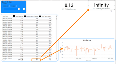
@amitchandak that solved my formula issue, but the score card is showing infinity instead of the total average. Any ideas?
- Mark as New
- Bookmark
- Subscribe
- Mute
- Subscribe to RSS Feed
- Permalink
- Report Inappropriate Content
Helpful resources

Join us at the Microsoft Fabric Community Conference
March 31 - April 2, 2025, in Las Vegas, Nevada. Use code MSCUST for a $150 discount!

Join our Community Sticker Challenge 2025
If you love stickers, then you will definitely want to check out our Community Sticker Challenge!

| User | Count |
|---|---|
| 25 | |
| 17 | |
| 12 | |
| 12 | |
| 10 |
| User | Count |
|---|---|
| 33 | |
| 27 | |
| 16 | |
| 14 | |
| 13 |


