Fabric Data Days starts November 4th!
Advance your Data & AI career with 50 days of live learning, dataviz contests, hands-on challenges, study groups & certifications and more!
Get registered- Power BI forums
- Get Help with Power BI
- Desktop
- Service
- Report Server
- Power Query
- Mobile Apps
- Developer
- DAX Commands and Tips
- Custom Visuals Development Discussion
- Health and Life Sciences
- Power BI Spanish forums
- Translated Spanish Desktop
- Training and Consulting
- Instructor Led Training
- Dashboard in a Day for Women, by Women
- Galleries
- Data Stories Gallery
- Themes Gallery
- Contests Gallery
- QuickViz Gallery
- Quick Measures Gallery
- Visual Calculations Gallery
- Notebook Gallery
- Translytical Task Flow Gallery
- TMDL Gallery
- R Script Showcase
- Webinars and Video Gallery
- Ideas
- Custom Visuals Ideas (read-only)
- Issues
- Issues
- Events
- Upcoming Events
Get Fabric Certified for FREE during Fabric Data Days. Don't miss your chance! Request now
- Power BI forums
- Forums
- Get Help with Power BI
- DAX Commands and Tips
- 2 Measures on same line graph
- Subscribe to RSS Feed
- Mark Topic as New
- Mark Topic as Read
- Float this Topic for Current User
- Bookmark
- Subscribe
- Printer Friendly Page
- Mark as New
- Bookmark
- Subscribe
- Mute
- Subscribe to RSS Feed
- Permalink
- Report Inappropriate Content
2 Measures on same line graph
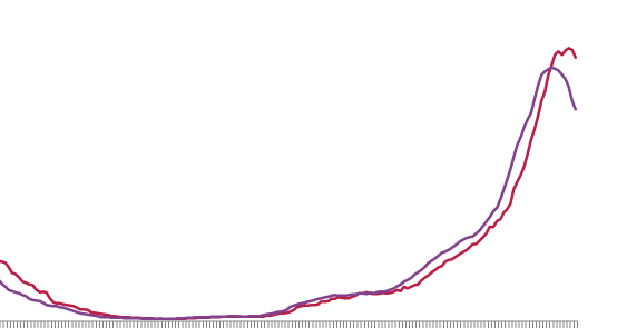
I have 2 rolling 14 day average calculations and Im hoping to display them (highlighted) on the same line graph:
However I've tried to create a date bridge and another table to relate to and still no luck with either approach.

Where it should look more like this:
Can anyone help with this?
SEE FILE ATTACHED
https://www.dropbox.com/s/ksi9fm0kbzpj1hg/Notification%20vs.%20Epi.pbix?dl=0
- Mark as New
- Bookmark
- Subscribe
- Mute
- Subscribe to RSS Feed
- Permalink
- Report Inappropriate Content
@Anonymous ,
Create a date table, Join both dates with that. (If they are from same table), one join will be inactive , you can activate that using userelation
rolling 14 will similar to
Rolling 14 = CALCULATE(sum(Sales[Sales Amount]),DATESINPERIOD('Date'[Date ],MAX('Date'[Date ]),-14,Day))
In case you need to use userelation -https://www.youtube.com/watch?v=e6Y-l_JtCq4
To get the best of the time intelligence function. Make sure you have a date calendar and it has been marked as the date in model view. Also, join it with the date column of your fact/s. Refer :radacad sqlbi My Video Series Appreciate your Kudos.
Helpful resources

Fabric Data Days
Advance your Data & AI career with 50 days of live learning, contests, hands-on challenges, study groups & certifications and more!

Power BI Monthly Update - October 2025
Check out the October 2025 Power BI update to learn about new features.

| User | Count |
|---|---|
| 7 | |
| 6 | |
| 4 | |
| 4 | |
| 4 |
| User | Count |
|---|---|
| 25 | |
| 17 | |
| 9 | |
| 8 | |
| 7 |

