FabCon is coming to Atlanta
Join us at FabCon Atlanta from March 16 - 20, 2026, for the ultimate Fabric, Power BI, AI and SQL community-led event. Save $200 with code FABCOMM.
Register now!- Power BI forums
- Get Help with Power BI
- Desktop
- Service
- Report Server
- Power Query
- Mobile Apps
- Developer
- DAX Commands and Tips
- Custom Visuals Development Discussion
- Health and Life Sciences
- Power BI Spanish forums
- Translated Spanish Desktop
- Training and Consulting
- Instructor Led Training
- Dashboard in a Day for Women, by Women
- Galleries
- Data Stories Gallery
- Themes Gallery
- Contests Gallery
- Quick Measures Gallery
- Notebook Gallery
- Translytical Task Flow Gallery
- TMDL Gallery
- R Script Showcase
- Webinars and Video Gallery
- Ideas
- Custom Visuals Ideas (read-only)
- Issues
- Issues
- Events
- Upcoming Events
To celebrate FabCon Vienna, we are offering 50% off select exams. Ends October 3rd. Request your discount now.
- Power BI forums
- Forums
- Get Help with Power BI
- Custom Visuals Development Discussion
- power bi graph is not showing exact vlaues
- Subscribe to RSS Feed
- Mark Topic as New
- Mark Topic as Read
- Float this Topic for Current User
- Bookmark
- Subscribe
- Printer Friendly Page
- Mark as New
- Bookmark
- Subscribe
- Mute
- Subscribe to RSS Feed
- Permalink
- Report Inappropriate Content
power bi graph is not showing exact vlaues
Hi Team,
I have the data represented in the below excel format.
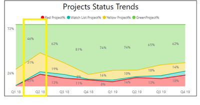
Now I want to represent the Excel table in status bar chart by quarter in PowerBi as shown below. I have a Region filter in powerbi dashboard.
Ideally, depending on the Region filter the Power Bi graph values should be changed accordingly.
But here the issue is when we are selecting a specific region, we are able to show the same values as in Excel, but when we are selecting the option as ‘SELECT ALL’ in the filter the graph values are not giving the correct values as per the excel sheet in the ‘Project Status Trends’ section.
Please find the above provided screenshots and let me know if you could assit with this request ASAP.
Regards,
Keerthi
- Mark as New
- Bookmark
- Subscribe
- Mute
- Subscribe to RSS Feed
- Permalink
- Report Inappropriate Content
What custom visual are you talking about?
Ignat Vilesov,
Software Engineer
Microsoft Power BI Custom Visuals
- Mark as New
- Bookmark
- Subscribe
- Mute
- Subscribe to RSS Feed
- Permalink
- Report Inappropriate Content
HI Viig,
I am using Stacked Area Chart visual.
Regards,
Keerthi
- Mark as New
- Bookmark
- Subscribe
- Mute
- Subscribe to RSS Feed
- Permalink
- Report Inappropriate Content
This is not a custom visual. We suggest to ask in Desktop.
Ignat Vilesov,
Software Engineer
Microsoft Power BI Custom Visuals


