FabCon is coming to Atlanta
Join us at FabCon Atlanta from March 16 - 20, 2026, for the ultimate Fabric, Power BI, AI and SQL community-led event. Save $200 with code FABCOMM.
Register now!- Power BI forums
- Get Help with Power BI
- Desktop
- Service
- Report Server
- Power Query
- Mobile Apps
- Developer
- DAX Commands and Tips
- Custom Visuals Development Discussion
- Health and Life Sciences
- Power BI Spanish forums
- Translated Spanish Desktop
- Training and Consulting
- Instructor Led Training
- Dashboard in a Day for Women, by Women
- Galleries
- Data Stories Gallery
- Themes Gallery
- Contests Gallery
- QuickViz Gallery
- Quick Measures Gallery
- Visual Calculations Gallery
- Notebook Gallery
- Translytical Task Flow Gallery
- TMDL Gallery
- R Script Showcase
- Webinars and Video Gallery
- Ideas
- Custom Visuals Ideas (read-only)
- Issues
- Issues
- Events
- Upcoming Events
The Power BI Data Visualization World Championships is back! Get ahead of the game and start preparing now! Learn more
- Power BI forums
- Forums
- Get Help with Power BI
- Custom Visuals Development Discussion
- [help] sankey image can't be displayed in poweBI
- Subscribe to RSS Feed
- Mark Topic as New
- Mark Topic as Read
- Float this Topic for Current User
- Bookmark
- Subscribe
- Printer Friendly Page
- Mark as New
- Bookmark
- Subscribe
- Mute
- Subscribe to RSS Feed
- Permalink
- Report Inappropriate Content
[help] sankey image can't be displayed in poweBI
Hi team,
I have below script.
import pandas as pd
import chart_studio.plotly as py
import plotly.graph_objects as go
labelListTemp1 = list(set(dataset.source.values))
labelListTemp2 = list(set(dataset.target.values))
labelList = labelListTemp1 + labelListTemp2
sankey_node = list(dict.fromkeys(labelList))
fig = go.Figure(data=[go.Sankey( node = dict( pad=15,
                                             thickness=20,
                                             line = dict(color = "black", width = 0.5),
                                             label = labelList,
                                             color = "blue" ),
                                              link = dict(source = dataset.source.apply(lambda x: labelList.index(x)),
                                                          target = dataset.target.apply(lambda x: labelList.index(x)),
                                                          value = dataset.value))])

fig.show()
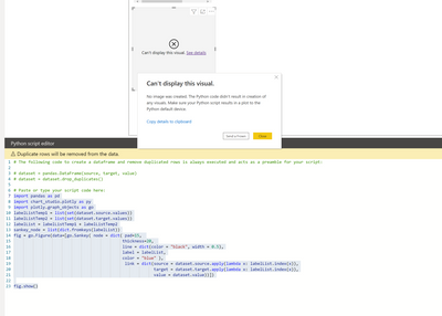
And I run it in powerBI with enabling python script. but the result is that the code opened a browser and displayed the sankey in browser, instead of in powerBI.
1. the code opened a browser and displayed the sankey in browser.
2. I would like the sankey chart displayed in powerBI, but powerBI says that 'the visual can't be displayed'.
Is there anyone that succesfully created sankey chart by python plotly lib? can any expert help take a look what's wrong here?
Thanks,
Cherie
Helpful resources

Power BI Monthly Update - November 2025
Check out the November 2025 Power BI update to learn about new features.

Fabric Data Days
Advance your Data & AI career with 50 days of live learning, contests, hands-on challenges, study groups & certifications and more!

| User | Count |
|---|---|
| 6 | |
| 5 | |
| 4 | |
| 2 | |
| 2 |

