- Power BI forums
- Updates
- News & Announcements
- Get Help with Power BI
- Desktop
- Service
- Report Server
- Power Query
- Mobile Apps
- Developer
- DAX Commands and Tips
- Custom Visuals Development Discussion
- Health and Life Sciences
- Power BI Spanish forums
- Translated Spanish Desktop
- Power Platform Integration - Better Together!
- Power Platform Integrations (Read-only)
- Power Platform and Dynamics 365 Integrations (Read-only)
- Training and Consulting
- Instructor Led Training
- Dashboard in a Day for Women, by Women
- Galleries
- Community Connections & How-To Videos
- COVID-19 Data Stories Gallery
- Themes Gallery
- Data Stories Gallery
- R Script Showcase
- Webinars and Video Gallery
- Quick Measures Gallery
- 2021 MSBizAppsSummit Gallery
- 2020 MSBizAppsSummit Gallery
- 2019 MSBizAppsSummit Gallery
- Events
- Ideas
- Custom Visuals Ideas
- Issues
- Issues
- Events
- Upcoming Events
- Community Blog
- Power BI Community Blog
- Custom Visuals Community Blog
- Community Support
- Community Accounts & Registration
- Using the Community
- Community Feedback
Register now to learn Fabric in free live sessions led by the best Microsoft experts. From Apr 16 to May 9, in English and Spanish.
- Power BI forums
- Forums
- Get Help with Power BI
- Custom Visuals Development Discussion
- Relationship betwwen arrival and departure flights
- Subscribe to RSS Feed
- Mark Topic as New
- Mark Topic as Read
- Float this Topic for Current User
- Bookmark
- Subscribe
- Printer Friendly Page
- Mark as New
- Bookmark
- Subscribe
- Mute
- Subscribe to RSS Feed
- Permalink
- Report Inappropriate Content
Relationship betwwen arrival and departure flights
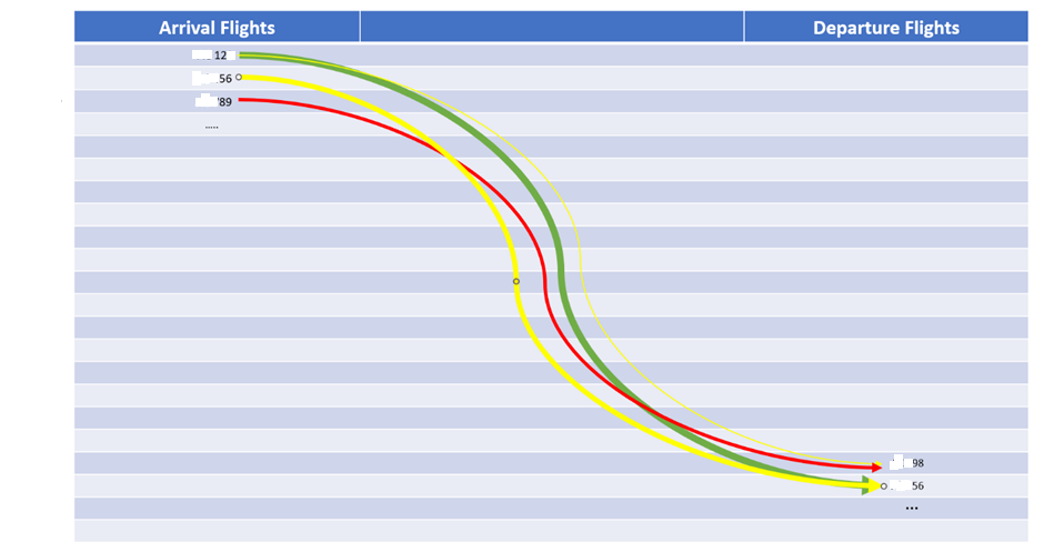
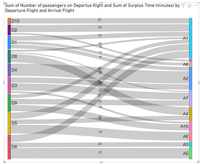
Hi, I want to create a custom visual showing the Relationship betwwen arrival and departure flights with arrow line towards departure flight. The thickness of line should be based on number of passengers on departure flight and the color of line should be green( surplus time >=15), yellow between <15 and >=10, Red <10). Sample data is given below and visual is also shown below. Please, can anyone help me out in this.
| Arrival Flight | Departure Flight | Number of passengers on Departue flight | Surplus Time (minutes) |
| A1 | D1 | 5 | 19 |
| A1 | D2 | 8 | 25 |
| A1 | D6 | 8 | 18 |
| A1 | D9 | 4 | 20 |
| A1 | D10 | 6 | 27 |
| A1 | D8 | 2 | 16 |
| A1 | D5 | 7 | 5 |
| A2 | D1 | 4 | -6 |
| A2 | D4 | 8 | 8 |
| A2 | D4 | 6 | 21 |
| A2 | D3 | 6 | 21 |
| A3 | D6 | 5 | 20 |
| A4 | D5 | 5 | 2 |
| A4 | D8 | 9 | 10 |
| A5 | D6 | 12 | 12 |
| A6 | D5 | 10 | -10 |
| A7 | D9 | 6 | 12 |
| A7 | D8 | 1 | 15 |
| A7 | D3 | 8 | 16 |
| A8 | D1 | 3 | 17 |
| A9 | D2 | 2 | 16 |
| A10 | D3 | 2 | 18 |
| A10 | D9 | 7 | 22 |
- Mark as New
- Bookmark
- Subscribe
- Mute
- Subscribe to RSS Feed
- Permalink
- Report Inappropriate Content
- Mark as New
- Bookmark
- Subscribe
- Mute
- Subscribe to RSS Feed
- Permalink
- Report Inappropriate Content

Helpful resources

Microsoft Fabric Learn Together
Covering the world! 9:00-10:30 AM Sydney, 4:00-5:30 PM CET (Paris/Berlin), 7:00-8:30 PM Mexico City

Power BI Monthly Update - April 2024
Check out the April 2024 Power BI update to learn about new features.

| User | Count |
|---|---|
| 6 | |
| 1 | |
| 1 | |
| 1 | |
| 1 |

