- Power BI forums
- Get Help with Power BI
- Desktop
- Service
- Report Server
- Power Query
- Mobile Apps
- Developer
- DAX Commands and Tips
- Custom Visuals Development Discussion
- Health and Life Sciences
- Power BI Spanish forums
- Translated Spanish Desktop
- Training and Consulting
- Instructor Led Training
- Dashboard in a Day for Women, by Women
- Galleries
- Data Stories Gallery
- Themes Gallery
- Contests Gallery
- QuickViz Gallery
- Quick Measures Gallery
- Visual Calculations Gallery
- Notebook Gallery
- Translytical Task Flow Gallery
- TMDL Gallery
- R Script Showcase
- Webinars and Video Gallery
- Ideas
- Custom Visuals Ideas (read-only)
- Issues
- Issues
- Events
- Upcoming Events
We've captured the moments from FabCon & SQLCon that everyone is talking about, and we are bringing them to the community, live and on-demand. Starts on April 14th. Register now
- Power BI forums
- Forums
- Get Help with Power BI
- Custom Visuals Development Discussion
- How would I create a Trend Analysis visualization ...
- Subscribe to RSS Feed
- Mark Topic as New
- Mark Topic as Read
- Float this Topic for Current User
- Bookmark
- Subscribe
- Printer Friendly Page
- Mark as New
- Bookmark
- Subscribe
- Mute
- Subscribe to RSS Feed
- Permalink
- Report Inappropriate Content
How would I create a Trend Analysis visualization (line graph) using text of employee Morale
Hello,
How would I go about creating a trend analysis visualization (line graph) to track employee morale / employee workload with Months / Years.
Currently, this is what I have:
This graph is only showing the months (X-axis) and the count for each month (Y-axis). I would like to visuialize the feelings of an employees morale such as: Good, Fantastic, OK.
Any help would be appreciated.
- Mark as New
- Bookmark
- Subscribe
- Mute
- Subscribe to RSS Feed
- Permalink
- Report Inappropriate Content
@Omar_204 I think this broken visual has to do with either your dataset does not contain the right information or the relationships of the tables that you have defined is inaccurate. I will show you one quick example here.
I have created 3 simple tables: Date, Morale, & Fact. My Fact table contains information that can relate to Date & Morale tables where each period (Month) has Morale evaluation results for each employee (I am assuming to have 8 employees). The line chart takes Month as the Y-axis, Count of Employee ID as the X-axis, and Employee Morale as the legend. The visual from these tables are shown as below. (Note that this example is not the best but should help to give you some ideas to work on yours) Thanks.
- Mark as New
- Bookmark
- Subscribe
- Mute
- Subscribe to RSS Feed
- Permalink
- Report Inappropriate Content
Hi @JChai,
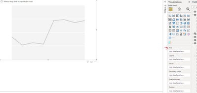
When I went to create a line graph, it's showing only Axis NOT X-Axis or Y-Axis. How did you get both of these fields to appear.
See below.
- Mark as New
- Bookmark
- Subscribe
- Mute
- Subscribe to RSS Feed
- Permalink
- Report Inappropriate Content
Hello @Omar_204,
I am not certain how your data looks like but I think adding the MORALE column as legend for the line chart should work fine for your objective.
Best,
JKC
- Mark as New
- Bookmark
- Subscribe
- Mute
- Subscribe to RSS Feed
- Permalink
- Report Inappropriate Content
Hi @JChai ,
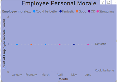
I added the MORALE column to the legend and it's only showing up as dots/points. I want this trend graph to show as a line graph.
The Axis is the Months, and the values is set to the count of morale.
Any ideas ?
Thank you.
- Mark as New
- Bookmark
- Subscribe
- Mute
- Subscribe to RSS Feed
- Permalink
- Report Inappropriate Content
Why your Y Axis has only to values, 1 and 2 ?
Shouldn't be Y-Axis Sum instead of Count?
Helpful resources

New to Fabric Survey
If you have recently started exploring Fabric, we'd love to hear how it's going. Your feedback can help with product improvements.

Power BI DataViz World Championships - June 2026
A new Power BI DataViz World Championship is coming this June! Don't miss out on submitting your entry.

Join our Fabric User Panel
Share feedback directly with Fabric product managers, participate in targeted research studies and influence the Fabric roadmap.


