FabCon is coming to Atlanta
Join us at FabCon Atlanta from March 16 - 20, 2026, for the ultimate Fabric, Power BI, AI and SQL community-led event. Save $200 with code FABCOMM.
Register now!- Power BI forums
- Get Help with Power BI
- Desktop
- Service
- Report Server
- Power Query
- Mobile Apps
- Developer
- DAX Commands and Tips
- Custom Visuals Development Discussion
- Health and Life Sciences
- Power BI Spanish forums
- Translated Spanish Desktop
- Training and Consulting
- Instructor Led Training
- Dashboard in a Day for Women, by Women
- Galleries
- Data Stories Gallery
- Themes Gallery
- Contests Gallery
- QuickViz Gallery
- Quick Measures Gallery
- Visual Calculations Gallery
- Notebook Gallery
- Translytical Task Flow Gallery
- TMDL Gallery
- R Script Showcase
- Webinars and Video Gallery
- Ideas
- Custom Visuals Ideas (read-only)
- Issues
- Issues
- Events
- Upcoming Events
The Power BI Data Visualization World Championships is back! Get ahead of the game and start preparing now! Learn more
- Power BI forums
- Forums
- Get Help with Power BI
- Custom Visuals Development Discussion
- How to show interactive 4 week progress trend from...
- Subscribe to RSS Feed
- Mark Topic as New
- Mark Topic as Read
- Float this Topic for Current User
- Bookmark
- Subscribe
- Printer Friendly Page
- Mark as New
- Bookmark
- Subscribe
- Mute
- Subscribe to RSS Feed
- Permalink
- Report Inappropriate Content
How to show interactive 4 week progress trend from report date in visual tab by using line and chart
Dear All,
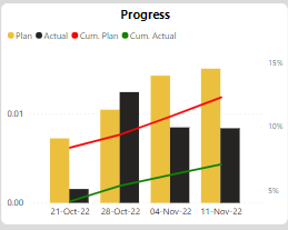
I am trying to visualize the interactive 4-week progress trend from the report date in the visual tab by using a line and cluster column chart. but no success. The visual date axis looks static and doesn't change when changing the report date.
Below visual showing four week trend (21-Oct to 11-Nov) fom report date 11-Nov-22 . and if i chnage the report date to 04-Nov-22 the trend should show the data from (14-Oct to 04-Nov). but its not.. trens is not sync with report date
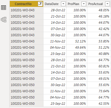
I have weekly data set for each contract (Example WO-43 & WO-50 showing plan and actual % on weekly basis ) and it looks similar to the below table.
i couldn't find any specific filter on this visual that will help showing the desire result.Therefore i am looking for expert advise how to fix this issue. Not sure weather it is visual issue or modeling
Kind Regards
- Mark as New
- Bookmark
- Subscribe
- Mute
- Subscribe to RSS Feed
- Permalink
- Report Inappropriate Content
Please provide sample data in usable format, not as a screenshot.
Please show the expected outcome based on the sample data you provided.
Helpful resources

Power BI Monthly Update - November 2025
Check out the November 2025 Power BI update to learn about new features.

Fabric Data Days
Advance your Data & AI career with 50 days of live learning, contests, hands-on challenges, study groups & certifications and more!

| User | Count |
|---|---|
| 2 | |
| 2 | |
| 1 | |
| 1 | |
| 1 |
| User | Count |
|---|---|
| 7 | |
| 5 | |
| 4 | |
| 2 | |
| 2 |


