FabCon is coming to Atlanta
Join us at FabCon Atlanta from March 16 - 20, 2026, for the ultimate Fabric, Power BI, AI and SQL community-led event. Save $200 with code FABCOMM.
Register now!Go To
- Power BI forums
- Get Help with Power BI
- Desktop
- Service
- Report Server
- Power Query
- Mobile Apps
- Developer
- DAX Commands and Tips
- Custom Visuals Development Discussion
- Health and Life Sciences
- Power BI Spanish forums
- Translated Spanish Desktop
- Training and Consulting
- Instructor Led Training
- Dashboard in a Day for Women, by Women
- Galleries
- Data Stories Gallery
- Themes Gallery
- Contests Gallery
- Quick Measures Gallery
- Notebook Gallery
- Translytical Task Flow Gallery
- TMDL Gallery
- R Script Showcase
- Webinars and Video Gallery
- Ideas
- Custom Visuals Ideas (read-only)
- Issues
- Issues
- Events
- Upcoming Events
Turn on suggestions
Auto-suggest helps you quickly narrow down your search results by suggesting possible matches as you type.
Showing results for
To celebrate FabCon Vienna, we are offering 50% off select exams. Ends October 3rd. Request your discount now.
- Power BI forums
- Forums
- Get Help with Power BI
- Custom Visuals Development Discussion
- Dumbbell bar chart in table and matrix
Reply
Topic Options
- Subscribe to RSS Feed
- Mark Topic as New
- Mark Topic as Read
- Float this Topic for Current User
- Bookmark
- Subscribe
- Printer Friendly Page
- Mark as New
- Bookmark
- Subscribe
- Mute
- Subscribe to RSS Feed
- Permalink
- Report Inappropriate Content
Dumbbell bar chart in table and matrix
05-16-2023
07:44 PM
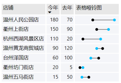
Result:
Mark the SVG measure below as image URL:
表格哑铃图 =
VAR MAX1 =
MAXX ( ALL ( 'table' ), [M.今年] )
VAR MAX2 =
MAXX ( ALL ( 'table' ), [M.去年] )
VAR W =
IF ( MAX1 >= MAX2, MAX1, MAX2)
VAR Value_Left= MIN ( [M.今年], [M.去年] )
VAR Value_Right=MAX ( [M.今年], [M.去年] )
VAR Color_Circle_Left=IF ( [M.今年] <= [M.去年], "DeepSkyBlue", "Black" )
VAR Color_Circle_Right=IF ( [M.今年] > [M.去年], "DeepSkyBlue", "Black")
VAR Line="<line x1='" & Value_Left / W*130+10 & "' y1='15' x2='" & Value_Right / W*130+10 & "' y2='15' style='stroke:DimGray;stroke-width:2' />"
VAR Circle_Left=
"<circle cx='" & Value_Left / W*130+10 & "' cy='15' r='5'" & " fill='" & Color_Circle_Left & "'/>"
VAR Circle_Right=
"<circle cx='" & Value_Right / W*130+10 & "' cy='15' r='5'" & " fill='" & Color_Circle_Right & "'/>"
VAR Bar =
Line& Circle_Left & Circle_Right
VAR SVG = "data:image/svg+xml;utf8," & "<svg xmlns='http://www.w3.org/2000/svg' height='30' width='150' >" & Bar & "</svg>"
RETURN
SVG
0 REPLIES 0


