A new Data Days event is coming soon!
This time we’re going bigger than ever. Fabric, Power BI, SQL, AI and more. We're covering it all. You won't want to miss it.
Learn more- Power BI forums
- Get Help with Power BI
- Desktop
- Service
- Report Server
- Power Query
- Mobile Apps
- Developer
- DAX Commands and Tips
- Custom Visuals Development Discussion
- Health and Life Sciences
- Power BI Spanish forums
- Translated Spanish Desktop
- Training and Consulting
- Instructor Led Training
- Dashboard in a Day for Women, by Women
- Galleries
- Data Stories Gallery
- Themes Gallery
- Contests Gallery
- QuickViz Gallery
- Quick Measures Gallery
- Visual Calculations Gallery
- Notebook Gallery
- Translytical Task Flow Gallery
- TMDL Gallery
- R Script Showcase
- Webinars and Video Gallery
- Ideas
- Custom Visuals Ideas (read-only)
- Issues
- Issues
- Events
- Upcoming Events
Level up your Power BI skills this month - build one visual each week and tell better stories with data! Get started
- Power BI forums
- Forums
- Get Help with Power BI
- Custom Visuals Development Discussion
- Custom/Existing Visual regenerating on user select...
- Subscribe to RSS Feed
- Mark Topic as New
- Mark Topic as Read
- Float this Topic for Current User
- Bookmark
- Subscribe
- Printer Friendly Page
- Mark as New
- Bookmark
- Subscribe
- Mute
- Subscribe to RSS Feed
- Permalink
- Report Inappropriate Content
Custom/Existing Visual regenerating on user selection
I am looking to either develop my own/find a visual that can dynamically regenerate/update based on a user selection.
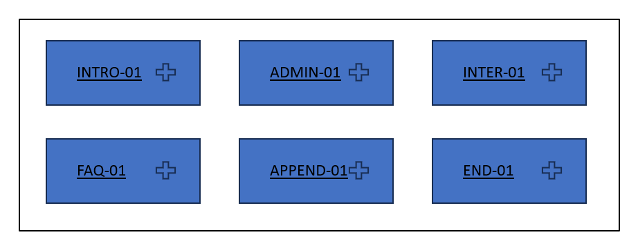
For context, the goal is simply to create a visual that lists a matrix of initial values (for example, a set of values that have a "-01" suffix) where a user can click on any of them that will then regenerate/update the visual with elements that have both the selected -01 suffix and the secondary -02 suffix, etc. for up to x amount of suffixes (basically recursive in a way).
Considerations:
- Grid-like visual where it shows all the -01 values as a single boxed element
- Potentially attaching a url field (found in another column) that will hyperlink if they click the center of the box
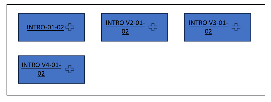
- Having an 'expand' option within the element that will regenerate to the same grid-like visual, but using the initial selected value as a filter, and only showing rows where there is both -01 and the next -02 value
- This expanded version still maintains same behavior as if it was the -01 initial option, such as having the hyperlink option on direct click, or expand
Methods originally considered but are not scalable:
- Using a series of cards (not sure if there is a url hyperlink attachment possible natively)
- Too many cards required and non adjustable without significant effort needed to incorporate
- Bookmarks (the amount of pages/bookmarks needed would need to be edited every single time when new entries are added)
- Had trouble figuring out how to properly get it to hide/show the next set of data properly or to filter correctly without external slicers on the page that also have to be interacted with
- Tree chart (although this kind of works, it is quite unintuitive and required an additional button for the hyperlink, as well as all prior elements in the tree remained on the page, cluttering the view even further
Quick sketch of the principle I am looking to achieve below:
From a 3x2 grid (adjustable/dynamic based on total values found and total size of the visual), user selects the + icon of the INTRO-01 box, which then leads to the next image, where its a subset of all the values under the INTRO-01 tag that are not the initial entry (for example, the act of clicking that element appends something that will now show anything that has a INTRO-01 tag AND the next set of tags). This can then keep incrementing as needed (depth and how many times this occurs would be manually built, up the amount of elements in the visual can dynamically change based on the data).


Ideally this kind of visual is something that already exists somewhere, and if not, has capability within the developer API where I can build this kind of visual with its behavior myself. I have searched for this kind of behavior on the forums but most posts have not quite fulfilled the conditions I want or are using tables with values rather than something like this, which doesnt work as I had hoped. Some threads even mention this may not be possible, but those were relatively old so perhaps this kind of visual/behavior may have been added in since?
Any tips or help would be appreciated.
Helpful resources

Power BI Monthly Update - April 2026
Check out the April 2026 Power BI update to learn about new features.

Data Days 2026 coming soon!
Sign up to receive a private message when registration opens and key events begin.

New to Fabric Survey
If you have recently started exploring Fabric, we'd love to hear how it's going. Your feedback can help with product improvements.

