Get Fabric certified for FREE!
Don't miss your chance to take the Fabric Data Engineer (DP-600) exam for FREE! Find out how by watching the DP-600 session on-demand now through April 28th.
Learn more- Power BI forums
- Get Help with Power BI
- Desktop
- Service
- Report Server
- Power Query
- Mobile Apps
- Developer
- DAX Commands and Tips
- Custom Visuals Development Discussion
- Health and Life Sciences
- Power BI Spanish forums
- Translated Spanish Desktop
- Training and Consulting
- Instructor Led Training
- Dashboard in a Day for Women, by Women
- Galleries
- Data Stories Gallery
- Themes Gallery
- Contests Gallery
- QuickViz Gallery
- Quick Measures Gallery
- Visual Calculations Gallery
- Notebook Gallery
- Translytical Task Flow Gallery
- TMDL Gallery
- R Script Showcase
- Webinars and Video Gallery
- Ideas
- Custom Visuals Ideas (read-only)
- Issues
- Issues
- Events
- Upcoming Events
Join the FabCon + SQLCon recap series. Up next: Power BI, Real-Time Intelligence, IQ and AI, and Data Factory take center stage. All sessions are available on-demand after the live show. Register now
- Power BI forums
- Forums
- Get Help with Power BI
- Custom Visuals Development Discussion
- Create a custom table using Measures in row
- Subscribe to RSS Feed
- Mark Topic as New
- Mark Topic as Read
- Float this Topic for Current User
- Bookmark
- Subscribe
- Printer Friendly Page
- Mark as New
- Bookmark
- Subscribe
- Mute
- Subscribe to RSS Feed
- Permalink
- Report Inappropriate Content
Create a custom table using Measures in row
Hi Guys,
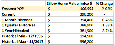
I am using Imported Power BI file and has 5 tables in it and related to each other as per the requirement. I've created all the required measures on the model. Now, my question is to display those measures as per the Business necessity. here's how they wanted to look like... all these measures will be sliced by Filter Consisting of Zip Codes init. Need to pin this visual in Dasboard.
For example, To display ForecastYOY row... I've created 2 measures to display ForecastYOY ($) and ForecastYOY % Change.
I was unable to display all these measures in the above table format. Is there anyway to display like that or should i go for creating my own custom visual, if so how can i acheive that ?.
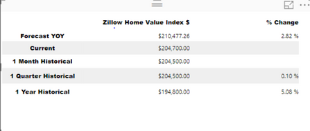
I have used PowerKPI Metrics to display first 5 rows and the rest of the 2 column names itself are dynamic which tends to change based on filter appiled (Date part in the column). Is there anyway that i can acheive in the same visual. I tried to move the date part from the column name to value but it's not displaying because the datatype in currency whereas we are trying ti insert date into it.
This how far I can go by using that custom visual...
Any help is greatly appreciated!
Solved! Go to Solution.
- Mark as New
- Bookmark
- Subscribe
- Mute
- Subscribe to RSS Feed
- Permalink
- Report Inappropriate Content
We'd recommend to try Power KPI Matrix out.
Please download this sample report to find out more about usage of this custom visual.
Ignat Vilesov,
Software Engineer
Microsoft Power BI Custom Visuals
Helpful resources

Power BI Monthly Update - April 2026
Check out the April 2026 Power BI update to learn about new features.

New to Fabric Survey
If you have recently started exploring Fabric, we'd love to hear how it's going. Your feedback can help with product improvements.

Power BI DataViz World Championships - June 2026
A new Power BI DataViz World Championship is coming this June! Don't miss out on submitting your entry.


