Party with Power BI’s own Guy in a Cube
Power BI is turning 10! Tune in for a special live episode on July 24 with behind-the-scenes stories, product evolution highlights, and a sneak peek at what’s in store for the future.
Save the date- Power BI forums
- Get Help with Power BI
- Desktop
- Service
- Report Server
- Power Query
- Mobile Apps
- Developer
- DAX Commands and Tips
- Custom Visuals Development Discussion
- Health and Life Sciences
- Power BI Spanish forums
- Translated Spanish Desktop
- Training and Consulting
- Instructor Led Training
- Dashboard in a Day for Women, by Women
- Galleries
- Data Stories Gallery
- Themes Gallery
- Contests Gallery
- Quick Measures Gallery
- Notebook Gallery
- Translytical Task Flow Gallery
- TMDL Gallery
- R Script Showcase
- Webinars and Video Gallery
- Ideas
- Custom Visuals Ideas (read-only)
- Issues
- Issues
- Events
- Upcoming Events
Enhance your career with this limited time 50% discount on Fabric and Power BI exams. Ends August 31st. Request your voucher.
- Power BI forums
- Forums
- Get Help with Power BI
- Custom Visuals Development Discussion
- Clustered Column in Percentage with line chart as ...
- Subscribe to RSS Feed
- Mark Topic as New
- Mark Topic as Read
- Float this Topic for Current User
- Bookmark
- Subscribe
- Printer Friendly Page
- Mark as New
- Bookmark
- Subscribe
- Mute
- Subscribe to RSS Feed
- Permalink
- Report Inappropriate Content
Clustered Column in Percentage with line chart as secondary axis
Hello Community,
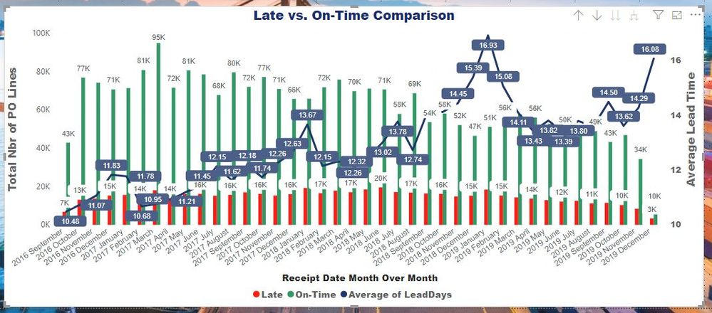
I have a quick question related with graphs that I have developed as pasted below:
However, I would like to show the clustered columns in % for each month (but when I am doing it, it splits total data as % split).
All I need is to display for each index/year-month on x-axis , the clustered columns between Late and On-Time in %, for instance I would like to see my clustered columns for 2019 November as 85% (On-Time): 15%(Late).
With excel you can simply obtain the desired result but it's difficul with Power BI. Appreciate help!


- Mark as New
- Bookmark
- Subscribe
- Mute
- Subscribe to RSS Feed
- Permalink
- Report Inappropriate Content
Hello,
As I understood, you want to see the ration between Late and On-Time columns in percents but only on labels, while columns still have to reflect absolute values. I found that it's possible to show labels in per cent of Grand Totals only but it looks like not your case.
I can recommend to ask in that thread also becuase they have more expretise regarding data modelling and visual that you use is core one.
Kind Regards,
Evgenii Elkin,
Software Engineer
Microsoft Power BI Custom Visuals
pbicvsupport@microsoft.com


