Become a Certified Power BI Data Analyst!
Join us for an expert-led overview of the tools and concepts you'll need to pass exam PL-300. The first session starts on June 11th. See you there!
Get registered- Power BI forums
- Get Help with Power BI
- Desktop
- Service
- Report Server
- Power Query
- Mobile Apps
- Developer
- DAX Commands and Tips
- Custom Visuals Development Discussion
- Health and Life Sciences
- Power BI Spanish forums
- Translated Spanish Desktop
- Training and Consulting
- Instructor Led Training
- Dashboard in a Day for Women, by Women
- Galleries
- Webinars and Video Gallery
- Data Stories Gallery
- Themes Gallery
- Contests Gallery
- Quick Measures Gallery
- Notebook Gallery
- Translytical Task Flow Gallery
- R Script Showcase
- Ideas
- Custom Visuals Ideas (read-only)
- Issues
- Issues
- Events
- Upcoming Events
Power BI is turning 10! Let’s celebrate together with dataviz contests, interactive sessions, and giveaways. Register now.
- Power BI forums
- Forums
- Get Help with Power BI
- Custom Visuals Development Discussion
- Budget, and Actuals Stacked Column Chart for Depar...
- Subscribe to RSS Feed
- Mark Topic as New
- Mark Topic as Read
- Float this Topic for Current User
- Bookmark
- Subscribe
- Printer Friendly Page
- Mark as New
- Bookmark
- Subscribe
- Mute
- Subscribe to RSS Feed
- Permalink
- Report Inappropriate Content
Budget, and Actuals Stacked Column Chart for Departments (x-axis labeling)
Hi Everyone,
I need help regarding the x-axis labeling. I've been working on this model for weeks. I have gotten closer to my desired result but I'm pretty stumped. Hoping I can receive a solution to this problem. I would like to keep the stacked column look.
1. This is the model from another data visualization software that I would like to mimic in power BI.
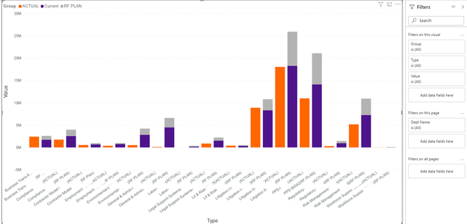
2. Below I attempted two times. As you can see (Exhibit A.) the labeling on the x-axis is pretty cluttered due to me having to differentiate between Actual and Current amounts and I would like it to be clean.
Exhibit A.
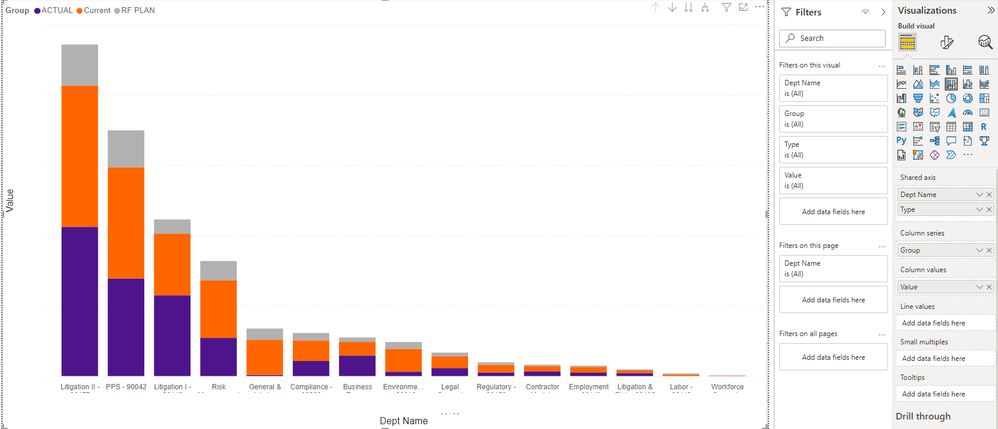
The second screenshot (Exhibit B.) is the desired aesthetic I would like however I am not sure how to move the actuals now that I have the Dept in the x-axis. Is it possible?
Exhibit B.
I would like the columns to look like Exhibit A, but the x-axis labeling to mimic Exhibit B.
Helpful resources

Join our Fabric User Panel
This is your chance to engage directly with the engineering team behind Fabric and Power BI. Share your experiences and shape the future.

Power BI Monthly Update - June 2025
Check out the June 2025 Power BI update to learn about new features.


