Join us at the 2025 Microsoft Fabric Community Conference
March 31 - April 2, 2025, in Las Vegas, Nevada. Use code MSCUST for a $150 discount! Early bird discount ends December 31.
Register Now- Power BI forums
- Get Help with Power BI
- Desktop
- Service
- Report Server
- Power Query
- Mobile Apps
- Developer
- DAX Commands and Tips
- Custom Visuals Development Discussion
- Health and Life Sciences
- Power BI Spanish forums
- Translated Spanish Desktop
- Training and Consulting
- Instructor Led Training
- Dashboard in a Day for Women, by Women
- Galleries
- Community Connections & How-To Videos
- COVID-19 Data Stories Gallery
- Themes Gallery
- Data Stories Gallery
- R Script Showcase
- Webinars and Video Gallery
- Quick Measures Gallery
- 2021 MSBizAppsSummit Gallery
- 2020 MSBizAppsSummit Gallery
- 2019 MSBizAppsSummit Gallery
- Events
- Ideas
- Custom Visuals Ideas
- Issues
- Issues
- Events
- Upcoming Events
Be one of the first to start using Fabric Databases. View on-demand sessions with database experts and the Microsoft product team to learn just how easy it is to get started. Watch now
- Power BI forums
- Forums
- Get Help with Power BI
- Custom Visuals Development Discussion
- Re: Bar chart in deneb to show the evolution by mo...
- Subscribe to RSS Feed
- Mark Topic as New
- Mark Topic as Read
- Float this Topic for Current User
- Bookmark
- Subscribe
- Printer Friendly Page
- Mark as New
- Bookmark
- Subscribe
- Mute
- Subscribe to RSS Feed
- Permalink
- Report Inappropriate Content
Bar chart in deneb to show the evolution by month
Hello Power BI community
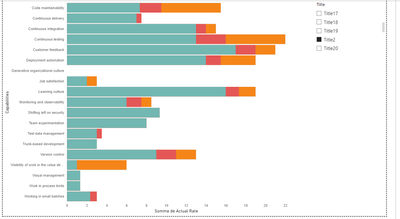
I'm trying to build a bar chart in deneb to show the evolution by month of each category, I want to edit the visual to :
- Display the month only if there has been an evolution, currently my visual displays the last month even if there is no evolution. For example, for the job satisfaction category: in October: 2; November: 2; December: 3; January: 3 ==> The tooltip displays October and January, but I'd like to get October and December, as the evolution took place in December not in January
- I want also to add is the visual a color legend for each month
==> If you have any other visual suggestions, please do not hesitate to share them with me.
Thanks a lot
Here is the pbix file : https://drive.google.com/file/d/1Of1AxMxBA4o_7f2zk6mC2y-upOJpJqt9/view?usp=sharing
Please help @giammariam 🙂
Solved! Go to Solution.
- Mark as New
- Bookmark
- Subscribe
- Mute
- Subscribe to RSS Feed
- Permalink
- Report Inappropriate Content
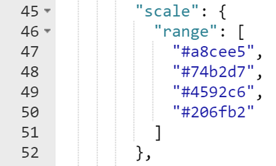
I went ahead and added this bit at line 45 to make the colors easily configurable for you. You'll want to include at least as many colors as there are months in your dataset. If you want the visual to pick the colors for you, delete these lines.
There isn't a limit on the number of months the visual can take. You'll just want to make sure that it's not so many that the visual becomes overcrowded.
.pbix file is attached.
If this is enough to get you going please consider liking this reply and choosing it as the solution. Otherwise, I'm happy to help further.
Madison Giammaria
Proud to be a Super User 😄
Do you frequently use Deneb to provide insights to your stakeholders? Have you considered sponsoring this free and open source custom visual? More info here!
- Mark as New
- Bookmark
- Subscribe
- Mute
- Subscribe to RSS Feed
- Permalink
- Report Inappropriate Content
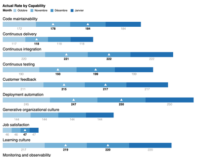
Hey @MargNIOP. Thanks for the tag. Here's a concept that I came up with for this. It has triangle indicators to show changes and it also has the Actual Rates as additional marks (bold for evolutions). Before getting this into Power BI, let me know your thoughts. If you don't like the additional marks, I can remove them.
Here's a gist to see it live.
Madison Giammaria
Proud to be a Super User 😄
Do you frequently use Deneb to provide insights to your stakeholders? Have you considered sponsoring this free and open source custom visual? More info here!
- Mark as New
- Bookmark
- Subscribe
- Mute
- Subscribe to RSS Feed
- Permalink
- Report Inappropriate Content
Hello @giammariam
I think it is really good solution we can see if we had an evolution or not and we can compare also the different categories.
Thanks a lot
- Mark as New
- Bookmark
- Subscribe
- Mute
- Subscribe to RSS Feed
- Permalink
- Report Inappropriate Content
@MargNIOP, I'll get it into Power BI. Before doing that though, do you have a desired color scheme in mind? If so could you provide either the color names, hex values, or rgb values for each month? If you like the current color scheme (gradient blues), I can stick with those.
Madison Giammaria
Proud to be a Super User 😄
Do you frequently use Deneb to provide insights to your stakeholders? Have you considered sponsoring this free and open source custom visual? More info here!
- Mark as New
- Bookmark
- Subscribe
- Mute
- Subscribe to RSS Feed
- Permalink
- Report Inappropriate Content
The gradient blues look good,
Right now, I don't really have a color scheme in mind. Can you show me which part of the code I can edit to change the color if I wish?
How many months does the visual last, please?
- Mark as New
- Bookmark
- Subscribe
- Mute
- Subscribe to RSS Feed
- Permalink
- Report Inappropriate Content
I went ahead and added this bit at line 45 to make the colors easily configurable for you. You'll want to include at least as many colors as there are months in your dataset. If you want the visual to pick the colors for you, delete these lines.
There isn't a limit on the number of months the visual can take. You'll just want to make sure that it's not so many that the visual becomes overcrowded.
.pbix file is attached.
If this is enough to get you going please consider liking this reply and choosing it as the solution. Otherwise, I'm happy to help further.
Madison Giammaria
Proud to be a Super User 😄
Do you frequently use Deneb to provide insights to your stakeholders? Have you considered sponsoring this free and open source custom visual? More info here!
- Mark as New
- Bookmark
- Subscribe
- Mute
- Subscribe to RSS Feed
- Permalink
- Report Inappropriate Content
Helpful resources

Join us at the Microsoft Fabric Community Conference
March 31 - April 2, 2025, in Las Vegas, Nevada. Use code MSCUST for a $150 discount!

We want your feedback!
Your insights matter. That’s why we created a quick survey to learn about your experience finding answers to technical questions.

Microsoft Fabric Community Conference 2025
Arun Ulag shares exciting details about the Microsoft Fabric Conference 2025, which will be held in Las Vegas, NV.

| User | Count |
|---|---|
| 3 | |
| 2 | |
| 1 | |
| 1 | |
| 1 |


