- Power BI forums
- Get Help with Power BI
- Desktop
- Service
- Report Server
- Power Query
- Mobile Apps
- Developer
- DAX Commands and Tips
- Custom Visuals Development Discussion
- Health and Life Sciences
- Power BI Spanish forums
- Translated Spanish Desktop
- Training and Consulting
- Instructor Led Training
- Dashboard in a Day for Women, by Women
- Galleries
- Data Stories Gallery
- Themes Gallery
- Contests Gallery
- QuickViz Gallery
- Quick Measures Gallery
- Visual Calculations Gallery
- Notebook Gallery
- Translytical Task Flow Gallery
- TMDL Gallery
- R Script Showcase
- Webinars and Video Gallery
- Ideas
- Custom Visuals Ideas (read-only)
- Issues
- Issues
- Events
- Upcoming Events
Learn from the best! Meet the four finalists headed to the FINALS of the Power BI Dataviz World Championships! Register now
- Power BI forums
- Forums
- Get Help with Power BI
- Custom Visuals Development Discussion
- Bar Graph & Month Column Issues
- Subscribe to RSS Feed
- Mark Topic as New
- Mark Topic as Read
- Float this Topic for Current User
- Bookmark
- Subscribe
- Printer Friendly Page
- Mark as New
- Bookmark
- Subscribe
- Mute
- Subscribe to RSS Feed
- Permalink
- Report Inappropriate Content
Bar Graph & Month Column Issues
Hello,
I have a table of items and their costs forecasted over the next 12 months.
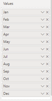
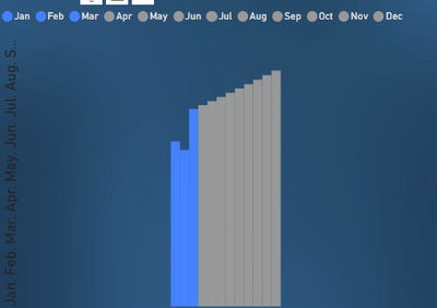
I'm trying to show this data in a bar graph, however, since the months are represented in indivual columns, I'm having to put each month in the 'values' field, which comes out showing the bars super close together and no titles on the x axis.
I would like 12 separate bars, with the name of the month below on the x axis.
Maybe I'm using the wrong visual?
Since this data is coming from excel, I've tried creating a new table to link to Power BI. However, having months as columns is proving to be difficult to work with in both...
any tips are appreciated.
Solved! Go to Solution.
- Mark as New
- Bookmark
- Subscribe
- Mute
- Subscribe to RSS Feed
- Permalink
- Report Inappropriate Content
You'll need to pivot your data in Power Query
How to Unpivot in Excel with Power Query + Video Tutorial (excelcampus.com)
Unpivot And Pivot Basics In Power BI - Query Editor Review - Enterprise DNA
Did I answer your question? Mark my post as a solution!
Proud to be a Super User!
- Mark as New
- Bookmark
- Subscribe
- Mute
- Subscribe to RSS Feed
- Permalink
- Report Inappropriate Content
Any luck?
Did I answer your question? Mark my post as a solution!
Proud to be a Super User!
- Mark as New
- Bookmark
- Subscribe
- Mute
- Subscribe to RSS Feed
- Permalink
- Report Inappropriate Content
Then you can use a single date field to create your bar graph
Did I answer your question? Mark my post as a solution!
Proud to be a Super User!
- Mark as New
- Bookmark
- Subscribe
- Mute
- Subscribe to RSS Feed
- Permalink
- Report Inappropriate Content
You'll need to pivot your data in Power Query
How to Unpivot in Excel with Power Query + Video Tutorial (excelcampus.com)
Unpivot And Pivot Basics In Power BI - Query Editor Review - Enterprise DNA
Did I answer your question? Mark my post as a solution!
Proud to be a Super User!
- Mark as New
- Bookmark
- Subscribe
- Mute
- Subscribe to RSS Feed
- Permalink
- Report Inappropriate Content
Thank you! that was super helpful and definetly acheived what I needed.
However, this month there were a few changes to the line descriptions and now I'm receiving errors in the unpivoted data and I'm not sure how to fix it. Not sure why it just didn't update normally, are you familiar with any other videos that might address refreshing data or errors in unpivoted data?


