Join us at FabCon Vienna from September 15-18, 2025
The ultimate Fabric, Power BI, SQL, and AI community-led learning event. Save €200 with code FABCOMM.
Get registeredEnhance your career with this limited time 50% discount on Fabric and Power BI exams. Ends August 31st. Request your voucher.
- Microsoft Fabric Community
- Fabric community blogs
- Power BI Community Blog
- Which pages are underperforming? Find out using Po...
- Subscribe to RSS Feed
- Mark as New
- Mark as Read
- Bookmark
- Subscribe
- Printer Friendly Page
- Report Inappropriate Content
Which pages are underperforming? Find out using Power BI and Google Analytics
- Subscribe to RSS Feed
- Mark as New
- Mark as Read
- Bookmark
- Subscribe
- Printer Friendly Page
- Report Inappropriate Content
Running a blog on your business website enables you to attract customers that are searching for information related to your business and helps you connect with them. But, do you know how your blog pages are performing against your business pages? Are you getting more customer leads due to the blog?
In this post, I am going to show you how to categorize your content based on your Blog Pages and your Business Pages. I will add a third category as this site has also a Google Analytics Glossary, and I want to understand how that is performing against the other pages/categories.
Why not do it in Google Analytics?
As you probably know, Google Analytics allows you to group your content so you can better analyze the performance on different categories.
It is not complicated to do it in the Google Analytics Admin panel, but I prefer to do it using Power Bi as it allows me to make changes retroactively.
Insights when content is categorized
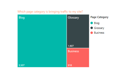
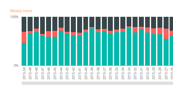
In this dashboard (see picture below), I can see:
1. How much traffic my Blog, Business and Glossary Pages are bringing to my site and looking at the data, the blog pages are by far the most popular. With the help of the blog, I can get quality customer leads to my business that hopefully lead to buying customers. Great, purposed achieved!
2. I can also see that even if the blog pages bring traffic, only a small portion of the visitors check out my Business Pages. Can I lead more blog readers in to my business pages? Further investigation should be done.

Now is your turn, Do you know how your pages are performing?
No? No worries, lets build the dashboard to find out.
Creating the dashboard: Get Data
Before you can start creating this dashboard you need to have Power BI Desktop installed (it’s FREE) and connect to Google Analytics. Once you have done that, we can start importing the data in Power BI.
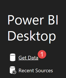
Let’s do it, open Power Bi Desktop and click on “Get Data”:
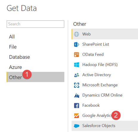
Select Google Analytics and click “Connect”:
Select your account, property, and view:

and now we will export a table with the following parameters:
• From the Time Category select “Date”
• From the Page Tracking Category select “ Page”
• And as we always need a metric, select “Unique Pageviews” from the Page Tracking category.
Why do I use Unique Pageviews instead of Users? Because “Users” is not a reliable metric.
Why do I use Sessions instead of Entrances? Because "Sessions" give a more complete hit view.
Your data should now look as below.
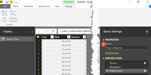
Finally, change the Name of the table to (1) “Page Categories”.
Create Date fields
We are going to create a few date columns that we will use to slice our data. Of course it is possible to import that from Google Analytics Date category, but because google has limitations about how many metrics and dimensions you can download, I prefer to download only “Date” and create the others on Power BI.
We will create a Year, Year_Week and Month Number and Page Category column.
Year Column
It’s very easy, here is how:
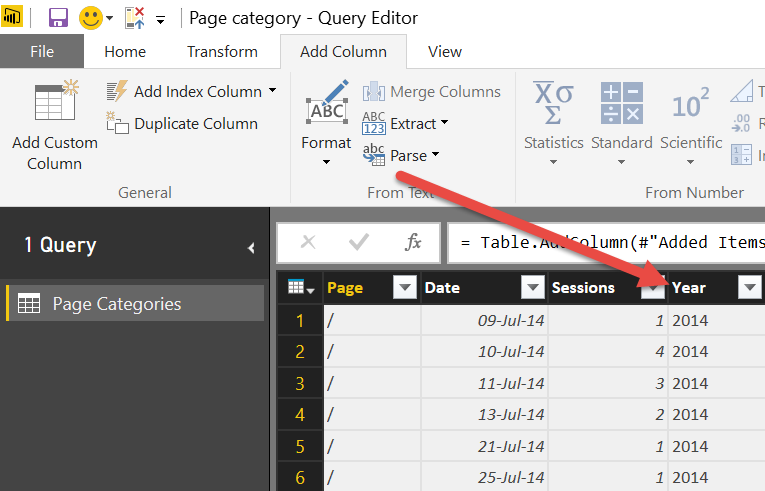
1. Click on “Add Column” tab
2. Click on “Add Column” Button
3. Give your new column a name: “Year”
4. Insert the formula: Number.ToText(Date.Year([Date]))
5. Check that there are no errors
6. and save.

And you will see your new column:
YearWeek Column
Now we are going to create a column with Year-Week data based on our “Date column”:
Follow the same steps, but use this formula instead:
[Year]&"-"&Text.PadStart(Number.ToText(Date.WeekOfYear([Date])),2,"0")
A short explanation:
• Date.WeekOfYear converts the column “Date” to a week number, ie.34
• Number.ToText converts a number to text and
• Text.PadStart adds a leading zero to the week number,ie:02
• &”-“& concatenates the year and the week with a “-“ in the middle, ie:2015-02
Month No column
Formula to get the month number so we can sort later the month name.
Date.Month([Date])
Categorize your content
Now, to be able to categorize your content, you need to have some kind of structure on your URLS. Here is how mine are structured:
1. My Glossary pages follow this pattern: /blog/glossary
2. My Blog pages follow this pattern:/blog/
NOTE: If you don’t have /blog in your URL for your blog pages, follow this tutorial.
3. And my business pages follow this 😕
So, I need to Add a New column with the following formula:
if Text.Contains([Page],"/blog/glossary") then "Glossary" else if Text.Contains([Page],"/blog") then "Blog" else "Business"
Which says, if the Page Url contains “/blog/glossary” then call it Glossary, if it contains “/blog” then call it Blog otherwise call it Business.
Easy right?

lets close and apply:

Before we start creating the dashboard we need to create one more column: Month Name. The reason I didn’t created on the steps before is because I am not aware that Power Query has that function, so we need to create it in Power Pivot.
Calculated column Month Name
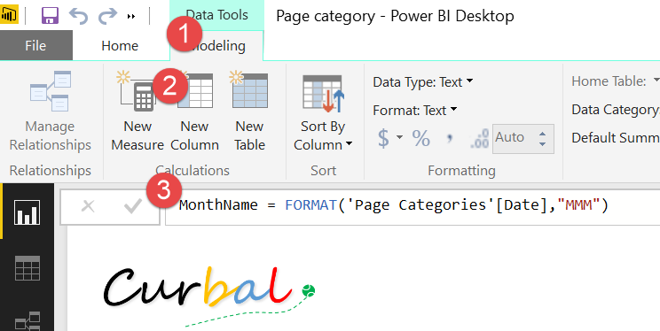
MonthName = FORMAT('Page Categories'[Date],"MMM")
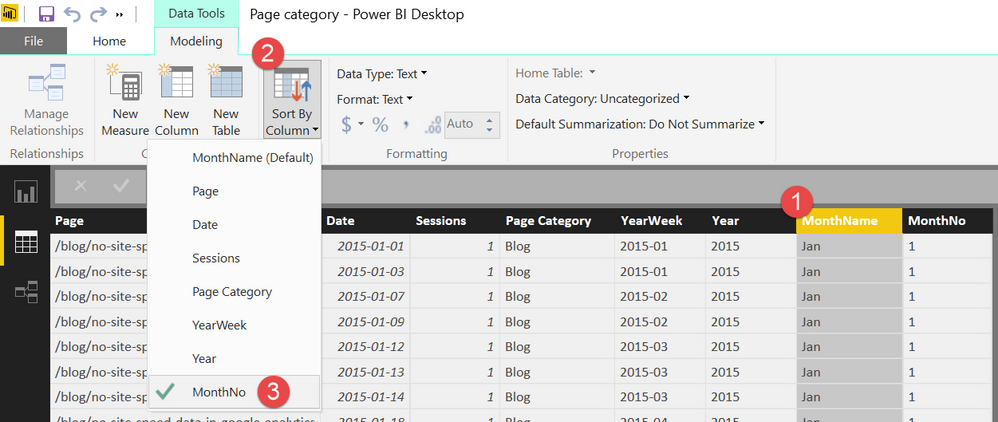
Click on the “Data” Tab
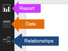
Click on the Month Name column and sort by Month No.
Building the dashboard
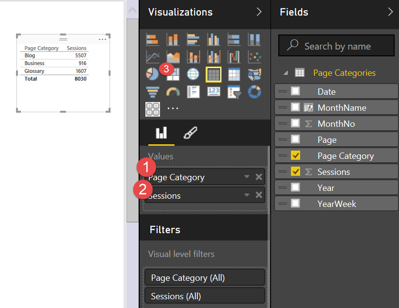
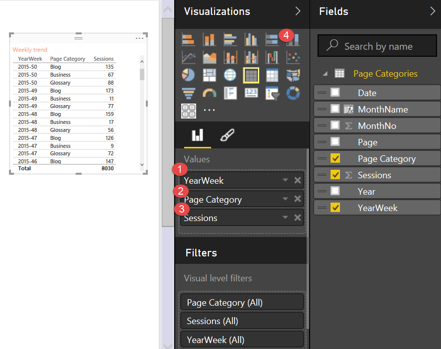
Now we can finally build the dashboard:
1. Drop the Page category
2. and Sessions fields
3. and choose tree map visualization:
Tree map visualization:
For the timeline visualization you need to:
1. Drop the Page category;
2. YearWeek
3. and Sessions
4. And choose 100% column stack visualization:
100% Stacked bar visualization;
Now, as slicers, I am using a custom visualization called chiclet slicer that you need to download from Power BI Visual Gallery if you want to use it.
Click on the three dots to import it and select that visualization for Year and Month Name:
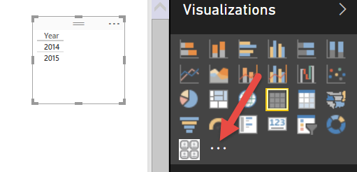
And you are done!
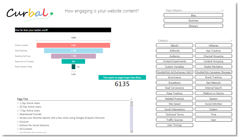
Next post: Track engagement with page categories and scroll depth
Before you start leading more readers to your business pages, you should find out how your business pages are performing.
In the next post I will show you how to track user engagement using the page categories and scroll depth! Here is a snapshot of how the dashboard will look like
You must be a registered user to add a comment. If you've already registered, sign in. Otherwise, register and sign in.
- August 2025 Power BI Update: Features That Matter ...
- 🏆 Power BI DataViz World Championships | EU Editi...
- Create a custom role in Power BI Report Server (SS...
- Do Not Use Web.BrowserContents (2/2)
- Do Not Use Web.BrowserContents (1/2)
- Calculation Groups and Field Parameters
- Power BI CI/CD Made Simple – A Beginner’s Guide wi...
- Power BI Apply All & Clear All Slicers (Step-by-St...
- Fabric Tutorial - Taming Large Data Models in Powe...
- 🧠 CALCULATE() vs. CALCULATETABLE() in Power BI: W...
-
wardy912
 on:
August 2025 Power BI Update: Features That Matter ...
-
Shubham_rai955
 on:
Create a custom role in Power BI Report Server (SS...
-
syazwansharani
 on:
Do Not Use Web.BrowserContents (2/2)
-
Shahid12523
 on:
Calculation Groups and Field Parameters
- damlapeker on: Power BI CI/CD Made Simple – A Beginner’s Guide wi...
-
Shubham_rai955
 on:
Power BI Apply All & Clear All Slicers (Step-by-St...
-
Shubham_rai955
 on:
🧠 CALCULATE() vs. CALCULATETABLE() in Power BI: W...
-
Shahid12523
 on:
Show Total When Nothing is Selected in Matrix Tabl...
-
 slindsay
on:
⚡ Translytical Task Flow Contest: Now Live!
-
 slindsay
on:
🏆 Power BI DataViz World Championships | EU Editi...
-
How To
685 -
Tips & Tricks
659 -
Events
154 -
Support insights
121 -
Opinion
83 -
DAX
66 -
Power BI
65 -
Power Query
62 -
Power BI Dev Camp
45 -
Power BI Desktop
40 -
Roundup
38 -
Dataflow
25 -
Featured User Group Leader
24 -
Power BI Embedded
20 -
Time Intelligence
19 -
Tips&Tricks
18 -
Data Protection
13 -
PowerBI REST API
12 -
Power Query Tips & Tricks
8 -
finance
8 -
Power BI Service
8 -
Direct Query
7 -
Power BI REST API
6 -
Auto ML
6 -
financial reporting
6 -
Data Analysis
6 -
Power Automate
6 -
Data Visualization
6 -
Python
6 -
Tips and Tricks
5 -
Machine Learning
5 -
Income Statement
5 -
Dax studio
5 -
powerbi
5 -
service
5 -
Power BI PowerShell
5 -
Bookmarks
4 -
Line chart
4 -
Group By
4 -
community
4 -
RLS
4 -
M language
4 -
Paginated Reports
4 -
External tool
4 -
Power BI Goals
4 -
Desktop
4 -
PowerShell
4 -
Data Science
3 -
Azure
3 -
Data model
3 -
Conditional Formatting
3 -
Visualisation
3 -
Life Sciences
3 -
Administration
3 -
M code
3 -
Visuals
3 -
SQL Server 2017 Express Edition
3 -
R script
3 -
Aggregation
3 -
Webinar
3 -
calendar
3 -
Gateways
3 -
R
3 -
M Query
3 -
CALCULATE
3 -
R visual
3 -
Reports
3 -
PowerApps
3 -
SharePoint
2 -
Power BI Installation and Updates
2 -
How Things Work
2 -
Tabular Editor
2 -
rank
2 -
ladataweb
2 -
Troubleshooting
2 -
Date DIFF
2 -
Transform data
2 -
Healthcare
2 -
Incremental Refresh
2 -
Number Ranges
2 -
Query Plans
2 -
Power BI & Power Apps
2 -
Random numbers
2 -
Day of the Week
2 -
Custom Visual
2 -
VLOOKUP
2 -
pivot
2 -
calculated column
2 -
M
2 -
hierarchies
2 -
Power BI Anniversary
2 -
Language M
2 -
inexact
2 -
Date Comparison
2 -
Power BI Premium Per user
2 -
Forecasting
2 -
REST API
2 -
Editor
2 -
Split
2 -
measure
2 -
Microsoft-flow
2 -
Paginated Report Builder
2 -
Working with Non Standatd Periods
2 -
powerbi.tips
2 -
Custom function
2 -
Reverse
2 -
PUG
2 -
Custom Measures
2 -
Filtering
2 -
Row and column conversion
2 -
Python script
2 -
Nulls
2 -
DVW Analytics
2 -
parameter
2 -
Industrial App Store
2 -
Week
2 -
Date duration
2 -
Formatting
2 -
Weekday Calendar
2 -
Support insights.
2 -
construct list
2 -
slicers
2 -
SAP
2 -
Power Platform
2 -
Workday
2 -
external tools
2 -
index
2 -
RANKX
2 -
Date
2 -
PBI Desktop
2 -
Date Dimension
2 -
Integer
2 -
Visualization
2 -
Power BI Challenge
2 -
Query Parameter
2 -
Report Server
1 -
Audit Logs
1 -
analytics pane
1 -
step by step
1 -
Top Brand Color on Map
1 -
Tutorial
1 -
Previous Date
1 -
XMLA End point
1 -
color reference
1 -
Date Time
1 -
Marker
1 -
Lineage
1 -
CSV file
1 -
conditional accumulative
1 -
Matrix Subtotal
1 -
Check
1 -
null value
1 -
Show and Tell
1 -
Cumulative Totals
1 -
Report Theme
1 -
Bookmarking
1 -
oracle
1 -
mahak
1 -
pandas
1 -
Networkdays
1 -
Button
1 -
Dataset list
1 -
Keyboard Shortcuts
1 -
Fill Function
1 -
LOOKUPVALUE()
1 -
Tips &Tricks
1 -
Plotly package
1 -
Sameperiodlastyear
1 -
Office Theme
1 -
matrix
1 -
bar chart
1 -
Measures
1 -
powerbi argentina
1 -
Canvas Apps
1 -
total
1 -
Filter context
1 -
Difference between two dates
1 -
get data
1 -
OSI
1 -
Query format convert
1 -
ETL
1 -
Json files
1 -
Merge Rows
1 -
CONCATENATEX()
1 -
take over Datasets;
1 -
Networkdays.Intl
1 -
refresh M language Python script Support Insights
1 -
Tutorial Requests
1 -
Governance
1 -
Fun
1 -
Power BI gateway
1 -
gateway
1 -
Elementary
1 -
Custom filters
1 -
Vertipaq Analyzer
1 -
powerbi cordoba
1 -
Model Driven Apps
1 -
REMOVEFILTERS
1 -
XMLA endpoint
1 -
translations
1 -
OSI pi
1 -
Parquet
1 -
Change rows to columns
1 -
remove spaces
1 -
Get row and column totals
1 -
Retail
1 -
Power BI Report Server
1 -
School
1 -
Cost-Benefit Analysis
1 -
DIisconnected Tables
1 -
Sandbox
1 -
Honeywell
1 -
Combine queries
1 -
X axis at different granularity
1 -
ADLS
1 -
Primary Key
1 -
Microsoft 365 usage analytics data
1 -
Randomly filter
1 -
Week of the Day
1 -
Azure AAD
1 -
query
1 -
Dynamic Visuals
1 -
KPI
1 -
Intro
1 -
Icons
1 -
ISV
1 -
Ties
1 -
unpivot
1 -
Practice Model
1 -
Continuous streak
1 -
ProcessVue
1 -
Create function
1 -
Table.Schema
1 -
Acknowledging
1 -
Postman
1 -
Text.ContainsAny
1 -
Power BI Show
1 -
Get latest sign-in data for each user
1 -
Power Pivot
1 -
API
1 -
Kingsley
1 -
Merge
1 -
variable
1 -
Issues
1 -
function
1 -
stacked column chart
1 -
ho
1 -
ABB
1 -
KNN algorithm
1 -
List.Zip
1 -
optimization
1 -
Artificial Intelligence
1 -
Map Visual
1 -
Text.ContainsAll
1 -
Tuesday
1 -
help
1 -
group
1 -
Scorecard
1 -
Json
1 -
Tops
1 -
financial reporting hierarchies RLS
1 -
Featured Data Stories
1 -
MQTT
1 -
Custom Periods
1 -
Partial group
1 -
Reduce Size
1 -
FBL3N
1 -
Wednesday
1 -
Q&A
1 -
Quick Tips
1 -
data
1 -
PBIRS
1 -
Usage Metrics in Power BI
1 -
Multivalued column
1 -
Pipeline
1 -
Path
1 -
Yokogawa
1 -
Dynamic calculation
1 -
Data Wrangling
1 -
native folded query
1 -
transform table
1 -
UX
1 -
Cell content
1 -
General Ledger
1 -
Thursday
1 -
update
1 -
Table
1 -
Natural Query Language
1 -
Infographic
1 -
automation
1 -
Prediction
1 -
newworkspacepowerbi
1 -
Performance KPIs
1 -
HR Analytics
1 -
keepfilters
1 -
Connect Data
1 -
Financial Year
1 -
Schneider
1 -
dynamically delete records
1 -
Copy Measures
1 -
Friday
1 -
Training
1 -
Event
1 -
Custom Visuals
1 -
Free vs Pro
1 -
Format
1 -
Active Employee
1 -
Custom Date Range on Date Slicer
1 -
refresh error
1 -
PAS
1 -
certain duration
1 -
DA-100
1 -
bulk renaming of columns
1 -
Single Date Picker
1 -
Monday
1 -
PCS
1 -
Saturday
1 -
Slicer
1 -
Visual
1 -
forecast
1 -
Regression
1 -
CICD
1 -
Current Employees
1 -
date hierarchy
1 -
relationship
1 -
SIEMENS
1 -
Multiple Currency
1 -
Power BI Premium
1 -
On-premises data gateway
1 -
Binary
1 -
Power BI Connector for SAP
1 -
Sunday
1 -
Workspace
1 -
Announcement
1 -
Features
1 -
domain
1 -
pbiviz
1 -
sport statistics
1 -
Intelligent Plant
1 -
Circular dependency
1 -
GE
1 -
Exchange rate
1 -
Dendrogram
1 -
range of values
1 -
activity log
1 -
Decimal
1 -
Charticulator Challenge
1 -
Field parameters
1 -
deployment
1 -
ssrs traffic light indicators
1 -
SQL
1 -
trick
1 -
Scripts
1 -
Color Map
1 -
Industrial
1 -
Weekday
1 -
Working Date
1 -
Space Issue
1 -
Emerson
1 -
Date Table
1 -
Cluster Analysis
1 -
Stacked Area Chart
1 -
union tables
1 -
Number
1 -
Start of Week
1 -
Tips& Tricks
1 -
Theme Colours
1 -
Text
1 -
Flow
1 -
Publish to Web
1 -
Extract
1 -
Topper Color On Map
1 -
Historians
1 -
context transition
1 -
Custom textbox
1 -
OPC
1 -
Zabbix
1 -
Label: DAX
1 -
Business Analysis
1 -
Supporting Insight
1 -
rank value
1 -
Synapse
1 -
End of Week
1 -
Tips&Trick
1 -
Excel
1 -
Showcase
1 -
custom connector
1 -
Waterfall Chart
1 -
Power BI On-Premise Data Gateway
1 -
patch
1 -
Top Category Color
1 -
A&E data
1 -
Previous Order
1 -
Substring
1 -
Wonderware
1 -
Power M
1 -
Format DAX
1 -
Custom functions
1 -
accumulative
1 -
DAX&Power Query
1 -
Premium Per User
1 -
GENERATESERIES
1
- 08-10-2025 - 08-16-2025
- 08-03-2025 - 08-09-2025
- 07-27-2025 - 08-02-2025
- 07-20-2025 - 07-26-2025
- 07-13-2025 - 07-19-2025
- 07-06-2025 - 07-12-2025
- 06-29-2025 - 07-05-2025
- 06-22-2025 - 06-28-2025
- 06-15-2025 - 06-21-2025
- 06-08-2025 - 06-14-2025
- 06-01-2025 - 06-07-2025
- 05-25-2025 - 05-31-2025
- 05-18-2025 - 05-24-2025
- View Complete Archives
