- Mark as New
- Bookmark
- Subscribe
- Mute
- Subscribe to RSS Feed
- Permalink
- Report Inappropriate Content
SUPERSTORE US SALES ANALYSIS (CY vs PY)
SUPERSTORE US SALES ANALYSIS (CY vs PY)
Source of inspiration - Originally prepared in Tableau by @NSuglani
- Mark as New
- Bookmark
- Subscribe
- Mute
- Subscribe to RSS Feed
- Permalink
- Report Inappropriate Content
- Mark as New
- Bookmark
- Subscribe
- Mute
- Subscribe to RSS Feed
- Permalink
- Report Inappropriate Content
Hello, great work! Could you please send the pbi file to zoeyzhang711@gmail.com, thank you so much!
- Mark as New
- Bookmark
- Subscribe
- Mute
- Subscribe to RSS Feed
- Permalink
- Report Inappropriate Content
Looks Great! Can you send pbix file to sjm400@gmail.com? Would greatly appreciate it!
- Mark as New
- Bookmark
- Subscribe
- Mute
- Subscribe to RSS Feed
- Permalink
- Report Inappropriate Content
Please send the PBIX file to romon.ft@gmail.com
- Mark as New
- Bookmark
- Subscribe
- Mute
- Subscribe to RSS Feed
- Permalink
- Report Inappropriate Content
- Mark as New
- Bookmark
- Subscribe
- Mute
- Subscribe to RSS Feed
- Permalink
- Report Inappropriate Content
Hello Arbaz Ahmad,
What an amazing and excellent report! Could you possibly please send pbix at azizisaqov91@gmail.com.
Thanks
Aziz.
- Mark as New
- Bookmark
- Subscribe
- Mute
- Subscribe to RSS Feed
- Permalink
- Report Inappropriate Content
Amazing! Please send the PBIX file to marquuezin@hotmail.com
- Mark as New
- Bookmark
- Subscribe
- Mute
- Subscribe to RSS Feed
- Permalink
- Report Inappropriate Content
Hi@Arbaz_Ahmad , really need your help~
I've seen lots of dashboard work from you, very great work and it really help me to think in a different way when i try to perfect my dashboard work.
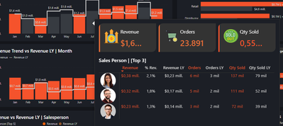
As i learned from your work, i gradually find that in dashboard you use many details like conclusive data/illustration and icon to add information to the chart/table, i realize that's a very clever way to increase information density. I have tried my best to imitate this technique, but there's something i didn't figure out :
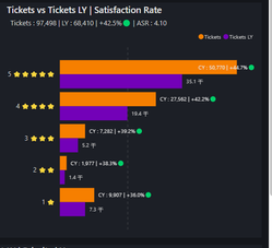
The label which contain data and icon in bar diagram , is these SVG ? where did you change the default label setting so it can show the label you want?
i have tried to use svg in the [automation label] setting, but it fail to show up. I wonder if it possible that you show me the dax you use for this kind of label and where did you put these measures?
Sorry to bother you, i would appreciate it if you could give me a reply at your earliest convenience . And again thanks your wonderful works!
- Mark as New
- Bookmark
- Subscribe
- Mute
- Subscribe to RSS Feed
- Permalink
- Report Inappropriate Content
Hi @Joanne_Wan
It is my pleasure that you find my dashboard helpful.
The image you attached is not SVG. i made a column in raw data, where i used stars to show the rating.
you can write dax to obtain this output, like write IF statement
Thanks,
- Mark as New
- Bookmark
- Subscribe
- Mute
- Subscribe to RSS Feed
- Permalink
- Report Inappropriate Content
Thanks, i have solved my problem. 🤝
- Mark as New
- Bookmark
- Subscribe
- Mute
- Subscribe to RSS Feed
- Permalink
- Report Inappropriate Content
My pleasure
Thanks,
- Mark as New
- Bookmark
- Subscribe
- Mute
- Subscribe to RSS Feed
- Permalink
- Report Inappropriate Content
Que grafico me permite tener esa visualización al posicionarse sobre la barra?
- Mark as New
- Bookmark
- Subscribe
- Mute
- Subscribe to RSS Feed
- Permalink
- Report Inappropriate Content
Pueden compartirme el PBIX? (mikel.zarate@proquinorte.com)
- Mark as New
- Bookmark
- Subscribe
- Mute
- Subscribe to RSS Feed
- Permalink
- Report Inappropriate Content
Hey @Arbaz_Ahmad . Great re-creation of a Tableau dashboard. I do agree with the original designer, @NSuglani, that you perhaps should have recognised your source of inspiration. Knowing a super user would simply copy the work of another does not make me think that I would be interested in any further work by that user. This is especially true where users post only images of the perported work and not the pbix to show their actual technical abilities. It makes me think the poster is attempting to impress potential employers, or is merely seeking kudos.
I'm transitioning from Tableau to Power BI and appreciate the skill required to build in both platforms. If you feel inspired to re-create a board you saw in Tableau Public, say so! Not doing implies you designed the board yourself. We can all build dashboards! Designing great dashboards with great UI/UX is the mark of a great developer over a simple builder.
- Mark as New
- Bookmark
- Subscribe
- Mute
- Subscribe to RSS Feed
- Permalink
- Report Inappropriate Content
Hi @Paul-Wyatt
Thanks for your appreciation, I should have mentioned the source of inspiration but I don't know the person who prepared this in Tableau,
Thanks to @NSuglani for his comment.
Now i mentioned.
Thanks,
- Mark as New
- Bookmark
- Subscribe
- Mute
- Subscribe to RSS Feed
- Permalink
- Report Inappropriate Content
You should state the source of inspiration for your work as this has been lifted from my Tableau dashboard (which I made before you), right down to the logo you used in the top left!
- Mark as New
- Bookmark
- Subscribe
- Mute
- Subscribe to RSS Feed
- Permalink
- Report Inappropriate Content
Hi.. @NSuglani
Actually, I don't konw the person who prepared this in Tableau, I just found the image of the dashboard but anyway thanks for the comment. I will mention source of inspiration.
Thanks,
- Mark as New
- Bookmark
- Subscribe
- Mute
- Subscribe to RSS Feed
- Permalink
- Report Inappropriate Content
that is very usefull.would you share the pbix file sarah.rasti1991@gmail.com
- Mark as New
- Bookmark
- Subscribe
- Mute
- Subscribe to RSS Feed
- Permalink
- Report Inappropriate Content
- Mark as New
- Bookmark
- Subscribe
- Mute
- Subscribe to RSS Feed
- Permalink
- Report Inappropriate Content
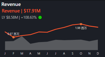
Great work!What visual to be used in below chart and how to creat?
Is there anyone can help answer? Appriciate your reply.


