Utilization Chart in R
06-27-2017 02:15 AM - last edited 06-27-2017 20:30 PM
36430 Views


Anonymous
Not applicable
- Mark as New
- Bookmark
- Subscribe
- Mute
- Subscribe to RSS Feed
- Permalink
- Report Inappropriate Content
Utilization Chart in R
06-27-2017
02:15 AM

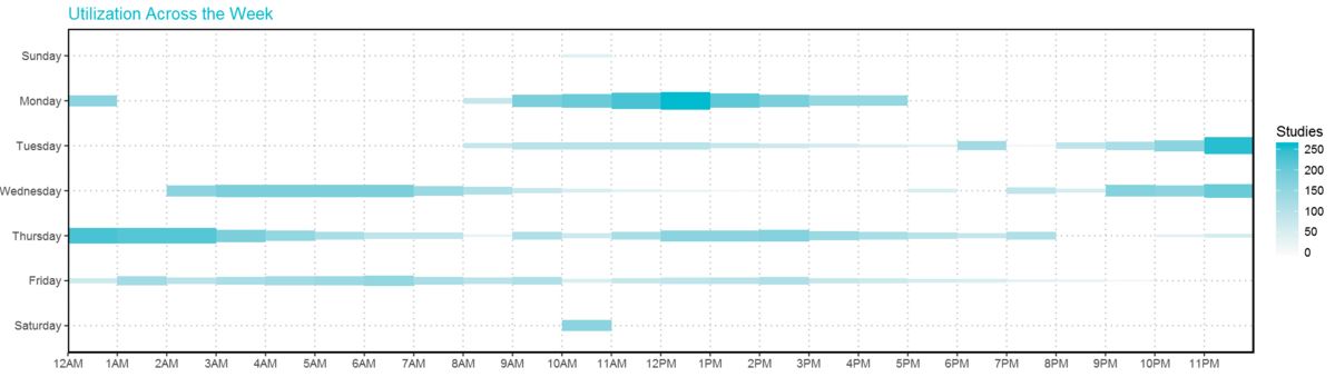
This Utilization chart has the effect of combination of Heat Map and Bubble Chart. It shows the amount of usage across 24/7.
The height of each rectangle can be adjusted and the density as well.
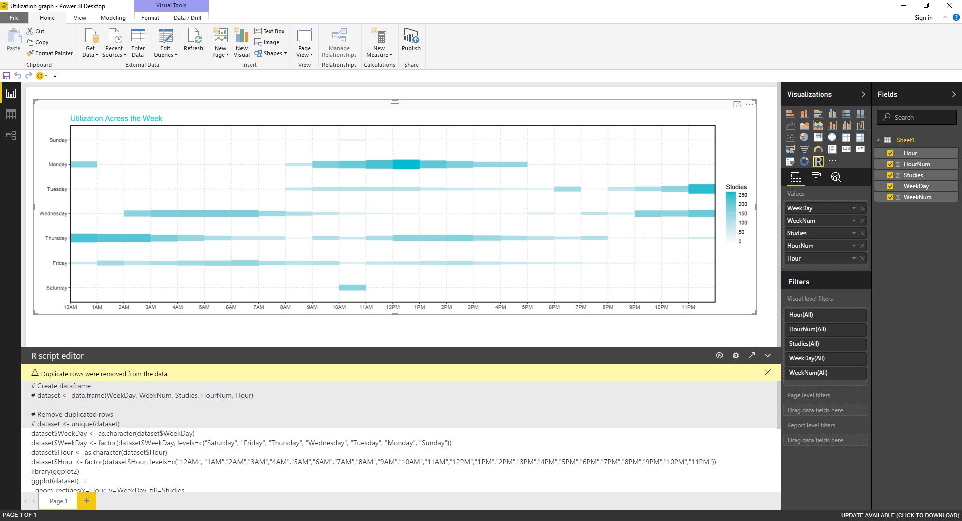
I also publish this chart with plotly: Chart link
- Mark as New
- Bookmark
- Subscribe
- Mute
- Subscribe to RSS Feed
- Permalink
- Report Inappropriate Content
12-11-2017
07:47 AM
I made an account just to say Thank you for this. This is a great graph and a great example. Much appreicated.
- Mark as New
- Bookmark
- Subscribe
- Mute
- Subscribe to RSS Feed
- Permalink
- Report Inappropriate Content
12-13-2017
07:20 PM
I appreicated your comments, too . Thanks heaps!!!
- Mark as New
- Bookmark
- Subscribe
- Mute
- Subscribe to RSS Feed
- Permalink
- Report Inappropriate Content
12-13-2017
07:18 PM
Thanks heaps mate. ![]()
- Mark as New
- Bookmark
- Subscribe
- Mute
- Subscribe to RSS Feed
- Permalink
- Report Inappropriate Content
07-03-2017
06:39 AM
Nice showcase ! You can use plotly in Power BI
https://github.com/Microsoft/PowerBI-visuals/blob/master/RVisualTutorial/CreateRHTML.md
- Mark as New
- Bookmark
- Subscribe
- Mute
- Subscribe to RSS Feed
- Permalink
- Report Inappropriate Content
07-03-2017
04:08 PM
THANKS!!
- Mark as New
- Bookmark
- Subscribe
- Mute
- Subscribe to RSS Feed
- Permalink
- Report Inappropriate Content
12-13-2017
12:09 AM
Hi @Anonymous
Great chart! Please consider making it a custom visual do get much greater exposure in the community.
We can assist in its creation if you will decide to go for it 🙂