FabCon is coming to Atlanta
Join us at FabCon Atlanta from March 16 - 20, 2026, for the ultimate Fabric, Power BI, AI and SQL community-led event. Save $200 with code FABCOMM.
Register now!- Power BI forums
- Get Help with Power BI
- Desktop
- Service
- Report Server
- Power Query
- Mobile Apps
- Developer
- DAX Commands and Tips
- Custom Visuals Development Discussion
- Health and Life Sciences
- Power BI Spanish forums
- Translated Spanish Desktop
- Training and Consulting
- Instructor Led Training
- Dashboard in a Day for Women, by Women
- Galleries
- Data Stories Gallery
- Themes Gallery
- Contests Gallery
- Quick Measures Gallery
- Visual Calculations Gallery
- Notebook Gallery
- Translytical Task Flow Gallery
- TMDL Gallery
- R Script Showcase
- Webinars and Video Gallery
- Ideas
- Custom Visuals Ideas (read-only)
- Issues
- Issues
- Events
- Upcoming Events
Calling all Data Engineers! Fabric Data Engineer (Exam DP-700) live sessions are back! Starting October 16th. Sign up.
- Power BI forums
- Forums
- Get Help with Power BI
- Power Query
- indexed time series
- Subscribe to RSS Feed
- Mark Topic as New
- Mark Topic as Read
- Float this Topic for Current User
- Bookmark
- Subscribe
- Printer Friendly Page
- Mark as New
- Bookmark
- Subscribe
- Mute
- Subscribe to RSS Feed
- Permalink
- Report Inappropriate Content
indexed time series
Hi All
I'm a complete newbie to DAX, while much more experienced with VBA and MySQL. I'm working with percentage growth time series data, sequentially stored in a table by Identifier, Date and Return. Return is transformed from a percentage figure to a factor in the SQL query already (Return/100+1 As Return). To create and indexed time series chart I have entered the following DAX code as a measure:
ReturnTmp =
CALCULATE (
PRODUCT ( Table1[Return] ) * 100 ;
FILTER ( ALL ( Table1 ); Table1[Date] <= MAX ( Table1[Date] ) );
VALUES ( Table1[Identifier] )
)
A - This works fine, but I'm struggling to have the first Return value in the chart set to 100 while all following returns in the time series remain as calculated above. I've tried several approaches with IF , IF &&, and COUNTROW statements, but no success.
B - Once the measure works I have to include it into the final measure by:
ReturnCum =
AVERAGEX ( Table1;Table1[ReturnTmp])
As I understood, there is not possibility to have it in one single measure. Is this correct?
Thank you very much for help.
Solved! Go to Solution.
- Mark as New
- Bookmark
- Subscribe
- Mute
- Subscribe to RSS Feed
- Permalink
- Report Inappropriate Content
Anybody who's interested, here's the solution after a few hours of try and error:
ReturnTmp =
CALCULATE (
IF ( COUNTROWS ( Table1 ) = 1 ; 100 ; PRODUCT ( Table1 [Return] ) * 100 ) ;
FILTER ( ALL ( Table1 ) ; Table1[Date] <= MAX (Table1[Date] ) ) ;
VALUES ( Table1[Identifier] )
)
This is a rather standard chart in financial analysis for plotting return series.
- Mark as New
- Bookmark
- Subscribe
- Mute
- Subscribe to RSS Feed
- Permalink
- Report Inappropriate Content
For Question A
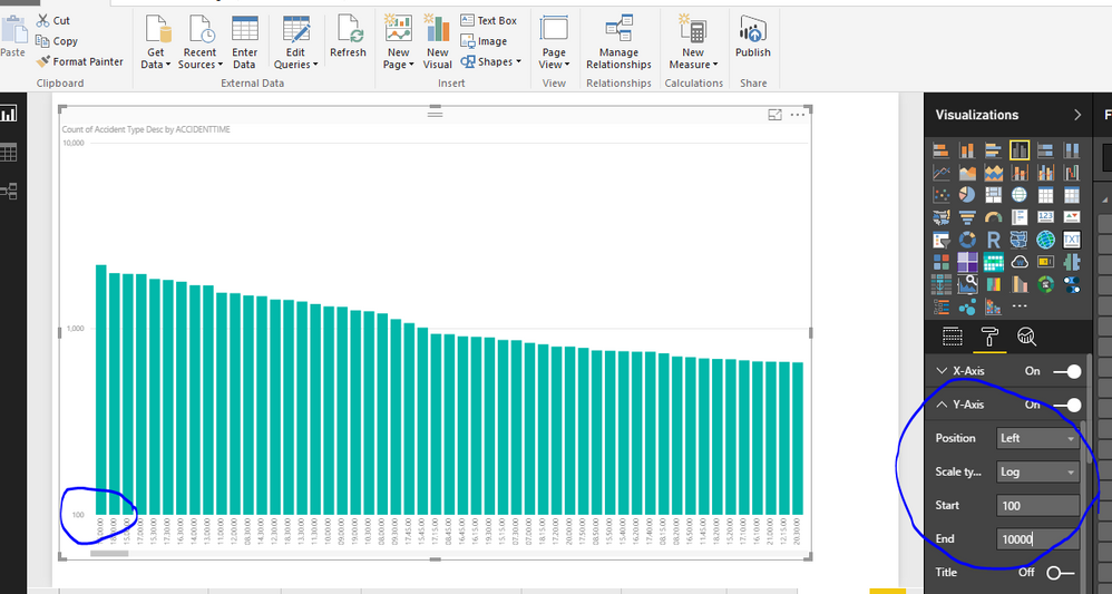
See the screenshot, You can adjust the settings shown in the screenshot in Analytics pane.
For Question B
You can use Variables. For more info, Follow this BLOG
Bhavesh
Love the Self Service BI.
Please use the 'Mark as answer' link to mark a post that answers your question. If you find a reply helpful, please remember to give Kudos.
- Mark as New
- Bookmark
- Subscribe
- Mute
- Subscribe to RSS Feed
- Permalink
- Report Inappropriate Content
Hi Bavesh
Thank you very much for your reply. I will work through the blog for question B.
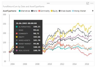
The proposed solution for A would only set the crossing point of the x-Axis to the y-Axis at 100 and not rebase the time series themselves to 100. See this screenshot, I need the series all to start at 100 for correct comparability of the graphs in the chart.
Thank you very much for any help on this.
Otto
- Mark as New
- Bookmark
- Subscribe
- Mute
- Subscribe to RSS Feed
- Permalink
- Report Inappropriate Content
Hi @OCK,
If I understand you correctly, you want to show the first point for all series which are around 100 in the line chart, right?
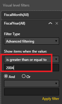
If that is a case, assume in 2004 year, all series data point are around 100. Then you can drag the X-axis field into the Visual level filter, set the "is greater than or equal to" 2004.
But if in 2004 year, only 1 series data point around 100, while other series's data point are around 100 in 2008 year. In this scenario, we can't move those series to the left side of the chart, to display on 2004 year. As in the chart, X-axis and Legend are groups, the position data points values display is based on the intersection of the X-axis and Legend.
Best Regards,
Qiuyun Yu
If this post helps, then please consider Accept it as the solution to help the other members find it more quickly.
- Mark as New
- Bookmark
- Subscribe
- Mute
- Subscribe to RSS Feed
- Permalink
- Report Inappropriate Content
Hi Qiuyun Yu,
Thank you very much for your reply. Unfortunately this cannot be done with filtering data on the visual, it must be set in the DAX function. The first value in the series must be set to 100 while all following items will apply the formula as outline above. Hence it must be something around this:
IF (Table1[Date] = MIN ( Table1[Date] ) ; 100 ; PRODUCT ( Table1[Return] ) * 100
With this filter applied:
FILTER ( ALL ( Table1 ); Table1[Date] <= MAX ( Table1[Date] ) );
VALUES ( Table1[Identifier] )
Thank you,
OCK
- Mark as New
- Bookmark
- Subscribe
- Mute
- Subscribe to RSS Feed
- Permalink
- Report Inappropriate Content
Anybody who's interested, here's the solution after a few hours of try and error:
ReturnTmp =
CALCULATE (
IF ( COUNTROWS ( Table1 ) = 1 ; 100 ; PRODUCT ( Table1 [Return] ) * 100 ) ;
FILTER ( ALL ( Table1 ) ; Table1[Date] <= MAX (Table1[Date] ) ) ;
VALUES ( Table1[Identifier] )
)
This is a rather standard chart in financial analysis for plotting return series.
Helpful resources

FabCon Global Hackathon
Join the Fabric FabCon Global Hackathon—running virtually through Nov 3. Open to all skill levels. $10,000 in prizes!

Power BI Monthly Update - October 2025
Check out the October 2025 Power BI update to learn about new features.


