Join the #PBI10 DataViz contest
Power BI is turning 10, and we’re marking the occasion with a special community challenge. Use your creativity to tell a story, uncover trends, or highlight something unexpected.
Get startedJoin us at FabCon Vienna from September 15-18, 2025, for the ultimate Fabric, Power BI, SQL, and AI community-led learning event. Save €200 with code FABCOMM. Get registered
- Microsoft Fabric Community
- Fabric community blogs
- Power BI Community Blog
- Supercharge Your Visuals: Easy Conditional Formatt...
- Subscribe to RSS Feed
- Mark as New
- Mark as Read
- Bookmark
- Subscribe
- Printer Friendly Page
- Report Inappropriate Content
Supercharge Your Visuals: Easy Conditional Formatting in Power BI Without DAX
- Subscribe to RSS Feed
- Mark as New
- Mark as Read
- Bookmark
- Subscribe
- Printer Friendly Page
- Report Inappropriate Content
Are you looking to add an extra layer of insight to your Power BI visualizations without diving into complex DAX expressions? Well, buckle up because I'm about to share a simple yet powerful technique that allows you to highlight maximum and minimum data points on your visuals with ease.
In Power BI, conditional formatting is a powerful feature that allows you to visually emphasize certain data points based on specific conditions. Typically, highlighting maximum and minimum values would involve writing DAX expressions. However, there's a lesser-known method that achieves the same result without touching a single line of DAX code.
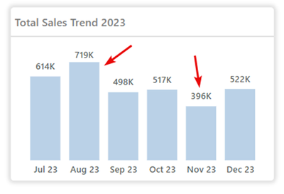
Begin by selecting the visual element (e.g., column chart, bar chart, etc.) where you want to highlight the maximum and minimum data points. In this chart, I need to highlight the bars for the highest and the lowest sales based on the Total Sales measure used here.
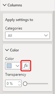
Next simply click on the "FX" button located within the Column formatting section of the visual to apply the conditional formatting.
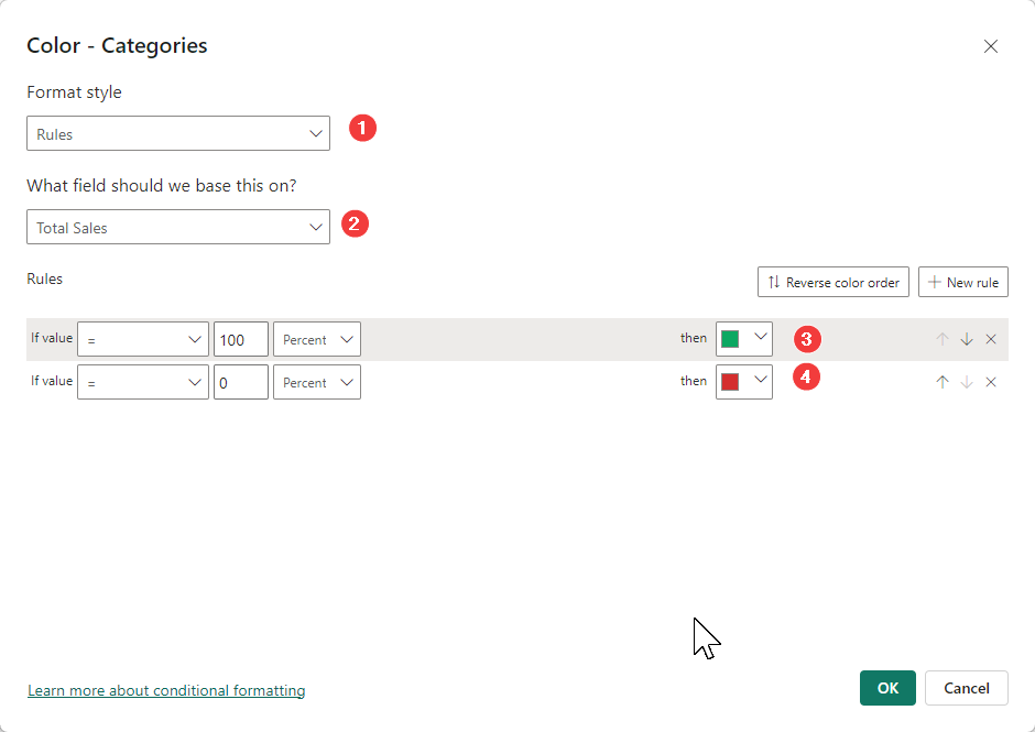
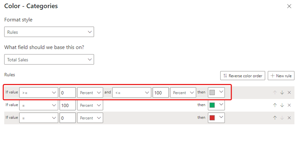
Apply percentage-based formatting rules to the visual using the Total Sales measure. Set 100% for the maximum value and 0% for the minimum value, then click OK as shown below.
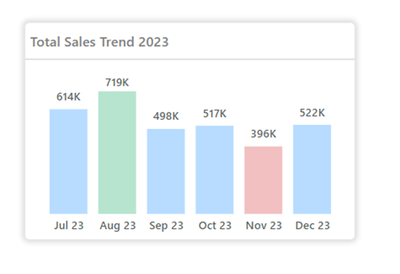
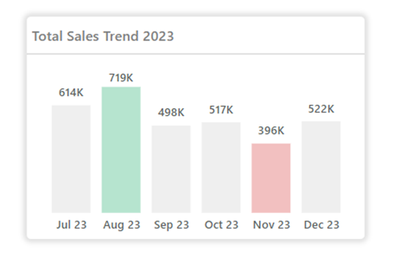
In this illustration, observe the column chart where the highest and lowest data points are emphasized through percentage-based formatting rules. Take note of how the tallest and shortest columns catch the eye, effectively highlighting extreme values without relying on complex DAX computations.
If you wish to assign a distinct color to data points other than those representing the maximum and minimum values in the bars, you can add a rule at the top as outlined below:
In conclusion, utilizing percentage-based formatting rules in Power BI empowers you to easily emphasize maximum and minimum data points in your visuals, enriching their clarity and visual attractiveness. This approach simplifies the process while offering enhanced flexibility and creativity in designing your dashboards.
Next time you aim to elevate the visual appeal of your Power BI reports, keep this handy technique in mind to breathe new life into your visuals. Stay tuned for additional tips and tricks to optimize your Power BI experience. Until then, happy visualizing
You must be a registered user to add a comment. If you've already registered, sign in. Otherwise, register and sign in.
- #PBI10 Dataviz Contest | Frequently Asked Question...
- How to Organize Measures Effectively in Power BI
- Power BI Enhancements You Need to Know - Part 6: P...
- #PBI10 Dataviz Contest | Meet the Judges
- Dataviz Contests - How to Submit
- #PBI10 Dataviz Contest
- Unlock Deeper Insights: Data Modeling Best Practic...
- How to Display Power BI Reports in a Continuous Sl...
- What Power BI Developers Often Miss and Why Does I...
- Power BI Enhancements You Need to Know – Part 5: O...
- warunad on: How to Organize Measures Effectively in Power BI
-
Magudeswaran_MR
 on:
Power BI Enhancements You Need to Know - Part 6: P...
-
 technolog
on:
#PBI10 Dataviz Contest | Meet the Judges
-
 slindsay
on:
Dataviz Contests - How to Submit
-
 slindsay
on:
#PBI10 Dataviz Contest
- TharunChalla on: What Power BI Developers Often Miss and Why Does I...
-
Magudeswaran_MR
 on:
Power BI Enhancements You Need to Know – Part 5: O...
-
Magudeswaran_MR
 on:
The Power of Automation: One-Click DAX Formulas an...
-
Olayemi_Awofe
 on:
Power BI Enhancements You Need to Know – Part 4: T...
-
 Ahmedx
on:
Custom Visualization of a 100% Stacked Bar Chart i...
-
How to
714 -
Tips & Tricks
692 -
Events
142 -
Support insights
121 -
Opinion
97 -
DAX
66 -
Power BI
65 -
Power Query
62 -
Power BI Dev Camp
45 -
Power BI Desktop
40 -
Roundup
39 -
Dataflow
22 -
Power BI Embedded
20 -
Featured User Group Leader
20 -
Time Intelligence
19 -
Tips&Tricks
18 -
PowerBI REST API
12 -
Data Protection
10 -
Power BI Service
8 -
Power Query Tips & Tricks
8 -
finance
8 -
Direct Query
7 -
Power Automate
6 -
Data Visualization
6 -
Python
6 -
Power BI REST API
6 -
Auto ML
6 -
financial reporting
6 -
Data Analysis
6 -
powerbi
5 -
service
5 -
Power BI PowerShell
5 -
Machine Learning
5 -
Income Statement
5 -
Dax studio
5 -
Power BI Goals
4 -
PowerShell
4 -
Desktop
4 -
Bookmarks
4 -
Line chart
4 -
Group By
4 -
community
4 -
RLS
4 -
M language
4 -
Paginated Reports
4 -
External tool
4 -
R
3 -
M Query
3 -
Webinar
3 -
CALCULATE
3 -
R visual
3 -
Reports
3 -
PowerApps
3 -
Data Science
3 -
Azure
3 -
Data model
3 -
Conditional Formatting
3 -
Visualisation
3 -
Life Sciences
3 -
Administration
3 -
M code
3 -
Visuals
3 -
SQL Server 2017 Express Edition
3 -
R script
3 -
Aggregation
3 -
calendar
3 -
Gateways
3 -
slicers
2 -
SAP
2 -
Power Platform
2 -
Workday
2 -
external tools
2 -
index
2 -
RANKX
2 -
PBI Desktop
2 -
Date Dimension
2 -
Integer
2 -
Visualization
2 -
Power BI Challenge
2 -
Query Parameter
2 -
Date
2 -
SharePoint
2 -
Power BI Installation and Updates
2 -
How Things Work
2 -
Tabular Editor
2 -
rank
2 -
ladataweb
2 -
Troubleshooting
2 -
Date DIFF
2 -
Transform data
2 -
Healthcare
2 -
Tips and Tricks
2 -
Incremental Refresh
2 -
Number Ranges
2 -
Query Plans
2 -
Power BI & Power Apps
2 -
Random numbers
2 -
Day of the Week
2 -
Custom Visual
2 -
VLOOKUP
2 -
pivot
2 -
calculated column
2 -
M
2 -
hierarchies
2 -
Power BI Anniversary
2 -
Language M
2 -
inexact
2 -
Date Comparison
2 -
Power BI Premium Per user
2 -
Forecasting
2 -
REST API
2 -
Editor
2 -
Split
2 -
measure
2 -
Microsoft-flow
2 -
Paginated Report Builder
2 -
Working with Non Standatd Periods
2 -
powerbi.tips
2 -
Custom function
2 -
Reverse
2 -
PUG
2 -
Custom Measures
2 -
Filtering
2 -
Row and column conversion
2 -
Python script
2 -
Nulls
2 -
DVW Analytics
2 -
parameter
2 -
Industrial App Store
2 -
Week
2 -
Date duration
2 -
Formatting
2 -
Weekday Calendar
2 -
Support insights.
2 -
construct list
2 -
Training
1 -
Announcement
1 -
Features
1 -
domain
1 -
pbiviz
1 -
sport statistics
1 -
Intelligent Plant
1 -
Circular dependency
1 -
GE
1 -
Exchange rate
1 -
Dendrogram
1 -
range of values
1 -
activity log
1 -
Decimal
1 -
Charticulator Challenge
1 -
Field parameters
1 -
deployment
1 -
ssrs traffic light indicators
1 -
SQL
1 -
trick
1 -
Scripts
1 -
Color Map
1 -
Industrial
1 -
Weekday
1 -
Working Date
1 -
Space Issue
1 -
Emerson
1 -
Date Table
1 -
Cluster Analysis
1 -
Stacked Area Chart
1 -
union tables
1 -
Number
1 -
Start of Week
1 -
Tips& Tricks
1 -
Workspace
1 -
Theme Colours
1 -
Text
1 -
Flow
1 -
Publish to Web
1 -
Extract
1 -
Topper Color On Map
1 -
Historians
1 -
context transition
1 -
Custom textbox
1 -
OPC
1 -
Zabbix
1 -
Label: DAX
1 -
Business Analysis
1 -
Supporting Insight
1 -
rank value
1 -
Synapse
1 -
End of Week
1 -
Tips&Trick
1 -
Showcase
1 -
custom connector
1 -
Waterfall Chart
1 -
Power BI On-Premise Data Gateway
1 -
patch
1 -
Top Category Color
1 -
A&E data
1 -
Previous Order
1 -
Substring
1 -
Wonderware
1 -
Power M
1 -
Format DAX
1 -
Custom functions
1 -
accumulative
1 -
DAX&Power Query
1 -
Premium Per User
1 -
GENERATESERIES
1 -
Report Server
1 -
Audit Logs
1 -
analytics pane
1 -
step by step
1 -
Top Brand Color on Map
1 -
Tutorial
1 -
Previous Date
1 -
XMLA End point
1 -
color reference
1 -
Date Time
1 -
Marker
1 -
Lineage
1 -
CSV file
1 -
conditional accumulative
1 -
Matrix Subtotal
1 -
Check
1 -
null value
1 -
Excel
1 -
Cumulative Totals
1 -
Report Theme
1 -
Bookmarking
1 -
oracle
1 -
mahak
1 -
pandas
1 -
Networkdays
1 -
Button
1 -
Dataset list
1 -
Keyboard Shortcuts
1 -
Fill Function
1 -
LOOKUPVALUE()
1 -
Tips &Tricks
1 -
Plotly package
1 -
Sameperiodlastyear
1 -
Office Theme
1 -
matrix
1 -
bar chart
1 -
Measures
1 -
powerbi argentina
1 -
Canvas Apps
1 -
total
1 -
Filter context
1 -
Difference between two dates
1 -
get data
1 -
OSI
1 -
Query format convert
1 -
ETL
1 -
Json files
1 -
Merge Rows
1 -
CONCATENATEX()
1 -
take over Datasets;
1 -
Networkdays.Intl
1 -
refresh M language Python script Support Insights
1 -
Governance
1 -
Fun
1 -
Power BI gateway
1 -
gateway
1 -
Elementary
1 -
Custom filters
1 -
Vertipaq Analyzer
1 -
powerbi cordoba
1 -
Model Driven Apps
1 -
REMOVEFILTERS
1 -
XMLA endpoint
1 -
translations
1 -
OSI pi
1 -
Parquet
1 -
Change rows to columns
1 -
remove spaces
1 -
Get row and column totals
1 -
Retail
1 -
Power BI Report Server
1 -
School
1 -
Cost-Benefit Analysis
1 -
DIisconnected Tables
1 -
Sandbox
1 -
Honeywell
1 -
Combine queries
1 -
X axis at different granularity
1 -
ADLS
1 -
Primary Key
1 -
Microsoft 365 usage analytics data
1 -
Randomly filter
1 -
Week of the Day
1 -
Azure AAD
1 -
query
1 -
Dynamic Visuals
1 -
KPI
1 -
Intro
1 -
Icons
1 -
ISV
1 -
Ties
1 -
unpivot
1 -
Practice Model
1 -
Continuous streak
1 -
ProcessVue
1 -
Create function
1 -
Table.Schema
1 -
Acknowledging
1 -
Postman
1 -
Text.ContainsAny
1 -
Power BI Show
1 -
Get latest sign-in data for each user
1 -
API
1 -
Kingsley
1 -
Merge
1 -
variable
1 -
Issues
1 -
function
1 -
stacked column chart
1 -
ho
1 -
ABB
1 -
KNN algorithm
1 -
List.Zip
1 -
optimization
1 -
Artificial Intelligence
1 -
Map Visual
1 -
Text.ContainsAll
1 -
Tuesday
1 -
help
1 -
group
1 -
Scorecard
1 -
Json
1 -
Tops
1 -
financial reporting hierarchies RLS
1 -
Featured Data Stories
1 -
MQTT
1 -
Custom Periods
1 -
Partial group
1 -
Reduce Size
1 -
FBL3N
1 -
Wednesday
1 -
Power Pivot
1 -
Quick Tips
1 -
data
1 -
PBIRS
1 -
Usage Metrics in Power BI
1 -
Multivalued column
1 -
Pipeline
1 -
Path
1 -
Yokogawa
1 -
Dynamic calculation
1 -
Data Wrangling
1 -
native folded query
1 -
transform table
1 -
UX
1 -
Cell content
1 -
General Ledger
1 -
Thursday
1 -
Table
1 -
Natural Query Language
1 -
Infographic
1 -
automation
1 -
Prediction
1 -
newworkspacepowerbi
1 -
Performance KPIs
1 -
HR Analytics
1 -
keepfilters
1 -
Connect Data
1 -
Financial Year
1 -
Schneider
1 -
dynamically delete records
1 -
Copy Measures
1 -
Friday
1 -
Q&A
1 -
Event
1 -
Custom Visuals
1 -
Free vs Pro
1 -
Format
1 -
Active Employee
1 -
Custom Date Range on Date Slicer
1 -
refresh error
1 -
PAS
1 -
certain duration
1 -
DA-100
1 -
bulk renaming of columns
1 -
Single Date Picker
1 -
Monday
1 -
PCS
1 -
Saturday
1 -
update
1 -
Slicer
1 -
Visual
1 -
forecast
1 -
Regression
1 -
CICD
1 -
Current Employees
1 -
date hierarchy
1 -
relationship
1 -
SIEMENS
1 -
Multiple Currency
1 -
Power BI Premium
1 -
On-premises data gateway
1 -
Binary
1 -
Power BI Connector for SAP
1 -
Sunday
1
- 06-29-2025 - 06-30-2025
- 06-22-2025 - 06-28-2025
- 06-15-2025 - 06-21-2025
- 06-08-2025 - 06-14-2025
- 06-01-2025 - 06-07-2025
- 05-25-2025 - 05-31-2025
- 05-18-2025 - 05-24-2025
- 05-11-2025 - 05-17-2025
- 05-04-2025 - 05-10-2025
- 04-27-2025 - 05-03-2025
- 04-20-2025 - 04-26-2025
- 04-13-2025 - 04-19-2025
- 04-06-2025 - 04-12-2025
- 03-30-2025 - 04-05-2025
- View Complete Archives
