New Offer! Become a Certified Fabric Data Engineer
Check your eligibility for this 50% exam voucher offer and join us for free live learning sessions to get prepared for Exam DP-700.
Get StartedJoin us at the 2025 Microsoft Fabric Community Conference. March 31 - April 2, Las Vegas, Nevada. Use code FABINSIDER for $400 discount. Register now
- Microsoft Fabric Community
- Fabric community blogs
- Power BI Community Blog
- Light & Dark theme together in Power BI
- Subscribe to RSS Feed
- Mark as New
- Mark as Read
- Bookmark
- Subscribe
- Printer Friendly Page
- Report Inappropriate Content
- Subscribe to RSS Feed
- Mark as New
- Mark as Read
- Bookmark
- Subscribe
- Printer Friendly Page
- Report Inappropriate Content
Initial Setup
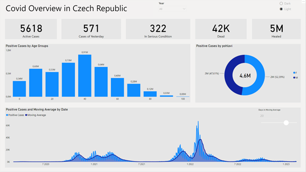
First I will introduce my report, which is a basic report based on covid data. The theme we see at this moment is the default one:
As we can see, the report contains all kind of visuals like cards, donut charts, slicer etc.
Problem Solving
1. Creating "Switch"
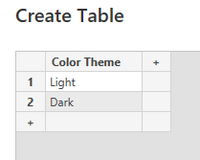
In the first step we need to think what kind of color combinations we want to have and what kind of themes we want to offer to our end users. In my case I will use only two color combinations but of course more can be added. My themes will be called „Light“ and „Dark“.
After the first step I need to create a switch, which will change the colors. The easiest solution is to create a new table.
I will call my new table as „Themes“.
Since I want to use those two values in my report, I will use them in a new slicer with a single select option:
2. Creating measures
Next step requires to write few DAX measures. Before we write any measure we need to think what elements we want to change in our report. Do we want to change visual background? Do we want to change color of the titles or legends? All those questions must be answered first.
In my case I will change following:
- Canvas background.
- Visual background.
- All visible text in the report.
With my goals above I will create three measures. Let’s start with the very first one.
Measure needs to return different value based on Color Theme slicer, for that I am going to use SWITCH statement with SELECTEDVALUE. Measure bellow basically says „If the selected theme is Light, give me hex color code of #F3F2F1 (which is light gray color) or in the case of Dark , give me #020202 (which is dark shade of gray). Those color codes can be adjusted of course.
Canvas Background =
SWITCH( SELECTEDVALUE( Themes[Color Theme]), "Light"," #f3f2f1", "Dark", "#020202" )
With the same logic I will create my two other measures, only the color codes will be different.
Visual Background =
SWITCH( SELECTEDVALUE( Themes[Color Theme]), "Light", "#e6e6e6", "Dark", "#041C32" )
Text Color =
SWITCH( SELECTEDVALUE( Themes[Color Theme]), "Light", "#000000", "Dark", "#FFFFFF" )
3. Setting up the visuals
Now we have everything prepared and we need to use those measures in our visuals.
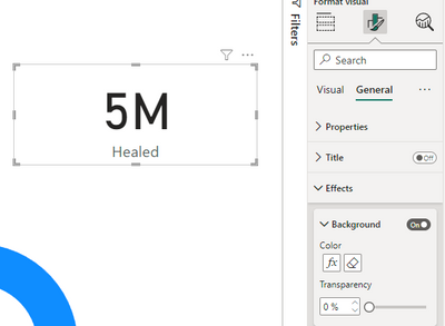
As a first example we can use Card visual. We need to go to formatting option and search for a background color and hit „fx“ option:
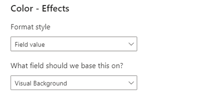
New window will open and we need to change Format style to Field value and select our measure, which changes visual Background. We just confirm with Ok.
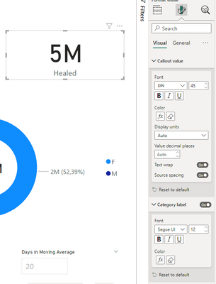
In the next step we need to do the same only this time we will set up our Callout value and Category label. Don’t forget we are setting up text, because of that we will use Text Color measure:
Once we are done, we can just use format painter and copy formatting to other cards in our report.
Since cards visuals are set up, we can move on to other visual. I will not go to every single visual I use in my report in this article since the steps are very similar, but I will describe one more – Canvas Background
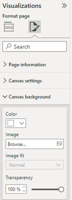
Setting up canvas background is not so straight forward like in other cases. Problem occurs that canvas does not support (yet) color based on DAX expressions. Here we can see a current formatting options of the canvas background:
As we see above, „fx“ button is missing. You might find in some visuals the same problem, but majority of colors can be adjusted. In case you can’t use DAX expressions for the color to change, you need to either keep fixed color or find visual which supports it.
Back to our problem with canvas. Since we can’t change the color directly in cavas background settings we are forced to use some workaround. In our case the workaround is having shape, which will serve the same way as the background. I am going to use rectangle as we see below:
I will expand the rectangle on the whole canvas area and do few formatting changes:
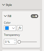
I) First we need to make fill dynamic. So I will apply in „fx“ Canvas Background measure.
II) I will turn off any borders and outlines of the shape.
III) I need to send shape to the back of my canvas. This can be done in top Format pane.
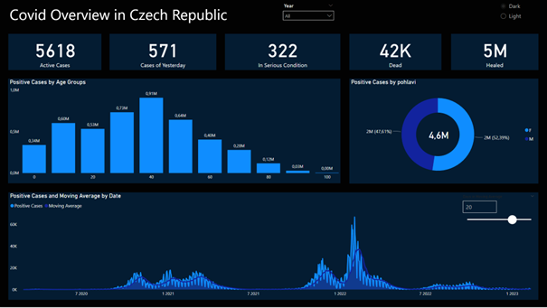
Now we should have some basic understanding of the set up. If we spend some time and adjust all other visuals with the same logic, we can see following results:
Light theme:
Dark theme:
You must be a registered user to add a comment. If you've already registered, sign in. Otherwise, register and sign in.
- Understanding TMDL in Power BI: A Game-Changer for...
- 🏆 Power BI DataViz World Championships | Week 1 F...
- 🏆 Power BI DataViz World Championships | Week 1 W...
- 🏆 Power BI DataViz Campeonato mundial! Semana 1!
- Fabric Capacity Scaling and Power BI - What happen...
- 🏆 Power BI DataViz World Championships | ¡La sema...
- 🏆 Power BI DataViz World Championships | Week 2 C...
- How to Use Multi-Cursor in Power BI TMDL View
- 🏆 Power BI DataViz World Championships | Meet the...
- Securing Data using Sensitivity Labels in Power BI
-
 Pragati11
on:
🏆 Power BI DataViz World Championships | Week 1 W...
-
 slindsay
on:
🏆 Power BI DataViz World Championships | Week 2 C...
-
 slindsay
on:
🏆 Power BI Data Visualization World Championships...
-
 slindsay
on:
🏆 Power BI DataViz World Championships | Week 1 C...
- Jalə on: Developing an Azerbaijan Shape Map
- ccarawan_1 on: Frequently Asked Questions | Power BI DataViz Worl...
- LYPowerBI on: Using Variables While Creating Custom Columns in P...
- cravity-hub on: Embedding Power BI Report in Web Pages
-
Poweraegg
 on:
Connecting Fact Tables in Microsoft Fabric: A Brid...
-
 PradipVS
on:
Power BI - Powered by Copilot
-
How to
647 -
Tips & Tricks
616 -
Support insights
121 -
Events
121 -
Opinion
80 -
DAX
66 -
Power BI
65 -
Power Query
62 -
Power BI Dev Camp
45 -
Power BI Desktop
40 -
Roundup
37 -
Power BI Embedded
20 -
Time Intelligence
19 -
Tips&Tricks
18 -
Featured User Group Leader
15 -
PowerBI REST API
12 -
Dataflow
9 -
Power Query Tips & Tricks
8 -
finance
8 -
Power BI Service
8 -
Data Protection
7 -
Direct Query
7 -
Power BI REST API
6 -
Auto ML
6 -
financial reporting
6 -
Data Analysis
6 -
Power Automate
6 -
Data Visualization
6 -
Python
6 -
Machine Learning
5 -
Income Statement
5 -
Dax studio
5 -
powerbi
5 -
service
5 -
Power BI PowerShell
5 -
Line chart
4 -
Group By
4 -
community
4 -
RLS
4 -
M language
4 -
Paginated Reports
4 -
External tool
4 -
Power BI Goals
4 -
PowerShell
4 -
Desktop
4 -
Bookmarks
4 -
Data Science
3 -
Azure
3 -
Data model
3 -
Conditional Formatting
3 -
Visualisation
3 -
Administration
3 -
M code
3 -
Visuals
3 -
SQL Server 2017 Express Edition
3 -
R script
3 -
Aggregation
3 -
calendar
3 -
Gateways
3 -
R
3 -
M Query
3 -
Webinar
3 -
CALCULATE
3 -
R visual
3 -
Reports
3 -
PowerApps
3 -
rank
2 -
ladataweb
2 -
Troubleshooting
2 -
Date DIFF
2 -
Transform data
2 -
Tips and Tricks
2 -
Incremental Refresh
2 -
Number Ranges
2 -
Query Plans
2 -
Power BI & Power Apps
2 -
Random numbers
2 -
Day of the Week
2 -
Custom Visual
2 -
VLOOKUP
2 -
pivot
2 -
calculated column
2 -
M
2 -
hierarchies
2 -
Power BI Anniversary
2 -
Language M
2 -
inexact
2 -
Date Comparison
2 -
Power BI Premium Per user
2 -
Forecasting
2 -
REST API
2 -
Editor
2 -
Split
2 -
Life Sciences
2 -
measure
2 -
Microsoft-flow
2 -
Paginated Report Builder
2 -
Working with Non Standatd Periods
2 -
powerbi.tips
2 -
Custom function
2 -
Reverse
2 -
PUG
2 -
Custom Measures
2 -
Filtering
2 -
Row and column conversion
2 -
Python script
2 -
Nulls
2 -
DVW Analytics
2 -
parameter
2 -
Industrial App Store
2 -
Week
2 -
Date duration
2 -
Formatting
2 -
Weekday Calendar
2 -
Support insights.
2 -
construct list
2 -
slicers
2 -
SAP
2 -
Power Platform
2 -
Workday
2 -
external tools
2 -
index
2 -
RANKX
2 -
PBI Desktop
2 -
Date Dimension
2 -
Integer
2 -
Visualization
2 -
Power BI Challenge
2 -
Query Parameter
2 -
Date
2 -
SharePoint
2 -
Power BI Installation and Updates
2 -
How Things Work
2 -
Tabular Editor
2 -
Excel
1 -
Cumulative Totals
1 -
Report Theme
1 -
Bookmarking
1 -
oracle
1 -
mahak
1 -
pandas
1 -
Networkdays
1 -
Button
1 -
Dataset list
1 -
Keyboard Shortcuts
1 -
Fill Function
1 -
LOOKUPVALUE()
1 -
Tips &Tricks
1 -
Plotly package
1 -
Healthcare
1 -
Sameperiodlastyear
1 -
Office Theme
1 -
matrix
1 -
bar chart
1 -
Measures
1 -
powerbi argentina
1 -
Canvas Apps
1 -
total
1 -
Filter context
1 -
Difference between two dates
1 -
get data
1 -
OSI
1 -
Query format convert
1 -
ETL
1 -
Json files
1 -
Merge Rows
1 -
CONCATENATEX()
1 -
take over Datasets;
1 -
Networkdays.Intl
1 -
refresh M language Python script Support Insights
1 -
Governance
1 -
Fun
1 -
Power BI gateway
1 -
gateway
1 -
Elementary
1 -
Custom filters
1 -
Vertipaq Analyzer
1 -
powerbi cordoba
1 -
Model Driven Apps
1 -
REMOVEFILTERS
1 -
XMLA endpoint
1 -
translations
1 -
OSI pi
1 -
Parquet
1 -
Change rows to columns
1 -
remove spaces
1 -
Get row and column totals
1 -
Retail
1 -
Power BI Report Server
1 -
School
1 -
Cost-Benefit Analysis
1 -
DIisconnected Tables
1 -
Sandbox
1 -
Honeywell
1 -
Combine queries
1 -
X axis at different granularity
1 -
ADLS
1 -
Primary Key
1 -
Microsoft 365 usage analytics data
1 -
Randomly filter
1 -
Week of the Day
1 -
Azure AAD
1 -
query
1 -
Dynamic Visuals
1 -
KPI
1 -
Intro
1 -
Icons
1 -
ISV
1 -
Ties
1 -
unpivot
1 -
Practice Model
1 -
Continuous streak
1 -
ProcessVue
1 -
Create function
1 -
Table.Schema
1 -
Acknowledging
1 -
Postman
1 -
Text.ContainsAny
1 -
Power BI Show
1 -
Get latest sign-in data for each user
1 -
API
1 -
Kingsley
1 -
Merge
1 -
variable
1 -
Issues
1 -
function
1 -
stacked column chart
1 -
ho
1 -
ABB
1 -
KNN algorithm
1 -
List.Zip
1 -
optimization
1 -
Artificial Intelligence
1 -
Map Visual
1 -
Text.ContainsAll
1 -
Tuesday
1 -
help
1 -
group
1 -
Scorecard
1 -
Json
1 -
Tops
1 -
financial reporting hierarchies RLS
1 -
Featured Data Stories
1 -
MQTT
1 -
Custom Periods
1 -
Partial group
1 -
Reduce Size
1 -
FBL3N
1 -
Wednesday
1 -
Power Pivot
1 -
Quick Tips
1 -
data
1 -
PBIRS
1 -
Usage Metrics in Power BI
1 -
Multivalued column
1 -
Pipeline
1 -
Path
1 -
Yokogawa
1 -
Dynamic calculation
1 -
Data Wrangling
1 -
native folded query
1 -
transform table
1 -
UX
1 -
Cell content
1 -
General Ledger
1 -
Thursday
1 -
Table
1 -
Natural Query Language
1 -
Infographic
1 -
automation
1 -
Prediction
1 -
newworkspacepowerbi
1 -
Performance KPIs
1 -
HR Analytics
1 -
keepfilters
1 -
Connect Data
1 -
Financial Year
1 -
Schneider
1 -
dynamically delete records
1 -
Copy Measures
1 -
Friday
1 -
Q&A
1 -
Event
1 -
Custom Visuals
1 -
Free vs Pro
1 -
Format
1 -
Active Employee
1 -
Custom Date Range on Date Slicer
1 -
refresh error
1 -
PAS
1 -
certain duration
1 -
DA-100
1 -
bulk renaming of columns
1 -
Single Date Picker
1 -
Monday
1 -
PCS
1 -
Saturday
1 -
update
1 -
Slicer
1 -
Visual
1 -
forecast
1 -
Regression
1 -
CICD
1 -
Current Employees
1 -
date hierarchy
1 -
relationship
1 -
SIEMENS
1 -
Multiple Currency
1 -
Power BI Premium
1 -
On-premises data gateway
1 -
Binary
1 -
Power BI Connector for SAP
1 -
Sunday
1 -
Training
1 -
Announcement
1 -
Features
1 -
domain
1 -
pbiviz
1 -
sport statistics
1 -
Intelligent Plant
1 -
Circular dependency
1 -
GE
1 -
Exchange rate
1 -
Dendrogram
1 -
range of values
1 -
activity log
1 -
Decimal
1 -
Charticulator Challenge
1 -
Field parameters
1 -
deployment
1 -
ssrs traffic light indicators
1 -
SQL
1 -
trick
1 -
Scripts
1 -
Color Map
1 -
Industrial
1 -
Weekday
1 -
Working Date
1 -
Space Issue
1 -
Emerson
1 -
Date Table
1 -
Cluster Analysis
1 -
Stacked Area Chart
1 -
union tables
1 -
Number
1 -
Start of Week
1 -
Tips& Tricks
1 -
Workspace
1 -
Theme Colours
1 -
Text
1 -
Flow
1 -
Publish to Web
1 -
Extract
1 -
Topper Color On Map
1 -
Historians
1 -
context transition
1 -
Custom textbox
1 -
OPC
1 -
Zabbix
1 -
Label: DAX
1 -
Business Analysis
1 -
Supporting Insight
1 -
rank value
1 -
Synapse
1 -
End of Week
1 -
Tips&Trick
1 -
Showcase
1 -
custom connector
1 -
Waterfall Chart
1 -
Power BI On-Premise Data Gateway
1 -
patch
1 -
Top Category Color
1 -
A&E data
1 -
Previous Order
1 -
Substring
1 -
Wonderware
1 -
Power M
1 -
Format DAX
1 -
Custom functions
1 -
accumulative
1 -
DAX&Power Query
1 -
Premium Per User
1 -
GENERATESERIES
1 -
Report Server
1 -
Audit Logs
1 -
analytics pane
1 -
step by step
1 -
Top Brand Color on Map
1 -
Tutorial
1 -
Previous Date
1 -
XMLA End point
1 -
color reference
1 -
Date Time
1 -
Marker
1 -
Lineage
1 -
CSV file
1 -
conditional accumulative
1 -
Matrix Subtotal
1 -
Check
1 -
null value
1

