FabCon is coming to Atlanta
Join us at FabCon Atlanta from March 16 - 20, 2026, for the ultimate Fabric, Power BI, AI and SQL community-led event. Save $200 with code FABCOMM.
Register now!Join the Fabric FabCon Global Hackathon—running virtually through Nov 3. Open to all skill levels. $10,000 in prizes! Register now.
- Microsoft Fabric Community
- Fabric community blogs
- Power BI Community Blog
- Achieve an End-to-End Data Analysis for your data ...
- Subscribe to RSS Feed
- Mark as New
- Mark as Read
- Bookmark
- Subscribe
- Printer Friendly Page
- Report Inappropriate Content
- Subscribe to RSS Feed
- Mark as New
- Mark as Read
- Bookmark
- Subscribe
- Printer Friendly Page
- Report Inappropriate Content
After ingesting, cleaning and transforming data, it is essential to visualize it in order to explore its patterns, trends and relationships. Visualizing data can help identify outliers, anomalies, clusters and correlations that might not be evident from numerical or textual data alone. Data visualization can also facilitate the communication and presentation of the results of data analysis to different audiences, such as stakeholders, customers or decision-makers. By using appropriate charts, graphs, maps or dashboards, data analysts can convey insights and recommendations in a clear and engaging way.
A scenario for Contoso Cuisines
One of the goals of Contoso Cuisines is to visualize the data they ingested and cleaned in Fabric to gain insights about their business performance. They want to see how much revenue they generated from orders in different regions, countries and time periods. They also want to compare the revenue based on the products they sold, such as categories, units and prices. Moreover, they want to evaluate the employee performance by looking at the number of orders, customers and commissions they handled. They can achieve this by completing the following step:
- Data Visualization
- Overview report of revenue generated
- Revenue performance report based on products
- Employee performance report based on orders and revenue generated
A - Overview report
As part of the requirements, the company wants a report that contains an overview of the revenue generated from orders in different countries, time periods and the impact of shipping days on the revenue. To achieve this, you can do the following:
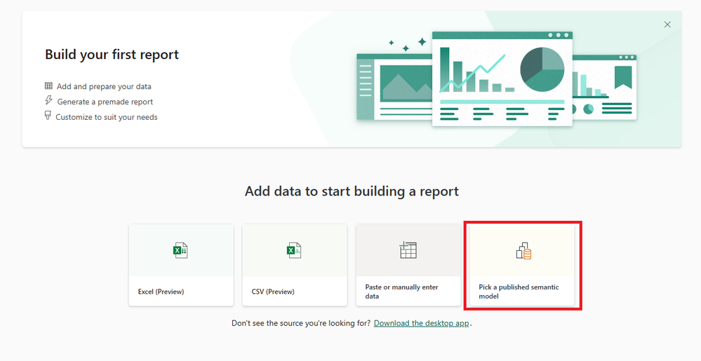
- In Microsoft Fabric, navigate to Power BI using the options on the left bottom corner of the page. Once on the Power BI page select the New Report button then select the Pick a published semantic model option
- Choose your published semantic model from the options presented to you then select the Connect button and choose Create a blank report.
Note: use the semantic model that has your Contoso Cuisines dataset set up from the previous blog (part 1) - On the blank page, add a Filter visualization at the top for Category and Product. Set the Field property by dragging and dropping CategoryName and ProductName from the Products table. Change the style of the visualization to be a Dropdown list.
- Add 2nd Filter visualization for Country and City. Set the Field property by dragging and dropping Country and City from the Order_Details_clean table. Change the style of the visualization to be a Dropdown list.
- Add a 2nd Filter visualization for Country and City. Set the Field property by dragging and dropping Country and City from the Order_Details_clean table. Change the style of the visualization to be a Dropdown list.
- Add a 3rd Filter visualization for Title and Employee. Set the Field property by dragging and dropping Title and FirstName from the Order_Details_clean table. Change the style of the visualization to be a Dropdown list.
- Add the last Filter visualization for Order Date. Set the Field property by dragging and dropping OrderDate from the Order_Details_clean table. Change the style of the visualization to be Between.
- Add 5 Card visualizations below the filters and set the Field properties to the following
- Card 1 – GrossRevenue
- Card 2 – Discount Value
- Card 3 – NetRevenue
- Card 4 – Orders
- Card 5 – Quantity
- Add a Gauge visualization and set its properties to the following values:
- Value – Average days to ships (use the DaysToShip field)
- Minimum value – Minimum of Days to ship
- Maximum value – Maximum of Days to ship
- The top part of your report page should look something similar to this
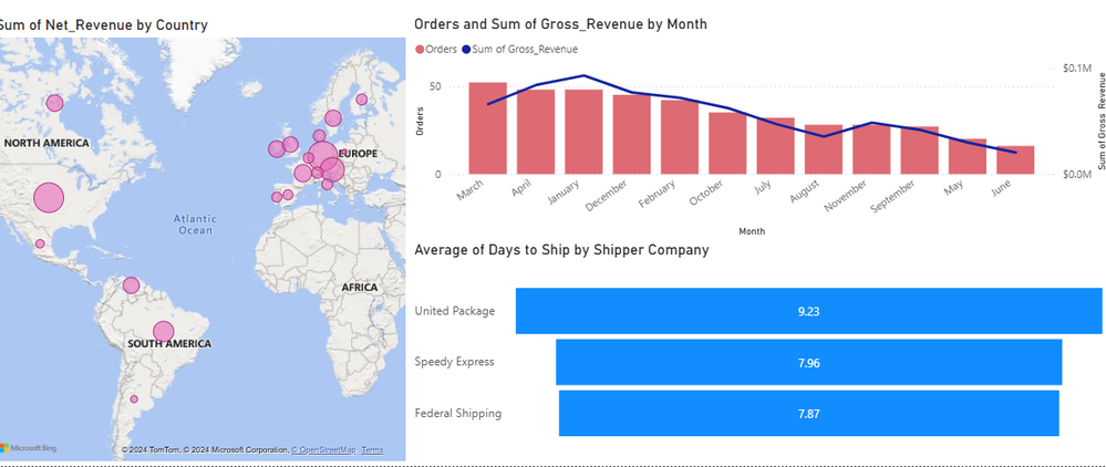
- You need to get the revenue generated based on each country. Add a Map visualization and set the properties to the following values:
- Location – use the Country and City fields from the Order details table.
- Bubble Size – Net_Revenue field
- You need to visualize the sales revenue performance and the frequency of orders over a period of 12 months. To achieve this, add a Line and Clustered Column Chart and set the properties to the following
- X-axis – Month
- Column y-axis – Orders (the measure)
- Line y-axis – Gross_Rvenue
- You need to analyse the customer's shipping company choice and the average days that company ships orders to customers. To achieve this, add a Funnel visual and set the Category property to the Shipper_Company field and then set the Values property to the average of Days_to_ship.
- Once done, this should be the result of your report page. Rename it to Overview
B – Revenue Performance based on Product
The next part of the requirements is to enable the company to analyse the sales performance to identify which products generate more impact to the revenue generated and is the most popular among customers.
- In your Power BI report, duplicate the Overview page and remove all the Card visualizations, Map, Gauge, Line and Clustered Column Chart, and Funnel visualizations.
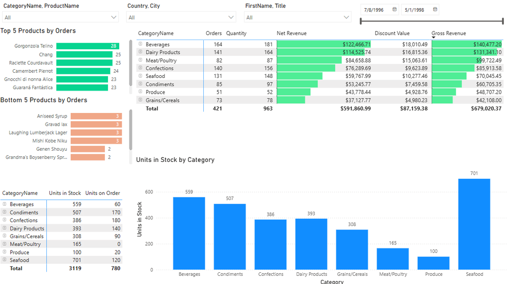
- First, you need to visualize the top 5 Products based on the number of Orders made for those products. To achieve this, add a Clustered bar chart and set the Y-axis property to the ProductName field from the Products table then set the X-axis property to the Orders measure.
- Make sure to set the filter of the visualization to show the Top N and set the number items to 5.
- Then, you need to visualize the bottom 5 Products based on the frequency of Orders made. To achieve this, copy the Top 5 Products visualization and update the filter to show the bottom 5 items.
- Next, you need to visualize the actual Discount, Gross and Net Revenue generated by orders for each Category. To achieve this, add a Matrix visualization and set the following properties
- Rows – use CategoryName and ProductName fields
- Values – use the Orders measure, Quantity, Gross Revenue, Discount and Net Revenue fields.
- You can some conditional formatting to show the variation in values for the Gross Revenue and Net Revenue, for example this will show how well each product category is performing based on the revenue it generates. To achieve this, select the dropdown icon next to Gross Revenue field, choose conditional formatting then choose data bars.
- Once done, the first part of the report page will look something like this
- Next, you need to show the how much Units are in Stock vs Units that are on order for each Product Category. You can achieve this by adding a Matrix visualization and set the properties to the following
- Rows – use CategoryName and ProductName fields
- Values – use the UnitsInStock and UnitsOnOrder fields
- Lastly, to complete this page you need to show case the Units in stock for each Product Category on it’s own visual for a better analysis. To achieve this, add a Clustered Column Chart and set the properties as the following
- X-axis – use CategoryName and ProductName fields
- Y-axis – use the UnitsInStock field
- Rename your page to Category and Product Performance and it should look similar to this
C – Employee Performance
The last part of the requirements if for the company to be able to analyze and monitor their employee performance to look at things like how much revenue is generated by each Employee role designation.
- In your Power BI report, duplicate the Category and Product Performance page.
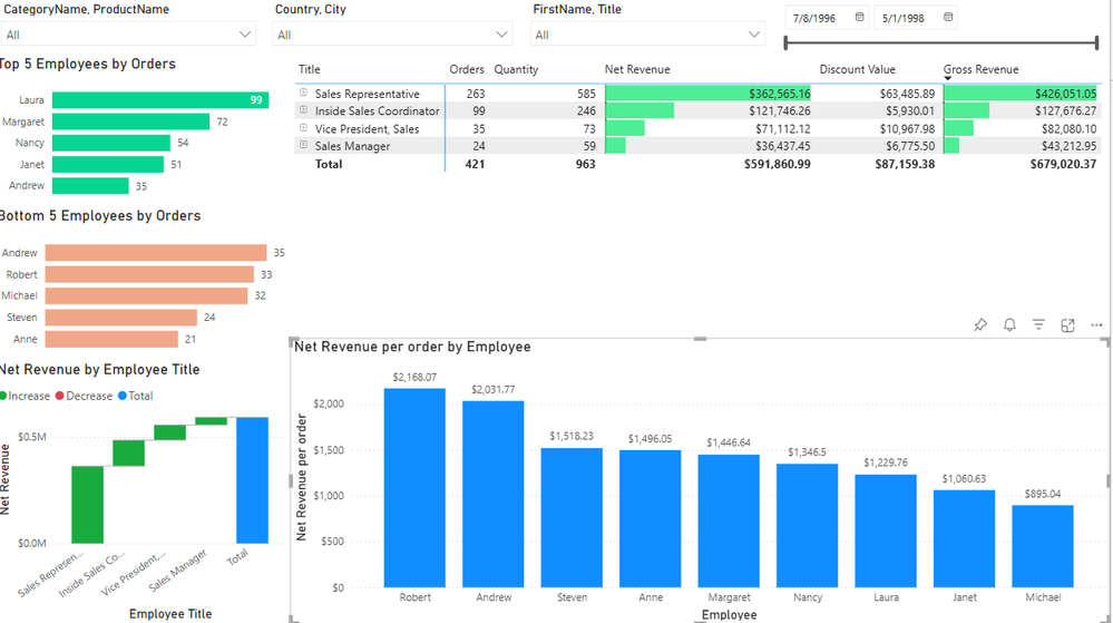
- First, you need to visualize the top 5 Employees based on the number of Orders made under their influence. To achieve this, update Top 5 Products Clustered bar chart and set the Y-axis property to the FirstName field from the Order Details table then set the X-axis property to the Orders measure.
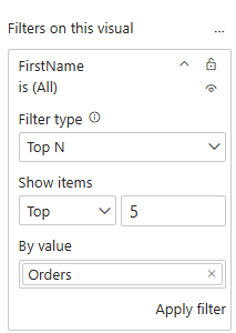
- Make sure to remove the ProductName filter and set the filter of the visualization to show the Top N and set the number items to 5 on FirstName.
- Then, you need to visualize the bottom 5 Employees based on the frequency of Orders made. To achieve this, update the Bottom 5 Products visualization and update the filter to show the bottom 5 items on FirstName and not ProductName
- Next, you need to visualize the actual Discount, Gross and Net Revenue generated by orders from each Employee Title and Employee Name. To achieve this, update the Matrix visualization and set the following properties
- Rows – use the Title and FirstName fields
- Now, you need to visualize the Net Revenue generated by each individual Employee Title/Department to identify any decrease/increase in the revenue performance. To achieve this, update the bottom Matrix visual and make it into a Waterfall Chart then set the properties to the following
- Category – use the Title field
- Y-axis – use the Net Revenue field
- Lastly, you need to analyze the Net Revenue Per Order generated by each individual Employee as part of their performance analysis. To achieve this, update the Clustered Column Chart and set the properties to the following
- X-axis – use the FirstName field
- Y-axis – use the Net Revenue per order field
- Once done, your Employee Performance report page should look something like this
Power BI report credit: Power BI Dashboard with Northwind
Homework
Now that you have went through an example of building a simple end-to-end solution with Fabric, you’re tasked with:
- Using the same dataset to train machine learning models with Data Science in Microsoft Fabric to predict future sales performance and customer behavior.
- Following the same solution structure with your own dataset this time and tag me on LinkedIn to share your solution!
- Get certified with the Microsoft Fabric Analytics Engineer DP:600 exam
You must be a registered user to add a comment. If you've already registered, sign in. Otherwise, register and sign in.
- 🚀 Performance Optimization with Calculation Group...
- Keep Letter Case When Importing Data
- The Dimensional Modeling & Granularity Edition
- snapshot calculation
- Power BI Charts: Display Measures as % with Field ...
- 🚀 Introducing SQL_BridgeVisual: Real-Time Writeba...
- How to Create Dynamic Titles in Power BI
- Hybrid Tables in Power BI Explained: Speed Up Your...
- Power BI Embedded URL Generation: A Step-by-Step G...
- Can versus Should in Power BI
-
 v-sgandrathi
on:
snapshot calculation
-
Royel
 on:
Power BI Charts: Display Measures as % with Field ...
-
_MMahmood_
 on:
Can versus Should in Power BI
- ketanTiwariAa on: Understanding DAX Filter Functions in Simple Words
-
oberthju
 on:
⚡ Power BI Performance Optimizations: From Minutes...
- _Abhilash on: Getting Started with Copilot in Power BI Desktop: ...
-
Peter_23
 on:
🏆 Announcing the judges' favorites from the Power...
-
 bhanu_gautam
on:
🏆 Announcing the finalists of the Power BI DataVi...
-
Abhilash_P
 on:
Power BI Copilot: Write DAX Measures Fast
-
 v-csrikanth
on:
Set a visual to allow report users dynamically sel...
-
How to
708 -
Tips & Tricks
685 -
Events
161 -
Support insights
121 -
Opinion
85 -
DAX
66 -
Power BI
65 -
Power Query
62 -
Power BI Dev Camp
45 -
Power BI Desktop
40 -
Roundup
38 -
Dataflow
26 -
Featured User Group Leader
24 -
Power BI Embedded
20 -
Time Intelligence
19 -
Tips&Tricks
18 -
Data Protection
13 -
PowerBI REST API
12 -
finance
8 -
Power BI Service
8 -
Power Query Tips & Tricks
8 -
Direct Query
7 -
Power BI REST API
6 -
Auto ML
6 -
financial reporting
6 -
Data Analysis
6 -
Power Automate
6 -
Data Visualization
6 -
Python
6 -
Tips and Tricks
6 -
Income Statement
5 -
Dax studio
5 -
powerbi
5 -
service
5 -
Power BI PowerShell
5 -
Machine Learning
5 -
Paginated Reports
4 -
External tool
4 -
Power BI Goals
4 -
Desktop
4 -
PowerShell
4 -
Bookmarks
4 -
Line chart
4 -
Group By
4 -
community
4 -
RLS
4 -
M language
4 -
Life Sciences
4 -
Administration
3 -
M code
3 -
Visuals
3 -
SQL Server 2017 Express Edition
3 -
R script
3 -
Aggregation
3 -
Webinar
3 -
calendar
3 -
Gateways
3 -
R
3 -
M Query
3 -
CALCULATE
3 -
R visual
3 -
Reports
3 -
PowerApps
3 -
Data Science
3 -
Azure
3 -
Data model
3 -
Conditional Formatting
3 -
Visualisation
3 -
measure
2 -
Microsoft-flow
2 -
Paginated Report Builder
2 -
Working with Non Standatd Periods
2 -
powerbi.tips
2 -
Custom function
2 -
Reverse
2 -
PUG
2 -
Custom Measures
2 -
Filtering
2 -
Row and column conversion
2 -
Python script
2 -
Nulls
2 -
DVW Analytics
2 -
parameter
2 -
Industrial App Store
2 -
Week
2 -
Date duration
2 -
Formatting
2 -
Weekday Calendar
2 -
Support insights.
2 -
construct list
2 -
slicers
2 -
SAP
2 -
Power Platform
2 -
Workday
2 -
external tools
2 -
index
2 -
RANKX
2 -
Date
2 -
PBI Desktop
2 -
Date Dimension
2 -
Integer
2 -
Visualization
2 -
Power BI Challenge
2 -
Query Parameter
2 -
SharePoint
2 -
Power BI Installation and Updates
2 -
How Things Work
2 -
Tabular Editor
2 -
rank
2 -
ladataweb
2 -
Troubleshooting
2 -
Date DIFF
2 -
Transform data
2 -
Healthcare
2 -
Incremental Refresh
2 -
Number Ranges
2 -
Query Plans
2 -
Power BI & Power Apps
2 -
Random numbers
2 -
Day of the Week
2 -
Custom Visual
2 -
VLOOKUP
2 -
pivot
2 -
calculated column
2 -
M
2 -
hierarchies
2 -
Power BI Anniversary
2 -
Language M
2 -
inexact
2 -
Date Comparison
2 -
Power BI Premium Per user
2 -
Forecasting
2 -
REST API
2 -
Editor
2 -
Split
2 -
help
1 -
group
1 -
Scorecard
1 -
Json
1 -
Tops
1 -
financial reporting hierarchies RLS
1 -
Featured Data Stories
1 -
MQTT
1 -
Custom Periods
1 -
Partial group
1 -
Reduce Size
1 -
FBL3N
1 -
Wednesday
1 -
Q&A
1 -
Quick Tips
1 -
data
1 -
PBIRS
1 -
Usage Metrics in Power BI
1 -
Multivalued column
1 -
Pipeline
1 -
Path
1 -
Yokogawa
1 -
Dynamic calculation
1 -
Data Wrangling
1 -
native folded query
1 -
transform table
1 -
UX
1 -
Cell content
1 -
General Ledger
1 -
Thursday
1 -
update
1 -
Table
1 -
Natural Query Language
1 -
Infographic
1 -
automation
1 -
Prediction
1 -
newworkspacepowerbi
1 -
Performance KPIs
1 -
HR Analytics
1 -
keepfilters
1 -
Connect Data
1 -
Financial Year
1 -
Schneider
1 -
dynamically delete records
1 -
Copy Measures
1 -
Friday
1 -
Training
1 -
Event
1 -
Custom Visuals
1 -
Free vs Pro
1 -
Format
1 -
Active Employee
1 -
Custom Date Range on Date Slicer
1 -
refresh error
1 -
PAS
1 -
certain duration
1 -
DA-100
1 -
bulk renaming of columns
1 -
Single Date Picker
1 -
Monday
1 -
PCS
1 -
Saturday
1 -
Slicer
1 -
Visual
1 -
forecast
1 -
Regression
1 -
CICD
1 -
Current Employees
1 -
date hierarchy
1 -
relationship
1 -
SIEMENS
1 -
Multiple Currency
1 -
Power BI Premium
1 -
On-premises data gateway
1 -
Binary
1 -
Power BI Connector for SAP
1 -
Sunday
1 -
Workspace
1 -
Announcement
1 -
Features
1 -
domain
1 -
pbiviz
1 -
sport statistics
1 -
Intelligent Plant
1 -
Circular dependency
1 -
GE
1 -
Exchange rate
1 -
Dendrogram
1 -
range of values
1 -
activity log
1 -
Decimal
1 -
Charticulator Challenge
1 -
Field parameters
1 -
deployment
1 -
ssrs traffic light indicators
1 -
SQL
1 -
trick
1 -
Scripts
1 -
Color Map
1 -
Industrial
1 -
Weekday
1 -
Working Date
1 -
Space Issue
1 -
Emerson
1 -
Date Table
1 -
Cluster Analysis
1 -
Stacked Area Chart
1 -
union tables
1 -
Number
1 -
Start of Week
1 -
Tips& Tricks
1 -
Theme Colours
1 -
Text
1 -
Flow
1 -
Publish to Web
1 -
Extract
1 -
Topper Color On Map
1 -
Historians
1 -
context transition
1 -
Custom textbox
1 -
OPC
1 -
Zabbix
1 -
Label: DAX
1 -
Business Analysis
1 -
Supporting Insight
1 -
rank value
1 -
Synapse
1 -
End of Week
1 -
Tips&Trick
1 -
Excel
1 -
Showcase
1 -
custom connector
1 -
Waterfall Chart
1 -
Power BI On-Premise Data Gateway
1 -
patch
1 -
Top Category Color
1 -
A&E data
1 -
Previous Order
1 -
Substring
1 -
Wonderware
1 -
Power M
1 -
Format DAX
1 -
Custom functions
1 -
accumulative
1 -
DAX&Power Query
1 -
Premium Per User
1 -
GENERATESERIES
1 -
Report Server
1 -
Audit Logs
1 -
analytics pane
1 -
step by step
1 -
Top Brand Color on Map
1 -
Tutorial
1 -
Previous Date
1 -
XMLA End point
1 -
color reference
1 -
Date Time
1 -
Marker
1 -
Lineage
1 -
CSV file
1 -
conditional accumulative
1 -
Matrix Subtotal
1 -
Check
1 -
null value
1 -
Show and Tell
1 -
Cumulative Totals
1 -
Report Theme
1 -
Bookmarking
1 -
oracle
1 -
mahak
1 -
pandas
1 -
Networkdays
1 -
Button
1 -
Dataset list
1 -
Keyboard Shortcuts
1 -
Fill Function
1 -
LOOKUPVALUE()
1 -
Tips &Tricks
1 -
Plotly package
1 -
Sameperiodlastyear
1 -
Office Theme
1 -
matrix
1 -
bar chart
1 -
Measures
1 -
powerbi argentina
1 -
Canvas Apps
1 -
total
1 -
Filter context
1 -
Difference between two dates
1 -
get data
1 -
OSI
1 -
Query format convert
1 -
ETL
1 -
Json files
1 -
Merge Rows
1 -
CONCATENATEX()
1 -
take over Datasets;
1 -
Networkdays.Intl
1 -
refresh M language Python script Support Insights
1 -
Tutorial Requests
1 -
Governance
1 -
Fun
1 -
Power BI gateway
1 -
gateway
1 -
Elementary
1 -
Custom filters
1 -
Vertipaq Analyzer
1 -
powerbi cordoba
1 -
Model Driven Apps
1 -
REMOVEFILTERS
1 -
XMLA endpoint
1 -
translations
1 -
OSI pi
1 -
Parquet
1 -
Change rows to columns
1 -
remove spaces
1 -
Get row and column totals
1 -
Retail
1 -
Power BI Report Server
1 -
School
1 -
Cost-Benefit Analysis
1 -
DIisconnected Tables
1 -
Sandbox
1 -
Honeywell
1 -
Combine queries
1 -
X axis at different granularity
1 -
ADLS
1 -
Primary Key
1 -
Microsoft 365 usage analytics data
1 -
Randomly filter
1 -
Week of the Day
1 -
Azure AAD
1 -
query
1 -
Dynamic Visuals
1 -
KPI
1 -
Intro
1 -
Icons
1 -
ISV
1 -
Ties
1 -
unpivot
1 -
Practice Model
1 -
Continuous streak
1 -
ProcessVue
1 -
Create function
1 -
Table.Schema
1 -
Acknowledging
1 -
Postman
1 -
Text.ContainsAny
1 -
Power BI Show
1 -
Get latest sign-in data for each user
1 -
Power Pivot
1 -
API
1 -
Kingsley
1 -
Merge
1 -
variable
1 -
Issues
1 -
function
1 -
stacked column chart
1 -
ho
1 -
ABB
1 -
KNN algorithm
1 -
List.Zip
1 -
optimization
1 -
Artificial Intelligence
1 -
Map Visual
1 -
Text.ContainsAll
1 -
Tuesday
1
- 09-28-2025 - 10-04-2025
- 09-21-2025 - 09-27-2025
- 09-14-2025 - 09-20-2025
- 09-07-2025 - 09-13-2025
- 08-31-2025 - 09-06-2025
- 08-24-2025 - 08-30-2025
- 08-17-2025 - 08-23-2025
- 08-10-2025 - 08-16-2025
- 08-03-2025 - 08-09-2025
- 07-27-2025 - 08-02-2025
- 07-20-2025 - 07-26-2025
- 07-13-2025 - 07-19-2025
- 07-06-2025 - 07-12-2025
- View Complete Archives
